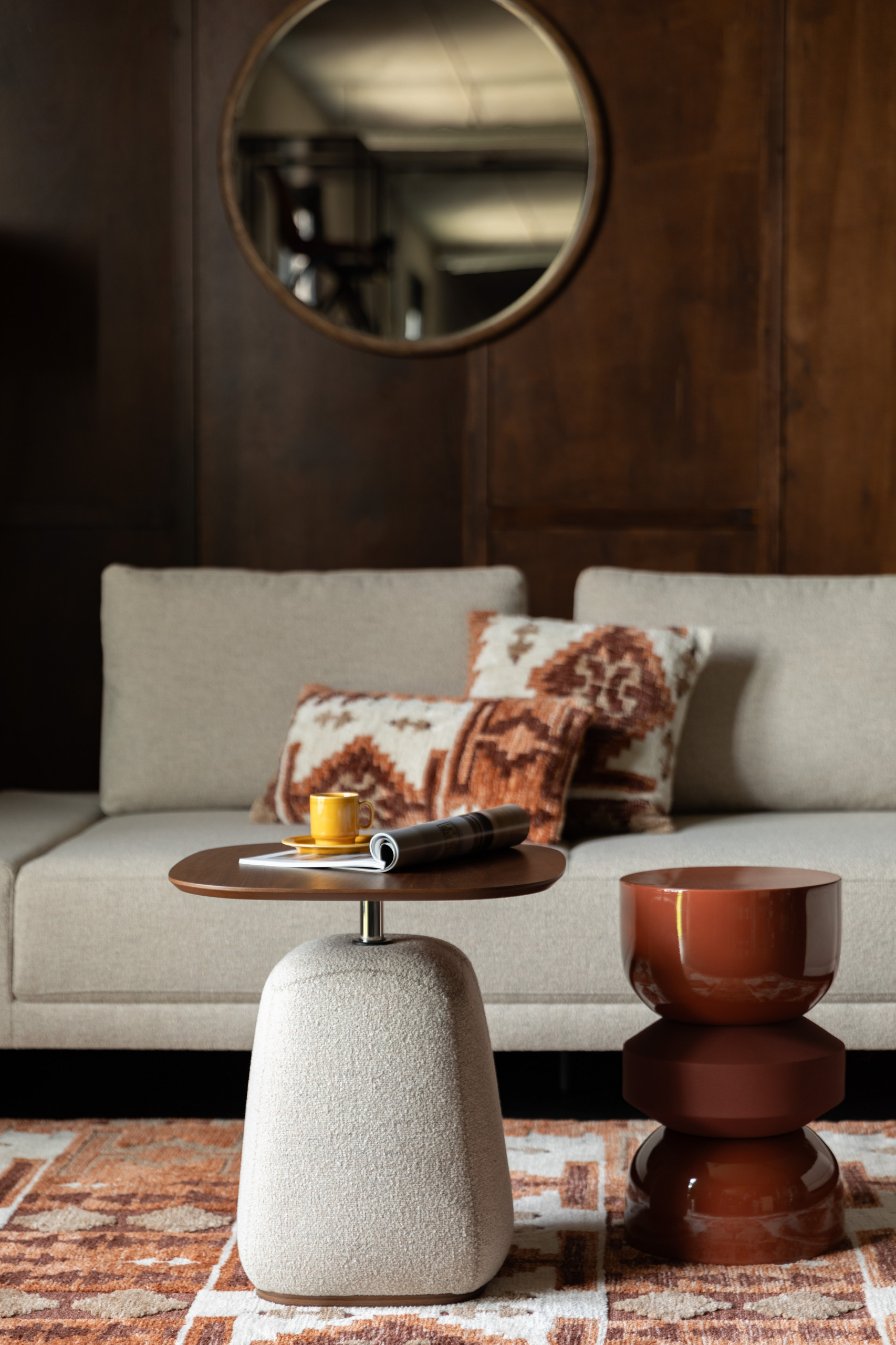
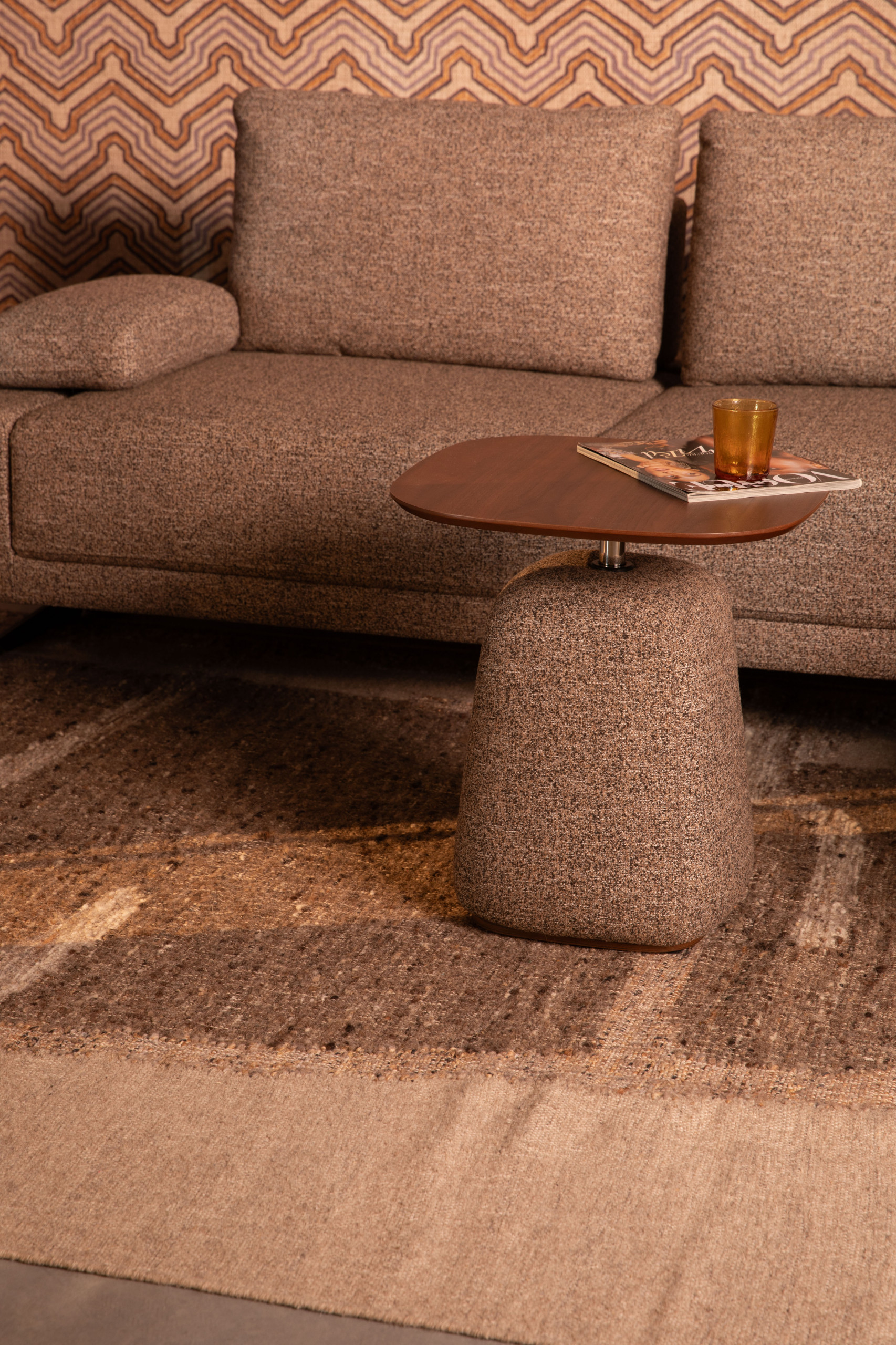
Another key ‘70s hue, heather gray, was also very much in evidence on the show floor this year, as a favorite for seating textiles and sofas. It helps to create a retro aesthetic, as in this suite from Dutchbone. Heather fabrics are generally in vogue and can be found enhancing other shades, such as brown.
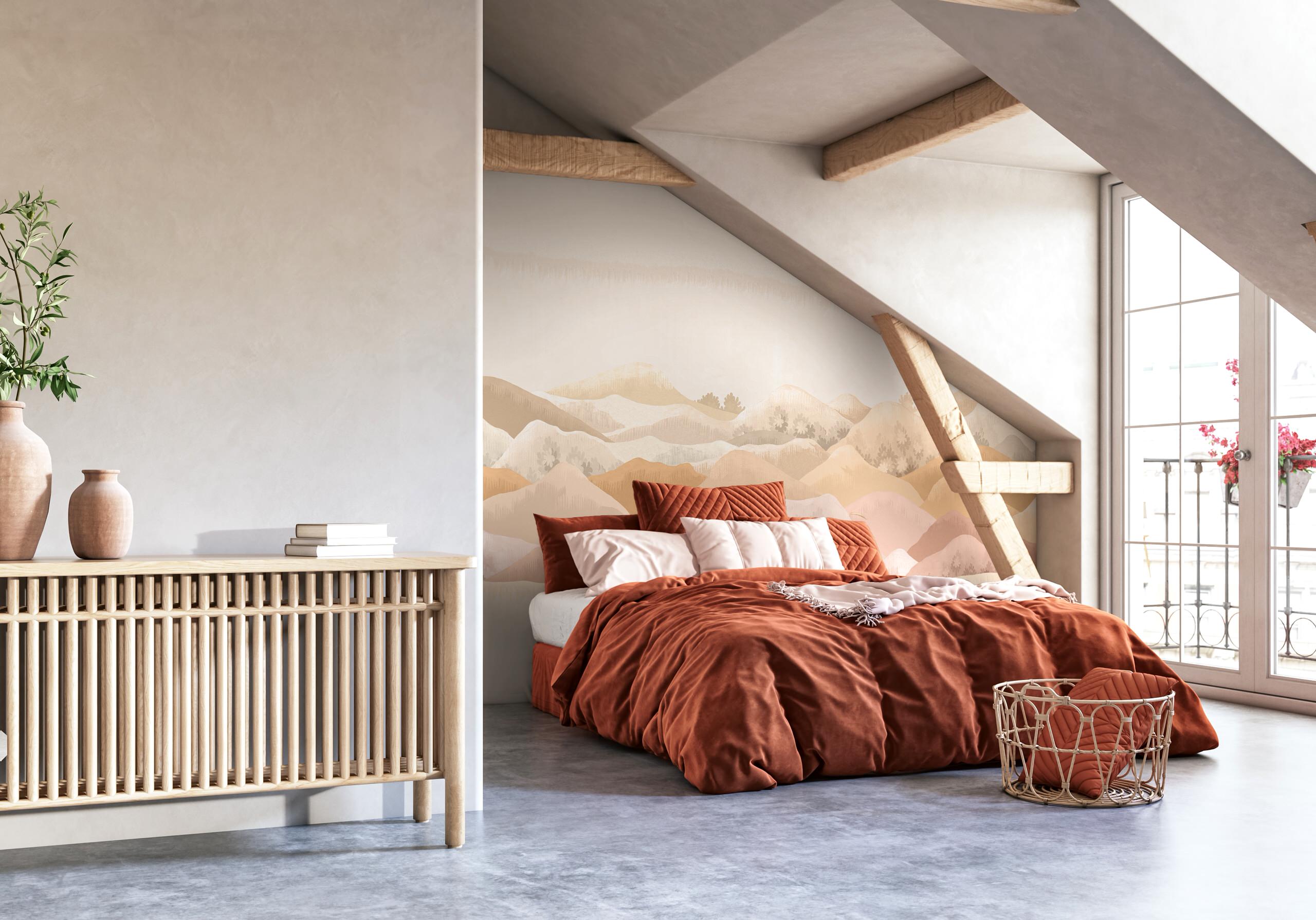
The new season envelops interiors in warm colors, with ocher hues taking center stage. They can be found as much on bed linens and accessories as on wall coverings. The new Aubusson collection from French wallpaper maker Papermint is proof of this, with the Douce Montage pattern featuring these soft, warm tones on a mountainous landscape.
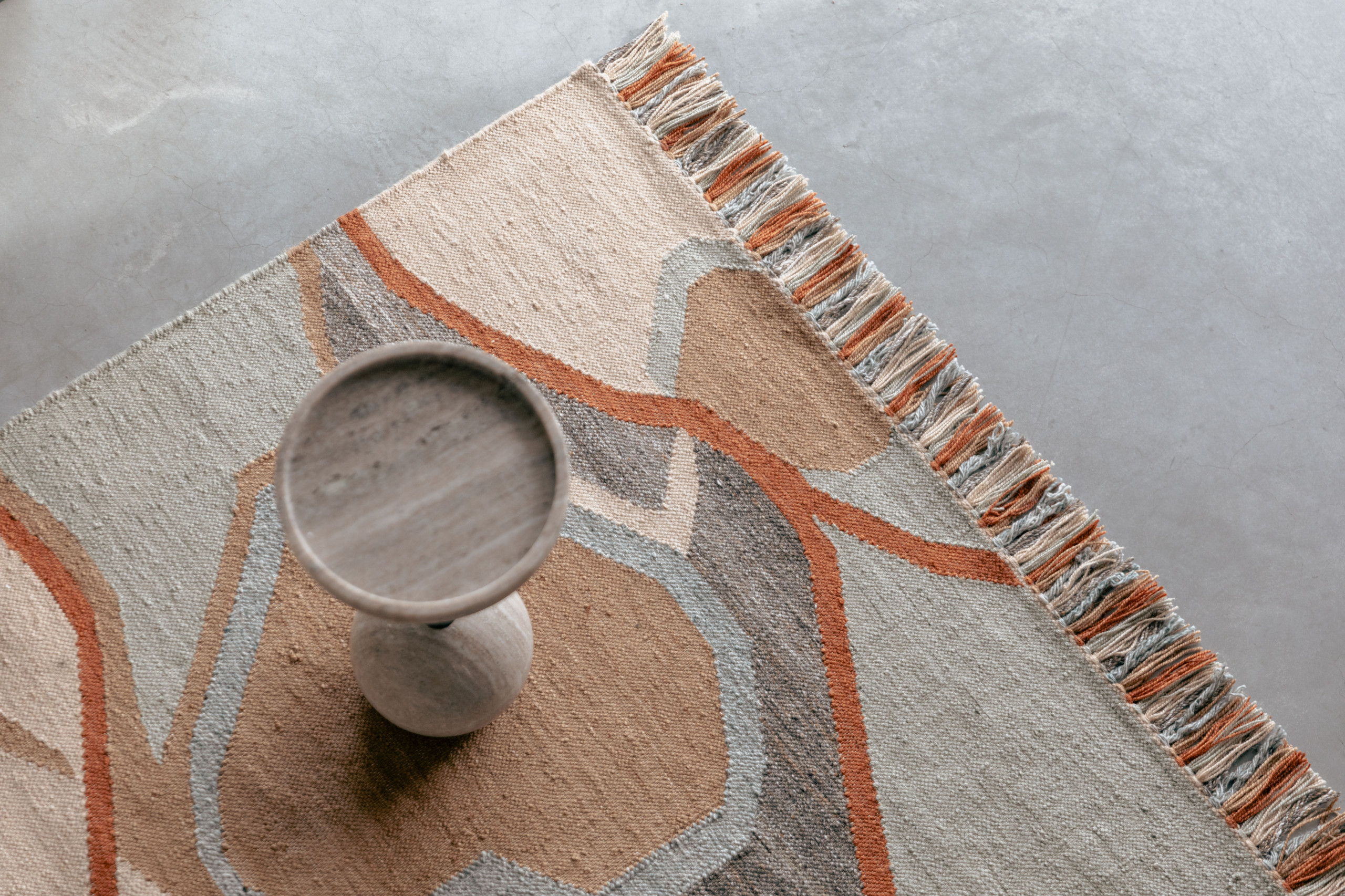
Continuing the trend of warm tones, beige and its sister shades are widely present this year in the collections of various suppliers, creating a new mineral palette far from the cold rocky tones we’re used to seeing. Zuiver’s Saigon tapi is a perfect example, softening the nuances between grays and beiges.
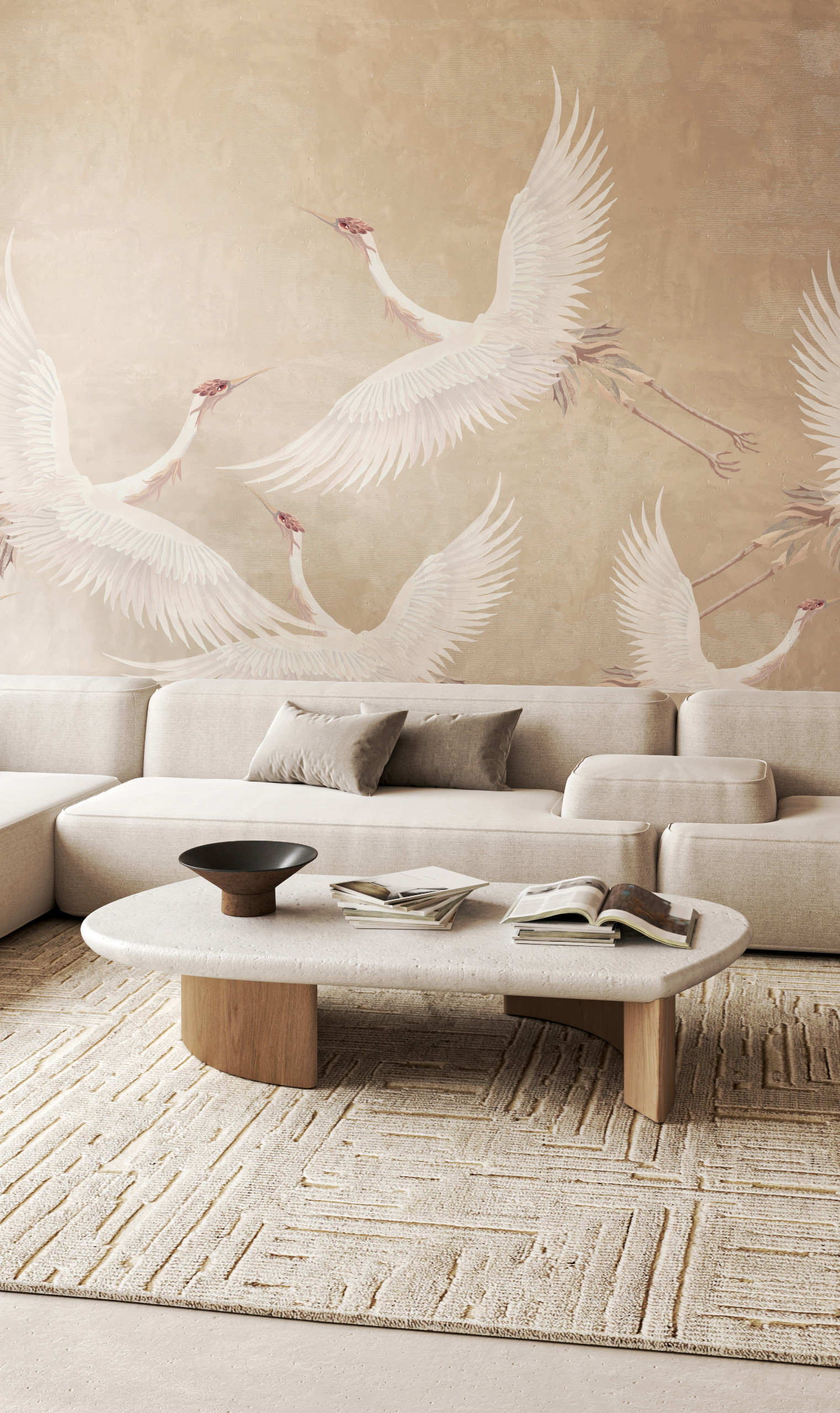
One of the trends to emerge from this Maison & Objet is neutrality, with the idea of leaving more room for the environment surrounding the interior. Purity is the order of the day, with cream and beige tones, sometimes tending toward bronze. We find them here on the walls with another Papermint product: the L’envol du Héron print from the new Aubusson collection.
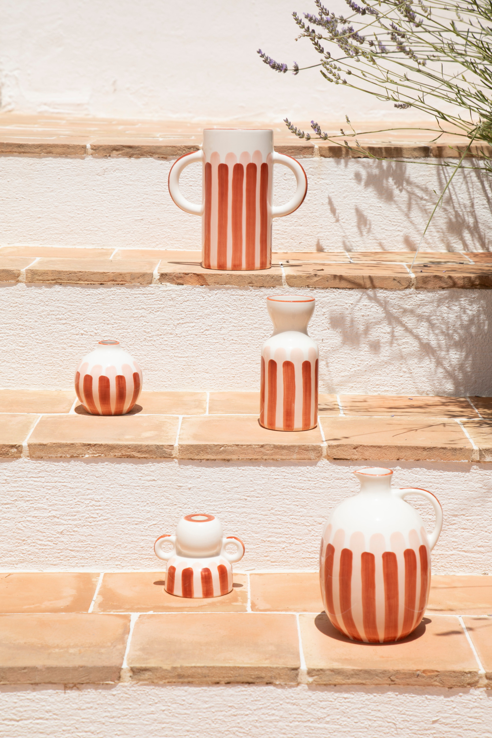
Alongside these natural shades are brighter, more vivid colors. While terra cotta has been a favorite in interior design palettes in recent years, it is now giving way to orange. Increasingly present, it is generally seen in the form of small touches as an interior illuminator. These vases by Oustao Cicada are one example.

Shimmering tones are the next big color trend this year. Inspired by new technologies, it has a futuristic aesthetic with its multicolored reflections reminiscent of rainbow hues, and its shimmering effects. Imperfettolad’s Beetle line is a perfect example of this with its iridescent fiberglass seats inspired by the shine of a beetle.
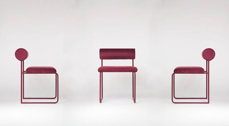
Halfway between burgundy and raspberry, wine sediment is also making a comeback this year, with hints of eggplant and even purple for the more daring. This is one of the shades chosen by Gimmic Design to adorn one of its office chairs. In addition to being stylish, they are also part of a circular economy approach to waste reduction.
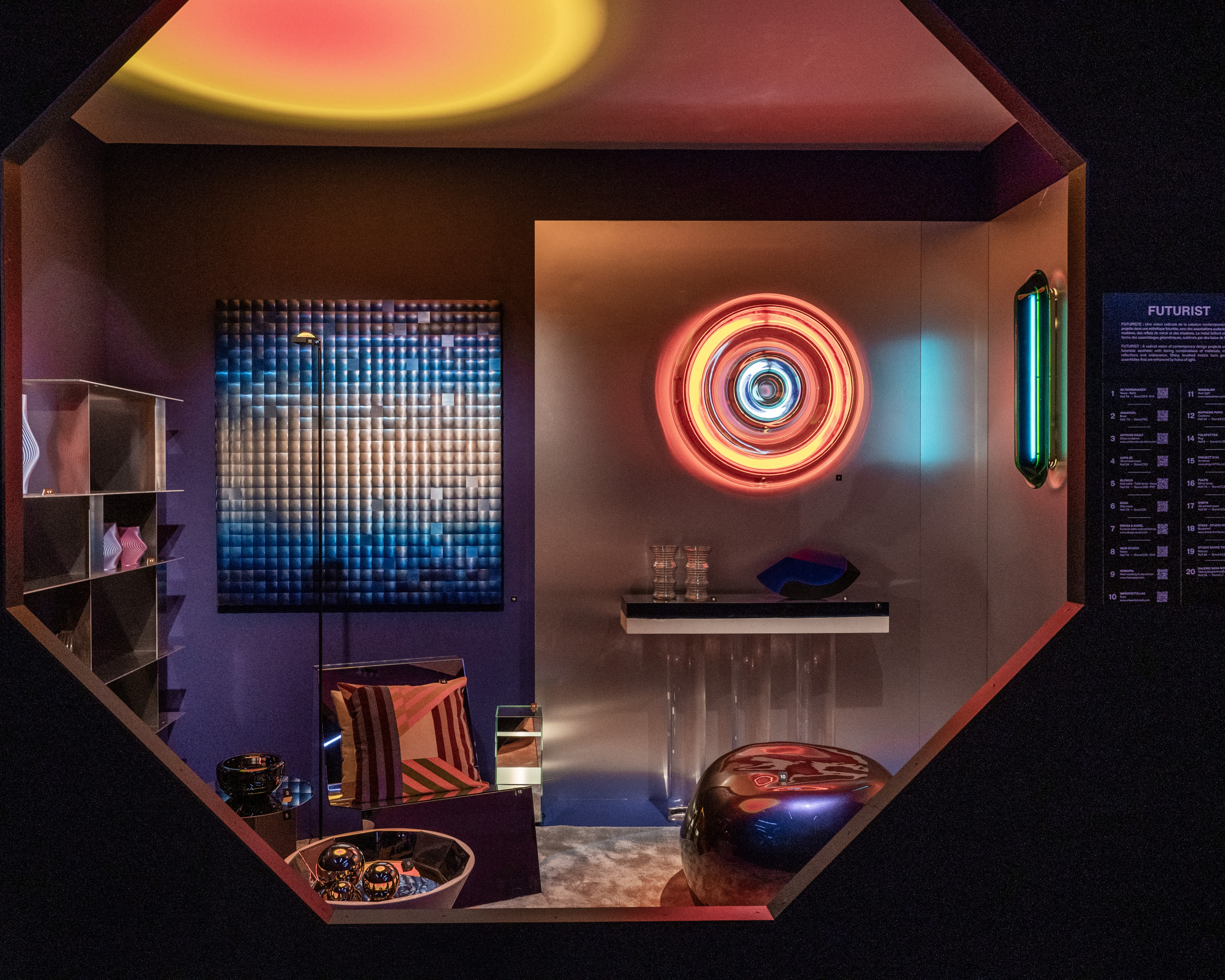
9. Cosmic Blue
Blue also features prominently in exhibitors’ new collections. In its darkest forms, sometimes bordering on ultramarine, it recalls the theme of the sky, the cosmos. It was at the heart of the What’s New in Decor scenography, imagined as every year by renowned trendsetter Elizabeth Leriche.
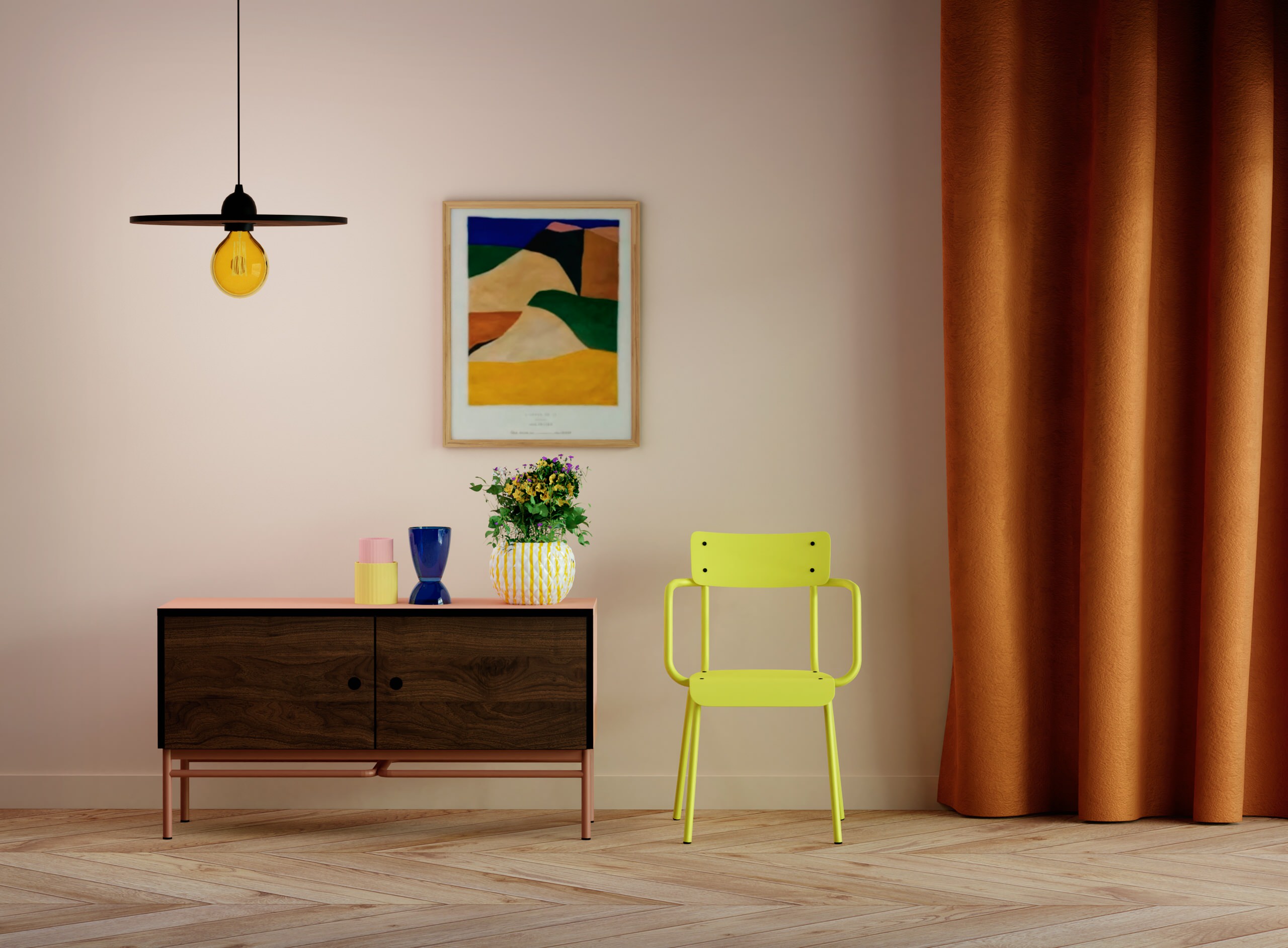
Finally, alongside this earthy, natural palette that will make up future interiors, there is also a pop revival, using primary colors. These include yellow, Klein blue, fuchsia pink and meadow green. The almost fluorescent yellow armchair by Les Gambettes is a good example.


Brown, which has been off the radar for several years, is making a comeback this fall, bringing with it all the nostalgia of the ‘70s. Warm, it is found mainly in tones of fawn and caramel. The fall collection by Dutch brand Dutchbone is proof of this, as the hue is used on numerous accessories and pieces of furniture such as the Appolo stool in Terra, pictured.