There’s no doubt that remodeling can be expensive and that it’s important to plan your budget accordingly. But I’ve always felt that if there’s one room that begs for a budget splurge, it’s the primary bathroom.
Bathroom and kitchen remodels, when executed well, can add value to a home. However, the best reason to splurge on a primary bathroom remodel is not for some future buyer, but for yourself. Having a private getaway in your home to relax and rejuvenate yourself is invaluable.
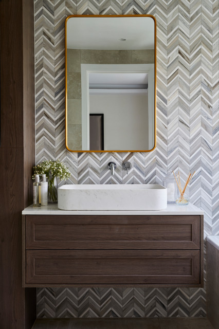
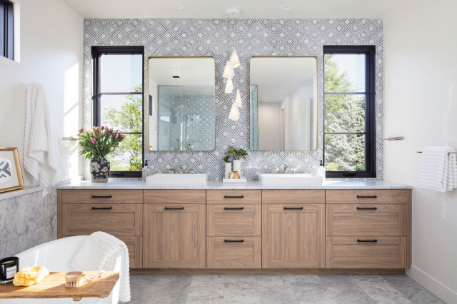
This stylish bathroom by Reniam Limited features a chevron-style marble backsplash that runs the full length of the wall between the vanity and the tub, creating visual interest and contrast against the dark wood cabinets and white fixtures.
The decision to use mixed metal finishes (a gold mirror frame and a chrome wall-mounted faucet) is an elegant touch.
2. Linen Cabinets
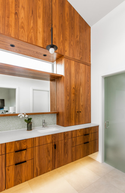
Adding a linen cabinet inside your primary bathroom is a convenient feature that my clients love — it’s so nice to grab a fresh, fluffy towel without having to leave the room.
The vanity in this bathroom by Click Architects was cleverly designed with an integrated linen cabinet hutch. It blends in seamlessly with the paneled wood soffit above.
3. Dramatic Lighting
While adding functional light in a bathroom is essential, if you want your bathroom to go beyond merely functional, adding dramatic lighting is key.
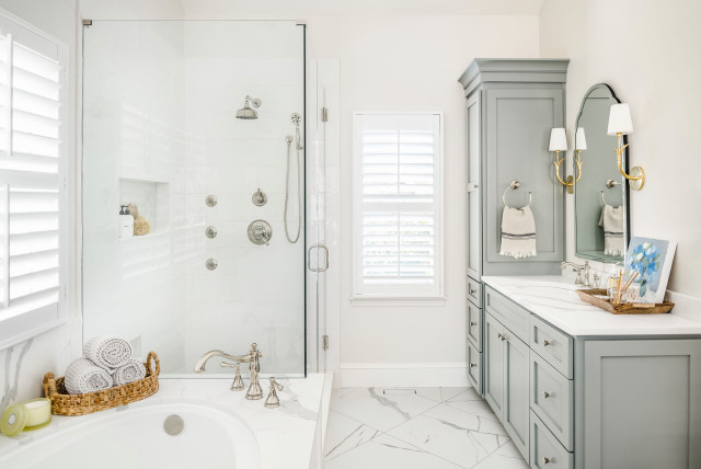
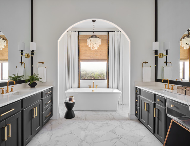
Haven Design and Construction hung a statement chandelier over this bathtub for a major wow factor. I also love how the drapery and the arch frame the fixture, immediately drawing your eye to it.
4. Open Shelving
Open shelving isn’t just for kitchens. It’s also popping up in bathroom remodels to provide easy access to essentials like cotton balls and swabs.
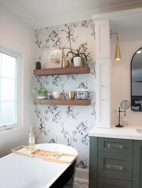
It’s also a great way to create that “shelfie” moment with houseplants and decorative objects, as seen in this bathroom by Signature Designs Kitchen | Bath | Interiors. The floating shelves in a natural wood are a warm touch against the black-and-white floral wallpaper.
5. Heated Towel Bars
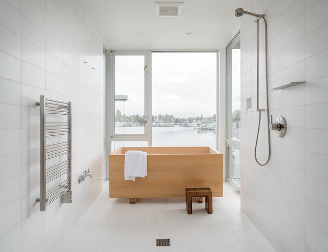
What’s dreamier than stepping out of the tub or shower and wrapping yourself in a pre-warmed towel? Heated towel bars have been popular in Europe for years and are finally becoming more mainstream in the U.S. Here’s an example of one in a Seattle bathroom by Heliotrope Architects. It’s one of those things that you’ll wonder how you lived without once you’ve experienced it.
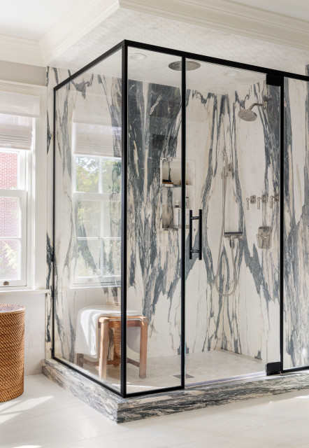
6. Slab Shower Surround
What better way to showcase a stone’s gorgeous veining pattern than to use slabs as the walls in your shower? The dramatic and graphic look of the black-and-white marble in this bathroom by Rosen Kelly Conway Architecture & Design is a visual showstopper, allowing other features in the space to be more reserved.
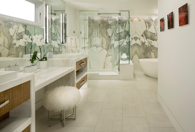
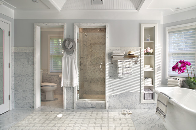
7. Side-by-Side Water Closet and Enclosed Shower
If you’re like me, you prefer to have a closed-off toilet so two people can use the bathroom simultaneously and still have privacy. This layout allows for that without skimping on the shower size.
This bathroom by Sussan Lari Architect also includes a freestanding tub, but thanks to the side-by-side water closet and shower layout, the space still feels roomy and open.
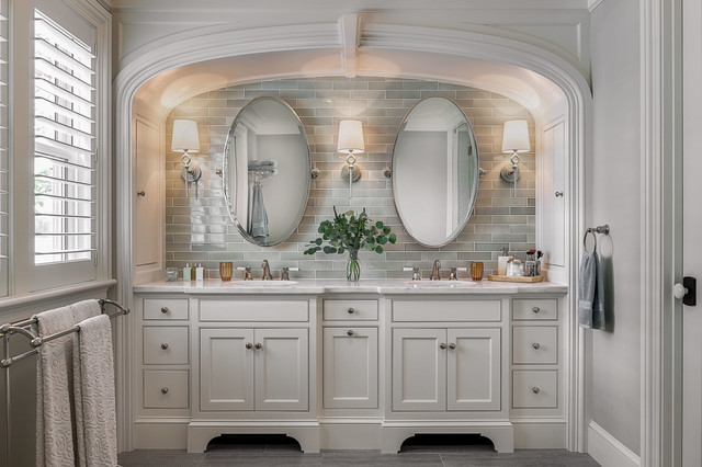
8. Alcove
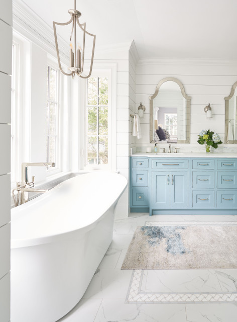
It’s not always the finishes that determine how luxurious a bathroom feels. It’s also the architectural details that give it a more upscale feel. In this traditional bathroom by TMS Architects, an arched alcove trimmed with gorgeous molding is the backdrop for the beautiful furniture-style double vanity.
The soft sage variegated tile backsplash is subtle and spa-like, while the elegant mirrors and sconces are like adding jewelry to complete an outfit.
9. Makeup Vanity
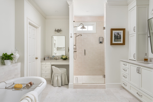
If you’ve got the room for it, having a sit-down area for putting on makeup is a really nice feature. In this bathroom by Innovative Construction, the vanity is tucked away in a corner next to the shower, with an adorable ruffled vanity chair and enough storage to contain the cosmetics clutter.
10. Wet Room
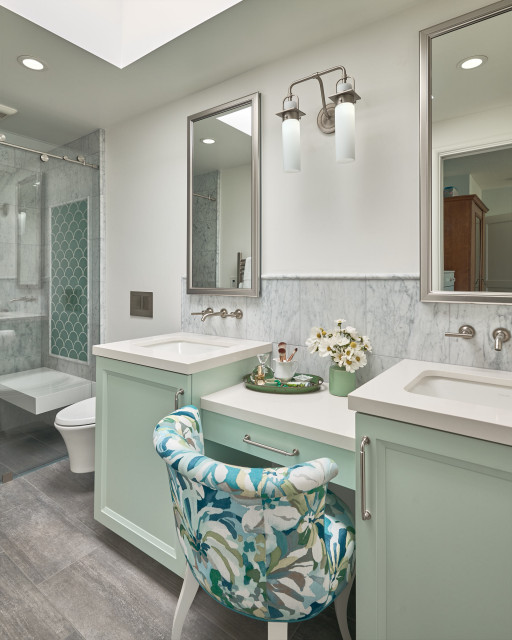
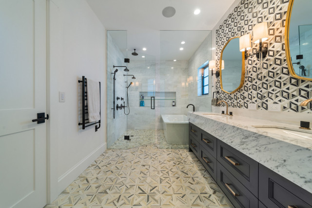
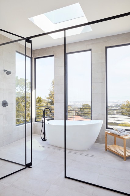
Sometimes there isn’t quite enough room to separate a freestanding tub and a shower. A wet room solves that problem while giving you the best of both worlds.
In this bathroom by Smithwood Builders, the marble floor tile runs the length of the bathroom into the shower, with a frameless glass enclosure separating the vanity area from the wet-room area. The black-painted vanity and black-and-gold faucets create a nice contrast to the mostly white scheme.


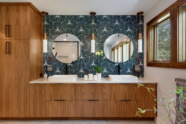
1. Knockout Backsplash
A vanity backsplash is perhaps the best and most visible area in a bathroom to make a stylish impact. Adding patterned tile that goes all the way to the ceiling adds instant drama.
Ohana Home & Design took this midcentury modern bathroom to the next level by using patterned geometric hexagonal tile in a dark marine blue from the vanity countertop to the ceiling. The white linear pattern on the tiles creates a celestial feeling and provides stark contrast to the walnut cabinets.