28 Home Design Trends

Change is to be expected. But lately it seems change is occurring at lightning speed. In response, some people are looking to slow life down by creating nurturing homes with warm, neutral colors, natural materials and a style that will last through whatever the world stirs up. You’ll find features that exemplify that sentiment, as well as other notable ideas, in this collection of 28 home design and remodeling trends.
Kitchens

1. Timeless style. 
Many homeowners are requesting traditional details and materials that create a timeless style, which can be a sustainable choice during renovations. A phrase that comes up repeatedly in conversations with design pros about this trending style is “quiet luxury.”

“Old is new again,” designer Alex Thies of Adelyn Charles Interiors says. “We are seeing a lot of even our most modern clients incorporate ‘old’ elements such as brick, handmade clay tiles, rustic wood elements and arches everywhere.” Some designers say the trend is a result of many homeowners looking to stay in their homes well into their retirement years and wanting materials and features they won’t grow tired of.

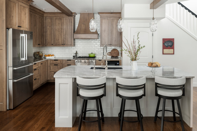
Kraft Custom Construction used a variety of classic elements in this Portland, Oregon, kitchen, including wood cabinets and beams, a subway tile backsplash and stone countertops.

2. Handmade features. Accompanying the trend toward timeless style is an embrace of handmade features and details. This includes handmade tiles, custom bathroom vanities and other bespoke elements, which create a feeling that the homeowner has something truly unique and special.

“We are gravitating toward materials with handcrafted and organic qualities, such as plasterwork, caning and wallcoverings with a hand-painted or watercolor feel,” says Micaela Quinton of Copper Sky Design + Remodel. “We are incorporating chiseled, tumbled, zellige and hand-cut tiles into almost every design.”

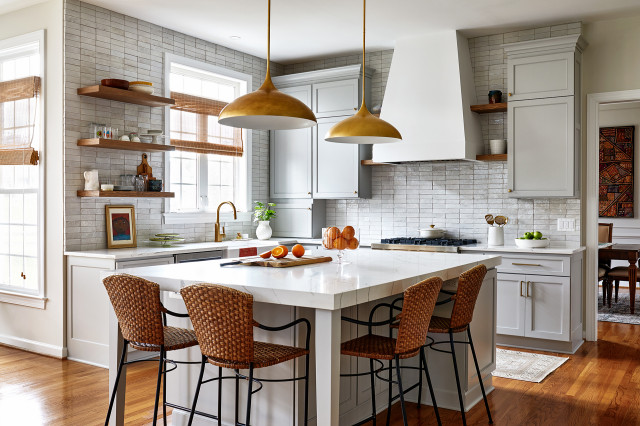
This Washington, D.C.-area kitchen by Case Architects & Remodelers embodies the look with hand-cut zellige-style backsplash tiles that give the walls a raw, organic look and feel.
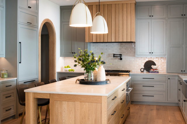
3. Wood cabinets, flooring and details. While always classic, wood cabinets and other details tend to ebb and flow in popularity. Right now the material is booming. “We’ve had a lot of interest in natural and stained wood cabinetry lately — walnut, quartersawn oak and rift-sawn oak,” designer Julie Deuble of Sierra Unlimited Construction and Arbor Craft Cabinetry says. “Also wood accents in painted kitchens. It’s a nice change from the endless white painted kitchens.”

Studio M Interiors incorporated numerous wood details into this Minneapolis kitchen, including the island, flooring, range hood and arched doorway.
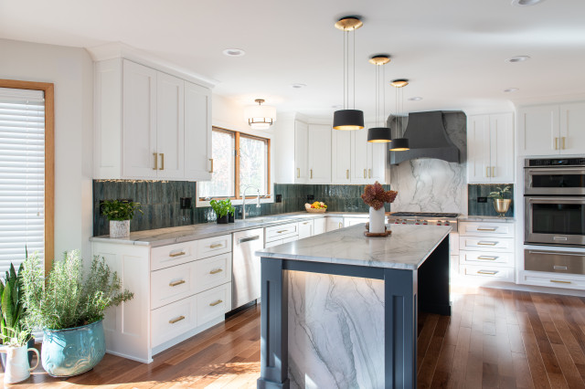
4. Blended backsplashes. Designers often use tile to create stylish kitchen backsplashes. To visually break up those expanses of tile, some designers are now installing a slab of stone or quartz behind the range or cooktop while keeping the surrounding backsplash areas tiled. The slab is often the same material as the countertops, giving the kitchen a vertical display of graphic veining or other interesting details to create a striking focal point that’s easy to wipe clean.

This Chicago kitchen by designer Patrick A. Finn illustrates the trend with a large slab behind the range in the same material as the countertops.
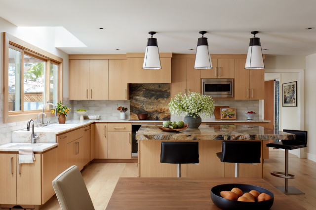
DiVittorio Architecture & Design took a similar approach in this Los Altos, California, kitchen with a stunning slab of green-and-gold stone behind the range that matches the island countertop.
The script gets flipped in this kitchen in a new-construction home by New Rosslyn Construction. Creamy zellige-style tiles form the main range backsplash while slabs cover the surrounding backsplash areas.
5. Upper cabinets. To help alleviate the look of large expanses of cabinets, some homeowners opt to go without upper cabinets altogether or choose open shelves that offer storage and display space. But some homeowners don’t want to lose the valuable upper cabinet storage and feel open shelves gather too much dust and require constant curating.

As a result, we’re seeing many kitchens embrace upper cabinets once again to maximize storage and keep dishes and glasses out of sight. Going with light colors and integrating a few glass-front cabinets are ways to help lighten the look of banks of upper cabinets.
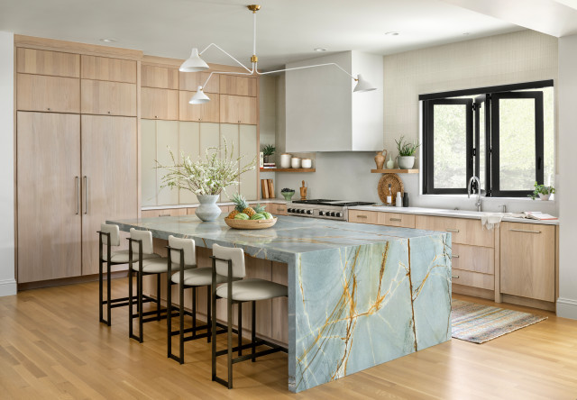
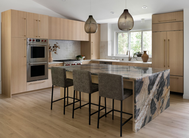
6. Statement-making island countertops. Islands have long been considered the hub of the kitchen. Lately, homeowners and design and remodeling pros are turning the feature into a focal point by incorporating dramatic stone countertop styles and colors with waterfall details that put the slabs on full display. Factor Design Build did just that in this Denver kitchen with jaw-dropping slabs of Blue Marine quartzite.
In this Eagan, Minnesota, kitchen by Vela Interior Design, showstopping slabs of Midnight Fusion quartzite add dramatic flourishes in tones that complement the rift-cut white oak cabinets.
7. Multipurpose islands. During a party, many people naturally congregate near the food and drinks, and that typically means the kitchen. To facilitate a communal atmosphere, many homeowners are looking for ways to create a kitchen fit for entertaining. In fact, 3 out of 5 homeowners (57%) use their kitchen for entertaining following a renovation.

A multipurpose island is often the linchpin of this approach. This Columbus, Ohio, kitchen by Kitchen Kraft has a large island with seating and a beverage fridge that allows guests to grab a drink without getting in the way of the cook.
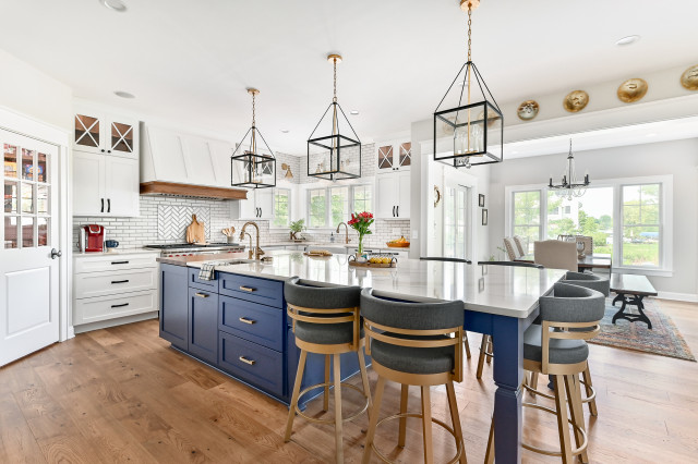
This Oconomowoc, Wisconsin, kitchen by Kowalske Kitchen & Bath features a long and narrow island with seating on three sides, a sink and a chopping station, ensuring the cook remains close to guests.
8. Butler’s pantries. If there’s one trend that has catapulted into the mainstream lately, it’s the rise of the butler’s pantry, or scullery. These secondary kitchen spaces help minimize visual and physical clutter in the main kitchen by creating space for pantry items, small appliances and extra countertops.

“We have done many of these recently and continue to receive requests for them,” designer Kristin Whalen of Cape Home Kitchen & Bath says. “They allow homeowners a hidden yet practical storage solution for small appliances and groceries — items that would otherwise clutter kitchen countertops.”

Designer Bria Hammel created this butler’s pantry off a Minneapolis kitchen. It features a speed oven, beverage fridge, countertop space, open and closed storage and a secondary sink.
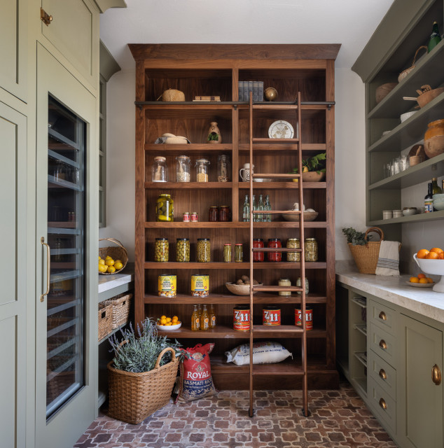
This beautiful Los Angeles butler’s pantry by designer Shannon Ggem features open and closed storage, a large wine fridge, a sink and even an oven and refrigerator.
9. Appliance garages. Appliance garages conceal countertop appliances such as blenders, coffee makers and toasters while keeping them easily accessible and organized. While they’ve been around for decades, they’re enjoying a resurgence in popularity as homeowners seek to declutter their homes and incorporate more gadgets into their kitchens looking and harder-working options.
Bathrooms

10. Amazing showers. 
A spa-like bathroom is the goal of many homeowners. Few things deliver that feel quite like a beautifully designed shower. We expect attention on lavish shower features and materials to continue to rise. Things like bold focal-point tile walls, wet-room setups, multiple shower heads, steam options, low-curb and curbless designs, heated benches and other luxurious details will continue to turn showers into the most relaxing spots in a home.

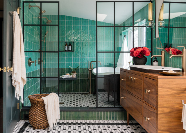
This La Grange Park, Illinois, bathroom by DEW Design features a low-curb shower and wet room with zellige-style green glass tiles, double shower heads, a handheld sprayer, a soapstone-look quartz floating bench, traditional black-and-white hexagonal floor tiles and a claw-foot cast-iron tub. The glass divider is actually “screen-printed with a black grid to give the illusion of a metal frame but is still ultra cleanable,” designer Ellen Whitehead says.
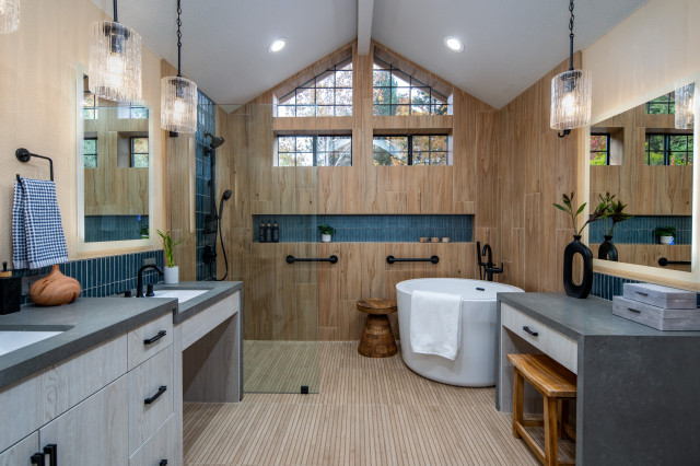
11. Stylish aging-in-place features. Homeowners are increasingly planning for special needs in their bathrooms, with a focus on aging household members. Two-thirds of homeowners (66%) address special needs during their bathroom remodels.

To address the needs of aging household members, remodeling homeowners add grab bars, nonslip flooring and curbless showers. This stylish Sacramento, California, bathroom by Lorain Design Associates features various accessible elements for aging household members, including multiple shower grab bars in a stylish matte black finish that bucks the notion that such features often look like they belong in a hospital rather than a residential space. The channeled tile flooring creates a nonslip surface. In addition to the curbless entry, a lowered sink has knee space to accommodate a wheelchair if needed.
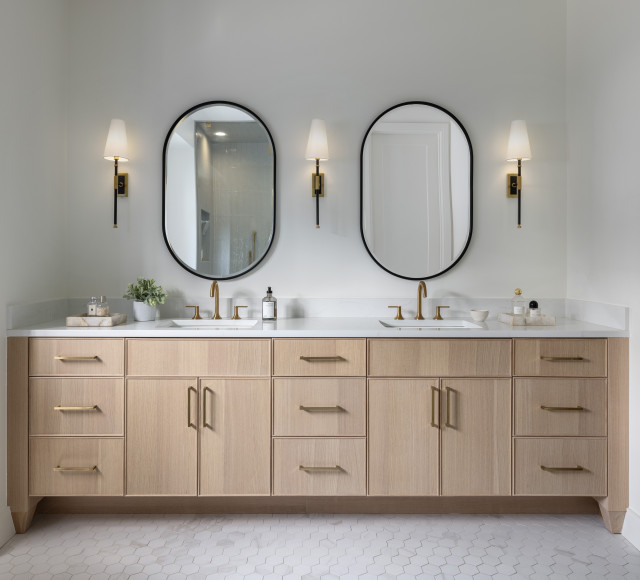
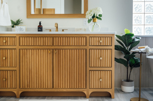
12. Wood bathroom vanities. For years, white bathroom vanities were the preferred choice among homeowners. At the same time, wood vanities were steadily increasing in popularity. But wood became the top choice for bathroom vanities, and we expect that trend to continue.

This Detroit bathroom by PRM Custom Builders features a gorgeous light wood vanity with skinny Shaker-style cabinet fronts.
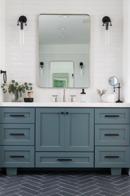
13. Bottom drawers on vanities. It’s nearly impossible to get a full-size drawer directly below and in front of a bathroom sink because of the way the plumbing sits at the back. Many pros recommend a design that puts a full-size drawer below a cabinet, as shown on this stylish vanity in an Orange County, California, bathroom by designer Madison Bettis of Madison Taylor. “They function well for storage, and it’s usable space instead of a faux drawer at the top that you can’t use because of the sink,” Bettis says.

An open shelf instead of drawers is also a popular option.
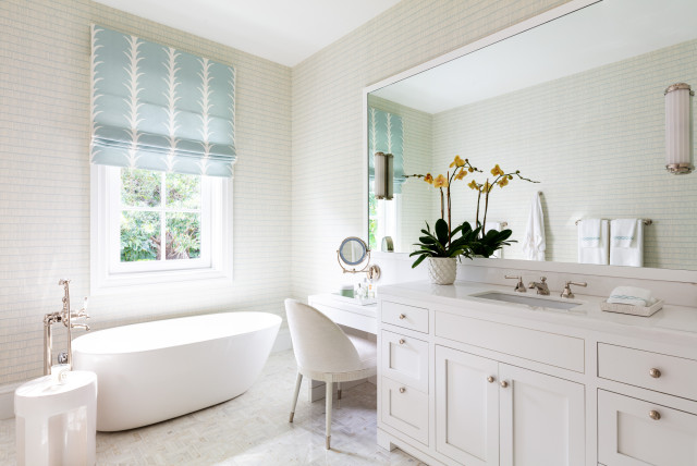
14. Makeup vanities. The beauty industry is booming and with it beauty products. To comfortably and efficiently assist day and night routines, many homeowners are returning to the concept of the once-popular built-in makeup vanity (also known as a makeup or dressing table). Pros are outfitting these features with specialized storage, seating, lighting, mirrors and other elements tailored to the homeowners’ regimens.
15. Warm neutrals. Perhaps the most talked-about trend happening now is the move away from cool grays and stark whites to warmer neutrals like beiges, creamy off-whites and rich browns. We first predicted this infusion in the kitchen, but the look is beginning to dominate throughout the home to provide a calmer, more welcoming environment. Designers recommend incorporating different tones, textures and patterns to create a more layered look that gives a room seasonal versatility.

“In the last few years, since people have been spending a lot more time at home, it’s become really important to feel good in your space,” designer Nicole Peter says. “As a result of that, I think that the color trends have really shifted quickly away from the austere grays and whites that we were seeing to much softer mushrooms, taupes and warm whites. Even in a very traditional or formal space, people are wanting to feel a level of coziness and comfort.”

Designer Linette Dai agrees. “Color is definitely back in a big way, and clients are unafraid to embrace deep tones such as burgundy, mustard, sienna, browns,” she says. “And green is now pretty much considered a neutral.”

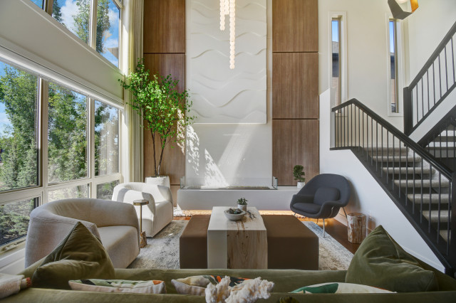
This Calgary, Alberta, living room by ANA Interiors showcases the trend with warm whites, a rich brown ottoman, a deep green sofa and a moody blue accent chair.
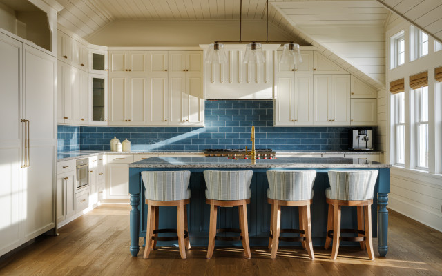
16. Blue. With so much going on in the world, many homeowners seem to be looking to blue accents and details to provide a sense of calm at home. Perhaps that’s why so many paint companies are choosing blue. Whether it’s a sky-inspired hue or a deep watery color, look for an array of blues to be featured more prominently in decorative materials and housewares in the coming year.

This North Carolina beachside kitchen by Griggs & Co. Homes features warm white cabinets and ceiling and wall panels with waves of soothing blue for the backsplash tile and island base.
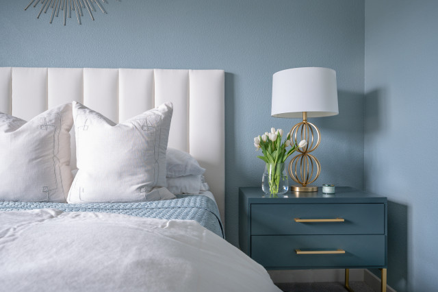
Brittany Lyons Interiors created a calming atmosphere in this Dallas bedroom with blue walls, nightstand and bedspread.
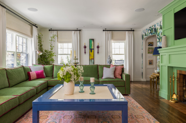
17. Jewel tones. While warm neutrals are popular, some designers are getting a lot of requests for bold, saturated jewel tones.

This Tampa, Florida, living room by Lisa Teague Upcoast Design is a good example with its vibrant green sofa and fireplace surround, blue coffee table, punch of pink in the pillows and rug, and colorful wallpaper.
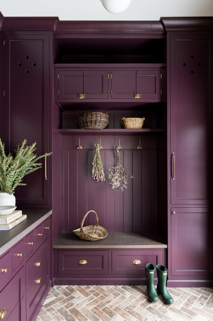
Designer Whittney Parkinson enveloped this Indianapolis mudroom in plum, giving a playful yet sophisticated update to the Tudor home.
Other Interior Design Details

18. Fluted and reeded cabinets and details. 
Fluted and reeded details have been on display at design shows throughout the year, accenting everything from kitchen islands to bathroom vanities to living room furniture. The aesthetic creates a thick, often rough statement-making detail beneath island countertops, bathroom vanities and dining room tables, adding texture and interest. Though the terms are often used interchangeably, reeded curves have a bulging outward appearance while fluted designs curve inward to reveal channel-like details.

This Austin, Texas, bathroom by Parsons i.d. features reeded details on the wood vanity and wall tile.
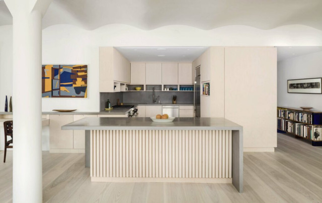
Specht Novak Architects applied fluting on this kitchen island in a New York City loft. The detail echoes vertical battens used to line the entryway.
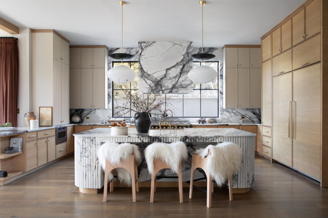
This Dallas kitchen by Urbanology Designs features a striking island wrapped in reeded marble.
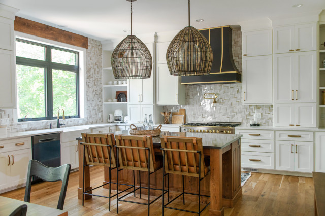
19. Herringbone everywhere. Herringbone is a classic design element that’s experiencing a renaissance, becoming the go-to pattern for kitchens, bathrooms and more. But the typically horizontal zigs are beginning to zag in new directions — diagonally or vertically — to create an updated look with visual interest, movement and texture, as seen in this Lake Delton, Wisconsin, kitchen by Rochelle Lee Interiors.
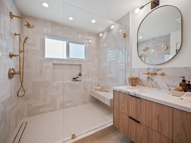
Similarly, this San Clemente, California, bathroom by Kaveh and Alena Zoghi of Eskan Developers features a shower with luminous walls of ivory-colored ceramic tiles in a 90-degree herringbone pattern. “We did [it] to do something interesting and modern,” Alena says. “The tile just spoke to us. We laid it out on the floor and loved it.”
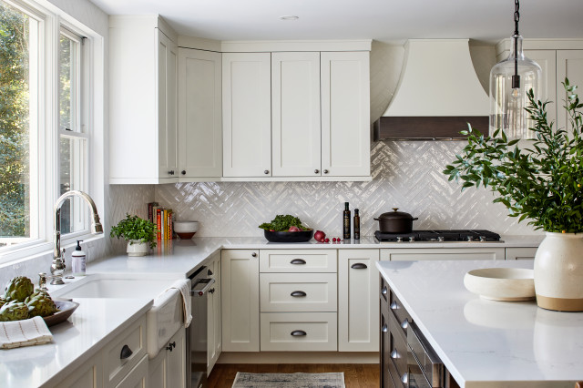
Here’s a more traditional herringbone pattern, created with glossy white tiles in a Washington D.C.-area kitchen by TriVistaUSA Design + Build.
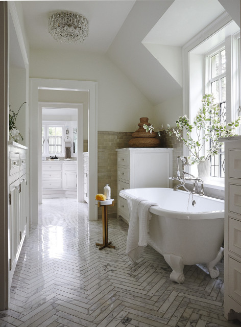
Andrea Schumacher Interiors used elegant marble tiles in a herringbone pattern to add movement and moxie to this Denver bathroom.
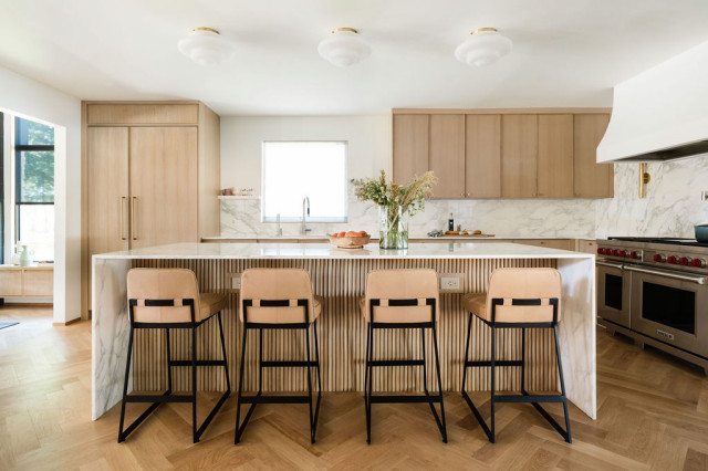
And Etch Design Group took a similar approach with wood flooring in a herringbone pattern for this Austin, Texas, home. Also notice the reeded design on the island back.
20. Woven textures. Including hits of visual texture is a great way to create interest and nuance in home interiors. It’s especially important in open floor plans where you want to introduce some cohesive design elements that don’t feel too repetitive.

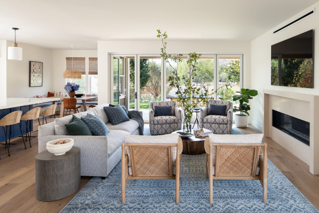
Working in elements of cane, rattan, grasscloth and other woven materials is becoming a go-to way to hit the right look. A great example is this popular San Francisco living room by Jennifer Wundrow Interior Design, where woven grass details used on the living room armchairs, the island stools and the light fixture and shades in the breakfast area help connect the spaces for a coordinated look and feel.
Outdoors

21. Small, intimate areas. Homeowners with modestly sized outdoor areas are on the hunt for ways to create inviting spaces that extend living space and entice guests outdoors. Searches for things like “small screened-in porch ideas,” “small backyard patio” and “small front porch” all rose last year.

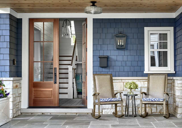
This small Chicago front porch has tons of curb appeal with blue shingle siding, stone flooring, white trim, a wood ceiling treatment and a pair of wood rocking chairs.
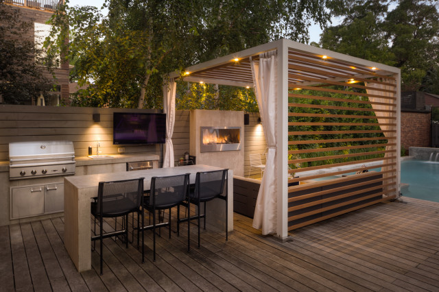
22. Entertaining spaces. Of course, if you have an abundance of outdoor space, you might as well use it. Homeowners are tricking out expansive outdoor areas with entertaining features that rival those usually found indoors. Anchoring these areas with a feature like a fireplace or fire pit, bar or outdoor TV creates a focal point and draws guests into the yard.
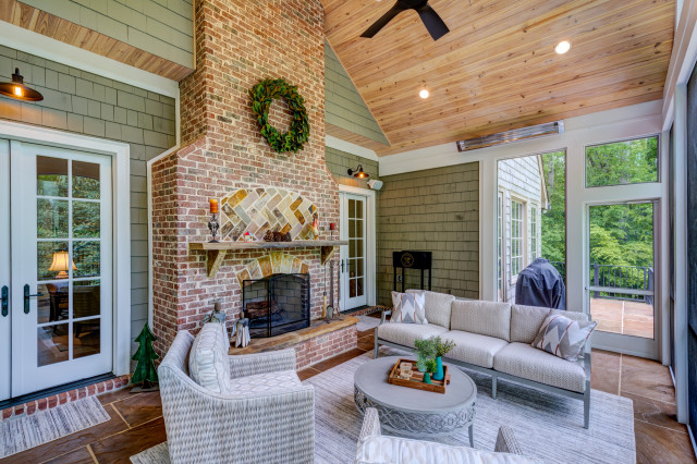
Screened-in or glassed-in porches are growing in popularity as they allow homeowners who live in regions that experience inclement weather, pollen or insects to enjoy the benefits of being outside while still having the comforts of home. As these spaces often sit directly off the main house, we’re seeing more and more design continuity between the home and porch — including a higher level of detail. Designers are elevating these indoor-outdoor spaces with stylish finishes, materials, furniture and decor, allowing for a seamless connection between indoors and out. Whatever the setup, designers recommend that homeowners invest in comfortable, high-quality and durable outdoor furniture to support the increased usage.

This Atlanta screened porch by Glazer Design & Construction features comfy furniture, a fireplace, an outdoor heater and a fan.
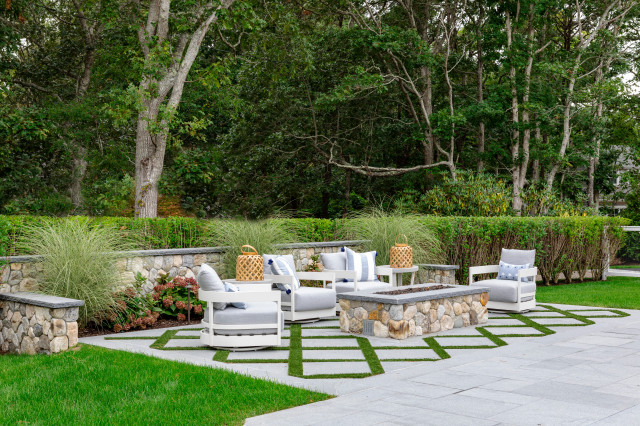
23. Grass between pavers. Whether driven by aesthetic requests or as a byproduct of maintaining on-site drainage, we’re seeing increased interest in greenery tucked between pavers. Garden paths and patios made of pavers separated by ground cover have grown in popularity due to their natural look, permeability and design versatility. This approach softens pathways, breaks up large expanses of hardscape and generally makes a walkway or patio feel more like a lush, living part of a garden.

James Phillip Golden Architect mixed pavers with turf in between to form a diamond pattern for this Osterville, Massachusetts, patio.
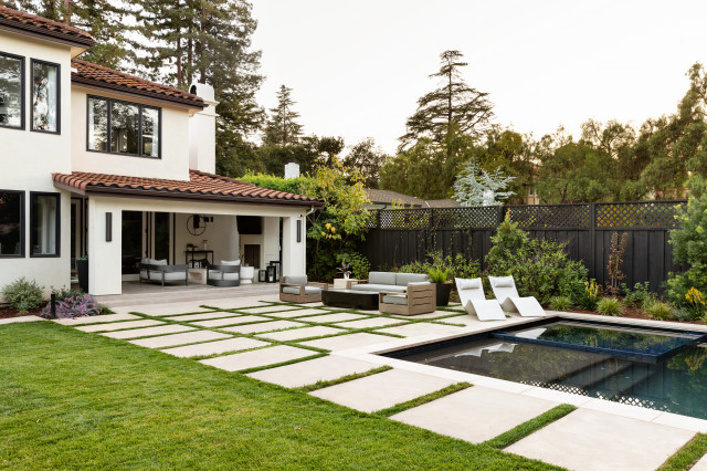
Pavers with grass create a permeable patio off this Los Altos, California, home by Urbanism Designs and delineate a walkway that leads to a pool house.
24. Lush, naturalistic (and waterwise) gardens. Increasingly, homeowners are looking for soft, meadow-like gardens that feature native and climate-appropriate plantings that attract wildlife and pollinators, add outdoor interest and don’t require constant maintenance. A phrase that comes up often with landscape designers is “right plant, right place,” meaning choosing plants that will flourish in a yard’s region and conditions.

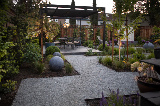
Inspiration for this San Francisco Bay Area lawn conversion by designer Hallie Schmidt of Tierra Madre Fine Gardens came from photos of the RHS Chelsea Flower Show that showed flowering meadows, geometric paths and tightly pruned evergreen shrubs. The 1,950-square-foot backyard features low-water grasses and sedges with year-round appeal. Bulbs pop up in spring, deciduous trees change with the seasons, and evergreen hedges provide garden structure.
Other Rooms

25. Mud-laundry rooms. 
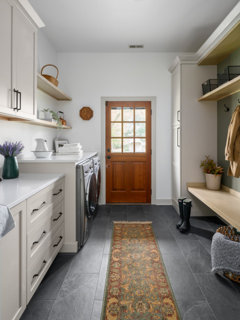
Combining a laundry room with a mudroom is a great idea for homes that see a lot of mess at the entry. This increasingly popular setup lets homeowners place grimy sports uniforms, sandy beach towels or muddy winter coats directly into the wash before dirt is tracked farther into the home. A utility sink lets you soak dirty clothes or delicates, and a pull-down faucet is effective at rinsing muddy boots and cleats. Meanwhile, design pros recommend mudroom storage components like cabinets, hooks and cubbies to help organize all the clean gear. A bench assists with taking shoes off and putting them on.

Dave Fox Design Build Remodelers gave this Columbus, Ohio, laundry-mudroom a clean yet lived-in farmhouse feel with slate floors, a glass-paned wood door, Shaker-style cabinets and white oak details.
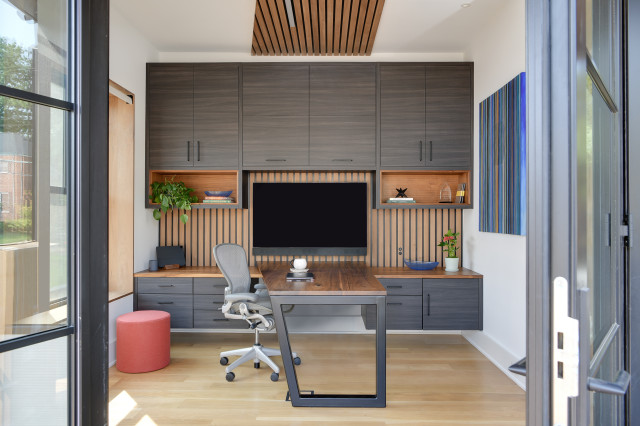
26. Home offices that hide cords and equipment. Many people desire a home office to look more “home” than “office.” But unsightly equipment like computers, printers and scanners — and the electrical cords that keep everything running — can make it difficult to design a space that’s both fashionable and functional. Designers are creating beautiful ways to do that with impressive built-ins and features that help hide office equipment and corral cords.

In this Arlington, Virginia, home office by Erica Peale, a built-in desk stylishly conceals office supplies and equipment. Minimalist outlets integrated into slats also help keep the sense of “office” out of mind and the feeling of home front and center.
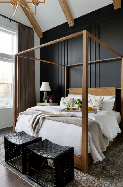
27. Architectural details in bedrooms. Comfort and calm are on many homeowners’ minds when designing a bedroom. But some are looking to make more of a style impact to counteract soothing colors and soft textures. Adding architectural details like wall paneling, ceiling beams and even four-poster beds help introduce graphic lines and shapes that make a strong statement.
Sustainability

28. Energy efficiency. Some home designers are seeing increased interest in sustainable upgrades. “Insulation, solar, battery backups, car-charging equipment, heat pumps, natural ventilation and air filtering, greywater systems and on and on,” architect Lincoln Lighthill says. “There’s a revolution in how we build new homes and upgrade existing ones that is adding comfort, convenience and cost savings, all while contributing to the health of our environment and the planet.”

For homeowners, now might be a smart time to incorporate energy-efficient elements. That’s because the Inflation Reduction Act allows for up to $14,000 in tax rebates and credits to homeowners for adding things like solar panels and energy-efficient electric appliances and insulation.

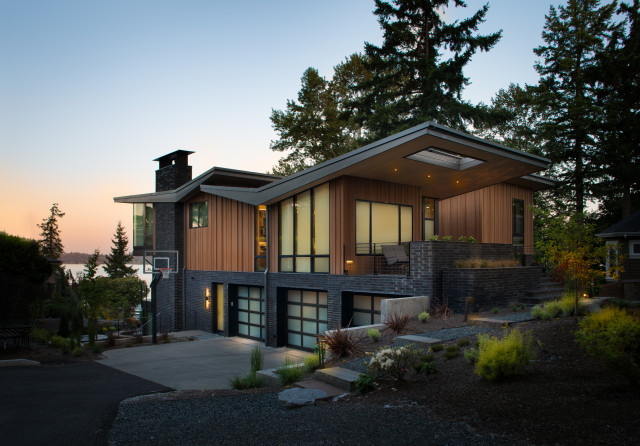
The Seattle home seen here by Rhodes Architecture + Light features several sustainable building elements, including a high-efficiency heat pump, an energy-recovery ventilation system and solar panels.

Sharing