Good-looking wall treatments and layered furnishings are laid out beautifully in these rooms.

Designers: Homeowners with Michael Miller of Phase2 Builders
Location: San Francisco
Size: 250 square feet (23 square meters)
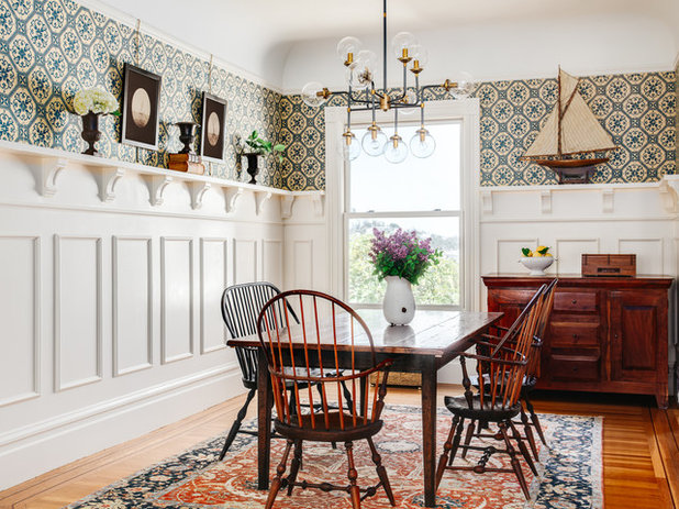
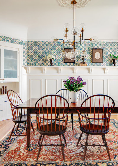
Homeowners’ request. Modernize while keeping and restoring the historical details of the Victorian-era home. “In addition, they looked to their experiences and former home of Cape Cod as inspiration for the materials, colors and treatments,” builder Michael Miller says. “They wanted it to feel like you could possibly be on a luxurious boat, while in fact the home is perched on the rolling hills of San Francisco, looking out to the Pacific.”
Wall treatment. Traditional Victorian-era-replica wainscoting, reaching two-thirds of the way to the 10-foot ceiling and painted crisp white, with an exaggerated cap shelf that displays antiques. The homeowners selected the wallpaper above the wainscoting for its historical appeal.

Designer secret. “Victorian treatments such as wainscoting and wallpaper, and the homeowners’ curated antiques within the space of modern materials and treatments, created a balance that feels carefully crafted, with details that make the space intriguing to be in,” Miller says.

Designer: Benjamin Dhong
Location: San Anselmo, California
Size: 289 square feet (27 square meters); 17 by 17 feet
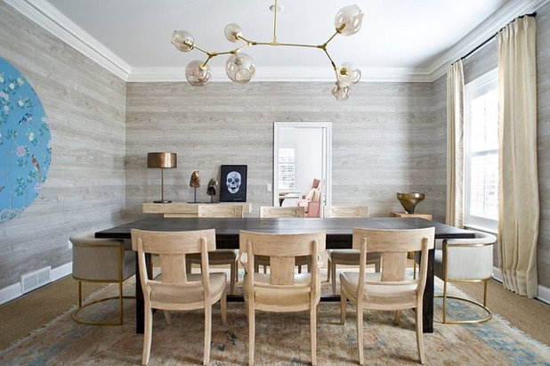
Homeowners’ request. Bring a more modern vibe to an American Colonial-style dining room without conflicting with the architecture. The room originally had 1970s floral-print burgundy wallpaper and brown molding.
Wall treatment. Faux-wood wallpaper from Nobilis. “We ran it horizontally to make it more modern,” designer Benjamin Dhong says.
Other special features. Painted white molding. Globe pendant light with arms. Custom burlap curtains. “For cheap dramatic art, we ordered a small roll of custom chinoiserie wallpaper and wallpapered it to a large 60-inch-diameter round frame,” Dhong says. “The floral chinoiserie wallpaper is decidedly classic, but the shape and size bring lots of modern drama into the room.”
Designer secret. “I don’t like making rooms too thematic or matchy-matchy, but I do like having a little relationship to the pieces,” Dhong says. “For example, the birds and flowers of the blue art harmonize with the faux bois walls, while the light fixture is very loose and ‘plays’ in the room, giving it movement and impact.”
Dining table, end chairs and table lamp: RH; chairs: Michael Taylor; light fixture: France & Son; wallpaper art: Paul Montgomery; console: Noir Furniture; flooring: rug over sea grass carpet

Designers: Beth Odence, who is also the homeowner, and stylist Courtney Philos-Jensen of Design No. Five
Location: Cotuit, Massachusetts
Size: 263 square feet (24 square meters); 19½ by 13½ feet
Homeowners’ request. Open up and update a pass-through dining room that was added to the home after it was built in 1740.
Wall treatment. The base color of the walls is Benjamin Moore’s Quaker Gray. The finish is a metallic silver glaze that was brushed on and applied with a rag by local artist Karen Crocker. The trim is painted in Benjamin Moore’s Shaker Beige. “It really brings out the slight golden sheen in the glaze, depending on the time of day,” designer and homeowner Beth Odence says. “I like a dramatic dining room, and loved the juxtaposition of the dining room’s moodiness with a Nantucket red living room and an antique kitchen that has been updated with crisp black kitchen cabinets.”
Other special features. Custom 12-foot oak table. Hand-rubbed antique-brass pendants.
Designer secret. “I always think that interesting and warm is better than forcing a lighter wall color,” Odence says. “Most dining rooms are used primarily at night, so I say embrace darker colors.”
“Uh-oh” moment. “Originally I had selected the Quaker Gray for the walls, ceiling and trim, which was a style in the late 1700s,” Odence says. “Four coats were done on all surfaces, and then the kitchen cabinets arrived. The bluish tint in the carbon-black cabinets was not complementary, taking the monochromatic gray dining room from drama to dreadful. I didn’t want to start over from scratch, so after consulting with artist Karen Crocker, we decided on the silver metallic glaze and beige trim, creating a finished wow look and feel. We also added a beige wall at one end of the kitchen and a beige entry at the opposite end, giving more continuity to the two rooms.”
Pendants: Goodman hanging light, Circa Lighting; table: Trappistine, Michel Ferrand; chairs: Aquinnah in ebonized ash, O&G; sailor’s knot photos: Barloga Studios

Designers: Berkeley Minkhorst and Kelley Lentini of House of Nomad
Location: Charlotte, North Carolina
Size: About 300 square feet (28 square meters)
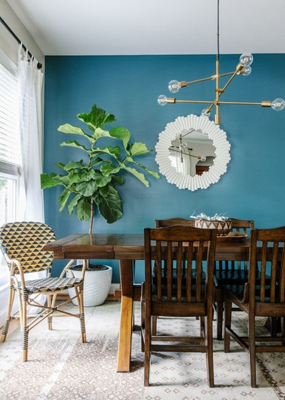
Homeowners’ request. A quick refresh of the downstairs in time to open it up for a local home tour. “The couple loves travel and wanted a space that reflected their wanderlust,” designer Kelley Lentini says. “Their open floor plan from living to dining didn’t flow, so our job was to give them a space that felt both personal and congruent.”
Wall treatment. Sherwin-Williams’ Seaworthy. “The lovely hue of turquoise added the pop the space called out for,” Lentini says. “Now when you walk in their space, the first thing that catches your eye is the back wall, and it does exactly what they asked for — pulls in their fun, love-to-travel vibe into the space.”
Other special features. Rattan end chairs. Brass light fixture. Accent mirror. Fiddle leaf fig tree in white cement planter. African baskets with air plants.
Designer secret. “Our decision to incorporate a bright accent wall was our secret with the space,” Lentini says. “It not only draws the eye in right when you open the front door, but creates a focal point that ties both the living and dining spaces together.

