
Designer: Jessi Helbig of Blythe Interiors
Location: San Diego
Size: 124 square feet (12 square meters)
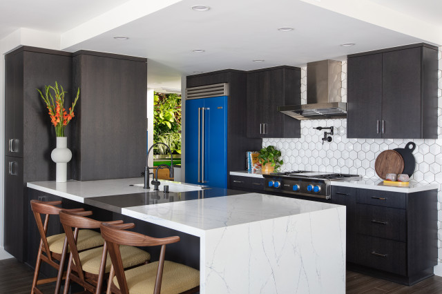
Homeowner’s request. “The vision for this entire home remodel was to embrace our client’s affinity for color, pattern, art and futuristic vibes while grounding the space with organic elements like natural wood,” designer Jessi Helbig says. “When it came to the kitchen, the layout was great but it seriously lacked personality — there wasn’t even a backsplash, just drywall. Our client also wanted deeper storage for kitchen gadgets and a larger peninsula for entertaining and casual dinner nights. We pulled a lot of inspiration from our client’s desire for a New York City industrial-loft-type feel while infusing it with an eclectic flair.”
Blue details. “We had BlueStar appliances on the radar from the beginning, due to their high-performance qualities and fun color options,” Helbig says. “Cobalt blue is one of our client’s favorite colors, and BlueStar’s Traffic Blue colorway stood out among the rest. Having the range knobs match the fridge, we were able to create a cohesive feel without overwhelming the space. This choice also allows the refrigerator to be the main focal point. This color is a common thread throughout the home, incorporated through furniture and other highly custom design elements, including dining chairs, a media console, artwork and a handcrafted vivarium.”
Other special features. Two-tone quartz countertops on the island make a subtle statement. “To keep the appliances as the focal point and maintain the modern, natural feel of the home, we chose beautiful custom flat-panel cabinetry in a rich, warm ebony that pairs beautifully with the new bamboo flooring,” Helbig says. “Another fun addition was the 3D hex tile that really plays up the modern, futuristic feel. We chose a contrasting grout to call attention to the tile’s shape, and it brings a real wow factor to the kitchen. It’s almost like a mini art installation that will surely be a conversation starter with guests.”
Designer tip. “Ensure you incorporate eye-catching patterns and textures so that the design doesn’t fall flat,” Helbig says. “Lean into organic elements. Natural wood tones transcend design style and will make your kitchen feel grounded and inviting. Even if it’s just a few small pops, this is a must-have addition to any kitchen.”
“Uh-oh” moment. “Initially, we selected a blue backsplash tile to match the appliances, but when it arrived, we noticed that the appliance color had changed and it no longer matched,” Helbig says. “This turned out to be a blessing in disguise because the same tile in white really makes the appliances pop and creates a lovely contrast against the cabinets. During installation, we loved the bold impact of the 3D tile and decided to run it into the dining room and create one powerful feature wall. Sometimes when things don’t go as planned, you end up with something that was even better than before.”
Backsplash tile: Hedron, Bedrosians Tile and Stone

Designer: Courtney Hinton of Hearth + Home
Location: Asheville, North Carolina
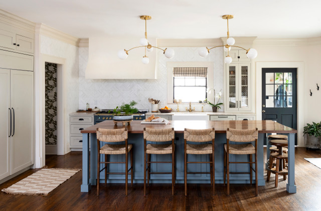
Homeowners’ request. “Our client wanted a kitchen that reflected the era of the home — 1920s Tudor — yet also felt fresh and artful,” designer Courtney Hinton says. “One of her main concerns was having an island large enough to comfortably seat her family and entertain friends. We ended up creating a very large butcher-block-top island around 10 feet long and added nice Parsons legs to help it feel more like a piece of furniture.”
Blue details. “We wanted the colors of the kitchen to feel very English, so I went with a rich and moody color called De Nimes by Farrow & Ball for the island,” Hinton says. “We also added a contrasting green wallpaper that felt like a modern Morris print for the pantry. Overall, I wanted the kitchen to feel neutral but not boring, hence the very loud and flashy tile backsplash.”
The island color complements a blue-gray ILVE range and similarly colored painted door.
Other special features. Taj Mahal quartzite countertops. “My favorite feature of this kitchen are the double chandeliers by Kate Spade,” Hinton says. “They exude 1920s glamour and add a real eclectic nature to the space. I was thrilled when my client loved them as much as I did and didn’t shy away from their bold statement.”
Designer tip. “We really embraced the bones/era of the home as well as the client’s personal style,” Hinton says. “Our client loves antiques and created a moody English atmosphere with pops of modern pieces and light for an interesting juxtaposition. Luckily, I had a lot to work off as she is a creative herself. I think if someone is ever in a creative rut, they can source inspiration from a particular era in history, a fun restaurant or bar they enjoy, their favorite hotel or vacation and spring off that.”
Island lights: Prescott, Visual Comfort

Designer: Austin Waldhauser of Kenwood Kitchens
Location: Ellicott City, Maryland
Size: About 180 square feet (17 square meters)
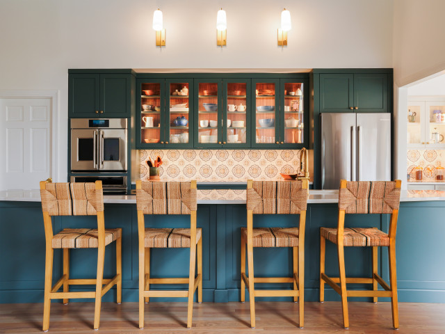
Homeowners’ request. “The kitchen was so closed off before,” designer Austin Waldhauser says. “The island had a half wall surrounding it, and the back wall of the kitchen was an alcove closet space. The homeowner wanted to open everything up and create a kitchen concept they can show off instead of hide away.”
Blue details. Blue-gray cabinets (Inchyra Blue by Farrow & Ball). (The island and perimeter cabinets are painted the same color but appear different in the photo.) “The client fell in love with the Farrow & Ball Inchyra Blue paint color she saw in a magazine and had to have it,” Waldhauser says. “The hand-painted tiles were another early selection by the client. We wanted something that would draw interest and be able to hold its own. The intentional decoration inside the cabinet complements the blue in the tile detail, the white walls and surroundings and the beautiful natural walnut cabinet interior.”
Other special features. Bianco Superiore quartzite countertops.
Designer tip. “Symmetry wherever you can find it,” Waldhauser says. “There are some scenarios where you have to choose ‘form follows function,’ but when you can combine the two, that is where a good design becomes a great design. I always ask myself, ‘Why am I putting this here?’ when crafting a layout. Have an intention for everything you place in your design.” Depending on the shade, it can be subtle and soothing, vibrant and energetic or dark and moody. (cited)


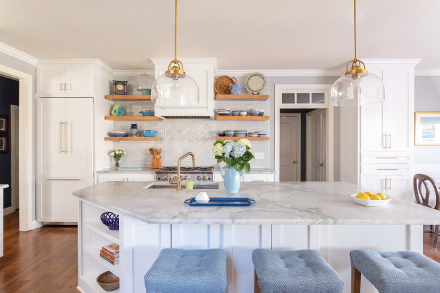
Designer: Mary Beth Zaehringer of Reimagine Raleigh
General contractor: Markus Zaehringer
Location: Raleigh, North Carolina
Size: 240 square feet (22 square meters); 12 by 20 feet
Homeowners’ request. “The homeowners wanted to have an open and airy space that took advantage of the natural light and that would make their BlueStar range the focal point of the kitchen,” designer Mary Beth Zaehringer says. “Our team set to work designing a room that would effectively maximize every square inch with true custom cabinetry — nothing prefabricated here — and special features that would balance functionality with a clean, modern design.”
Zaehringer used Houzz Pro business software to manage the project and create a 3D Floor Plan to help her clients visualize the kitchen design.
Blue details. “The color palette was centered around the brilliant [blue] BlueStar range, which propelled the look for the entire room,” Zaehringer says. “We knew that bright whites and soft grays would complement the stove perfectly and make those gorgeous blue stools really pop. Also, the homeowner had a treasure trove of beautiful, colorful crockery and antiques throughout her home that we wanted to incorporate into the design of the kitchen, giving it a warm, personal touch.”
Other special features. Dolomite countertops. Glazed ceramic backsplash tiles.
Designer tip. “Rather than purchasing all new accessories, we love to first see what pieces the homeowner may already have and are not using,” Zaehringer says. “Making old things feel new by highlighting them in an updated room not only makes the finished project that much more special, but it is also a cost-effective way of refreshing any space.”