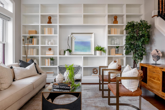
The designer could have added even more storage where the artwork currently hangs, but I like how the openness creates more head space and helps break up all the cabinetry. The design also allows for a punch of personality .
You could also consider lining multiple sides of a room with built-in seating. Cushioned backing would eliminate the need for stand-alone furniture such as sofas and chairs, freeing up valuable floor space.
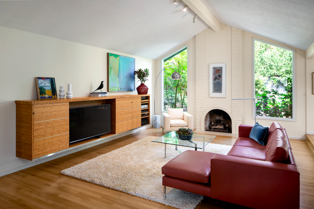
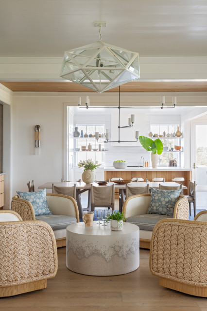
While it can be a hard truth to accept, some small living rooms just can’t — or shouldn’t — fit a standard-size sofa. But another truth is that a sofa isn’t always necessary. A great alternative is an array of club chairs. This arrangement provides adequate seating, creates a stylish look and encourages conversation.
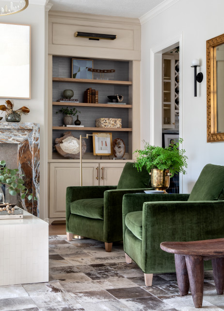
Consider chairs with a swivel function, which will allow you and your guests to comfortably face one another, another area of the room or a view.
Also note that the traditional coffee table concept isn’t the only — or even necessarily the best — option. A side table can provide the right amount of surface without clogging up traffic flow the way a bulkier piece might.
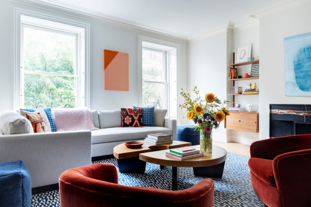
The fact that your living room doesn’t boast tons of square footage doesn’t mean you have to forgo big design statements. Creating a showstopping moment with a statement piece can often distract from the size. A statement piece is an item that becomes the focus of your design and draws people’s eyes when they walk into the room. It can come in many forms.
In this midsize living room in a New York townhouse, a striking double demilune coffee table and large patterned rug add big style, making the space appear larger than it is.
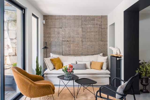
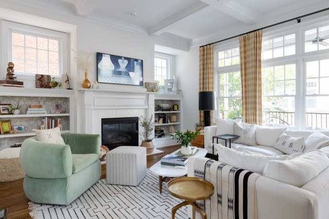
It might sound counterintuitive, but I recommend filling your small living room with lots of furniture and decor items that reflect you and your family members’ personalities — without making it feel overcrowded, of course.
In this Atlanta living room, the designer kept the well-decorated approach from feeling overwhelming by sticking to a light and bright palette. There’s a lot going on in here with various furniture pieces, window treatments, accessories on display, lots of pattern and millwork. But the space feels open and welcoming, and is bursting with personality and interest.
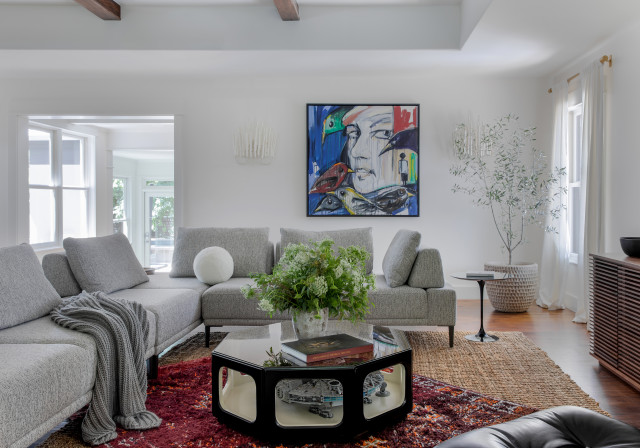
One rug should be large and more dominant. The other should be smaller and contrasting in material, color or pattern. Also, the large rug should lie straight, aligning with the perimeter of the room and your furniture arrangement. The second layer often works best offset from the bottom layer.
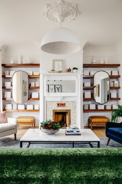


This is an obvious one, but it needs to be here. Built-ins are the ultimate when it comes to making the most of a small space. Custom fitted units can be built into awkward angles and alcoves, and store-bought furniture simply cannot compete in this area.
Storage is necessary to keep a home uncluttered and show that’s it’s been thoughtfully designed; it also can improve the shape and function of interior spaces overall.