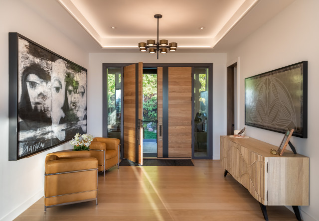
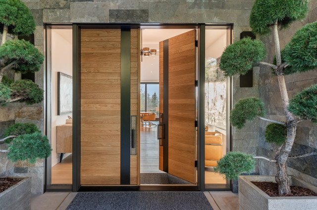
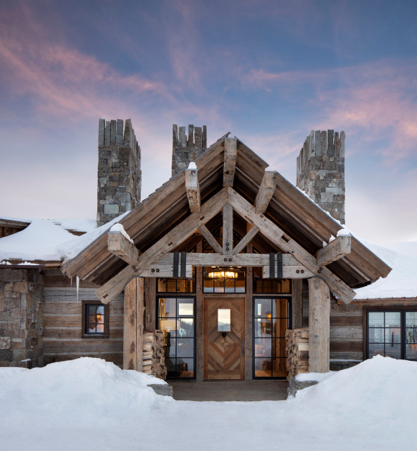
By integrating materials found throughout the home, the door “creates cohesion in the remodel design,” Olson says. “The glass panes at either side of the door intentionally pull together the interior and exterior spaces and draw natural light into the interior space, contributing to the open feeling sought by the client.”
The team also added multiple levels of lighting inside — a chandelier, down lighting and cove lighting — to create depth.
Designer tips. “Use French double doors to create a sense of grandeur; mix vintage furniture and art to balance contemporary architecture and create a lived-in feel; and create an entry sequence that immediately draws you to the best views, pulling visitors into the space and creating a welcoming feeling,” Olson says.
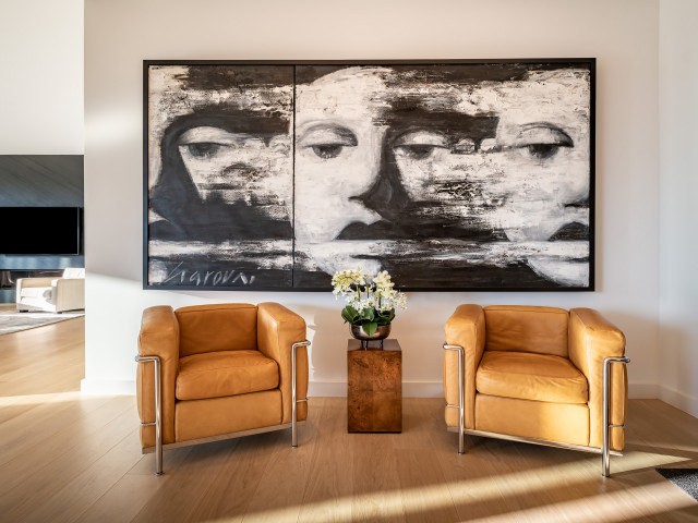
“Uh-oh” moment. The structural integrity of a fireplace in the original entryway was compromised during the remodel. “At the time, it felt like a setback,” Olson says. But it ended up being fortuitous. “It gave our team the opportunity to thoughtfully relocate the fireplace and achieve the open feeling in the entry we were really after.”
Designer: Charles Warren of Teass \ Warren Architects
Location: Chevy Chase, Maryland
Size: 140 square feet (13 square meters); 7 by 20 feet
Homeowners’ request. “The existing house didn’t have a great entry — the door swung onto a narrow landing and hallway, and it just wasn’t a nice way to enter the house,” architect Charles Warren says. The goal was to create a more graceful and open entrance and to provide a connection between a new mudroom and office space. The architects and the client used Houzz ideabooks to collect and share ideas for the project, Warren says.
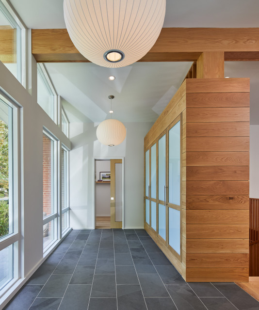
Main features. Custom built-in cabinetry serves as a screen and backdrop to the large windows at the front of the house while also providing plenty of storage. It’s made from white oak, which Warren says is used throughout the house as a unifying and warming element. The flooring is 12-by-24-inch Brazil Black slate from Daltile, chosen in part for its durability.
Other special elements. Classic Nelson ball pendants complement the midcentury modern style of the home. “The space glows like a lantern from the exterior,” Warren says.
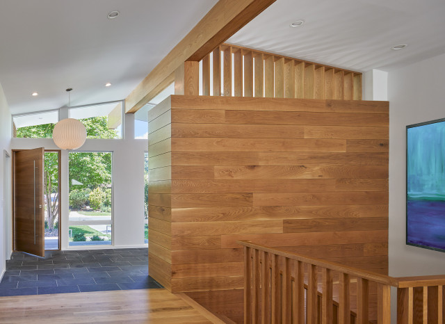
Warren also recommends splurging on a great front door if your budget allows. “It’s something you touch every day,” he says. “That’s when the details can really be appreciated, almost like a piece of art. It also helps with the curb appeal.”
“Uh-oh” moment. At the beginning of the project, the team realized that its original “glassy” design for the entry created deep views into the house. “The client was legitimately concerned about privacy,” Warren says. “Then we had an idea about using the built-in cabinetry as a screen for those views, while also getting needed storage for coats and shoes. The cabinet also acts as a railing to the new staircase. The whole composition almost becomes a single sculptural element in the center of the house that serves multiple functions.”
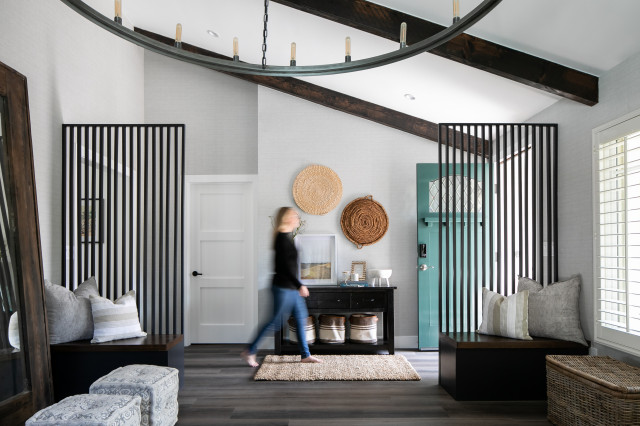
Designers: Lindsay Stokes Kennedy and Alexandra Cole of Kennedy Cole Interior Design
Location: Fullerton, California
Size: About 50 square feet (4.7 square meters)
Homeowners’ request. When designers Lindsay Stokes Kennedy and Alexandra Cole began working on the entryway to this Orange County, California, home, it was completely open to the room beside it, which the client used for yoga and meditation. The design team’s goal was to create separation between this “wellness room” and the entryway without completely closing it off. “We added storage benches with a slatted backing to designate the rooms and encourage you forward into the rest of the home from the front door,” Stokes Kennedy says.
Main feature. A durable and easy-to-clean textural vinyl wallpaper from York Wallcoverings wraps the entry walls and continues into the wellness room, creating an air of sophistication from the moment you walk into the home. “It really helps to set the tone,” Cole says.
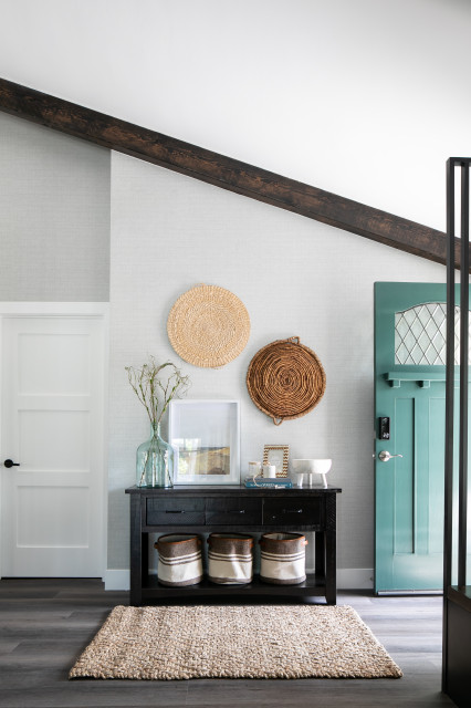
Cole says a decorative bowl is a must-have entry element. “Whether it’s full of keys or chocolates, there seems to always be a functional reason to have a decorative bowl on your entry console,” Cole says.
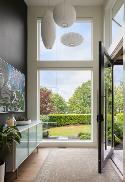
Designer: Tatiana Darnell of Space Lab Design Services
Location: Sammamish, Washington
Size: 64 square feet (6 square meters); 8 by 8 feet
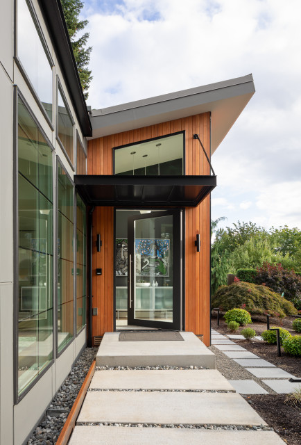
Homeowners’ request. Before it was remodeled, this Seattle-area home lacked a distinct entry. “It created confusion for guests and delivery drivers, who went to our garage door rather than our invisible front door,” one of the homeowners says. “We wanted a beautiful entry that would welcome our guests, while pulling nature in.”
Designer Tatiana Darnell took a bold approach to the problem. “We wanted to create a big-gesture, high-volume space, with lots of glass, an accent wall and fun lighting,” she says. “I thought of the entry addition as a lantern element that had to seamlessly integrate with the rest of the house, and it works. It draws you in when it is all lit up at dusk and fills the house with natural light during the day.”
Main feature. The homeowners wanted a piece of art in their new entryway that represented something important to them. They found just what they were looking for — Lori-ann Latremouille’s painting “Magnolia” — at Gunnar Nordstrom Gallery. “What we love about Sammamish is the connection with nature we‘re privileged to enjoy,” one of the homeowners says. “For us, the painting represents the connection between humanity and nature and our responsibility to protect and preserve this for future generations.”
Darnell notes that the dark accent wall directly across from the entrance door provides a beautiful backdrop for the painting.
Designers: Architect Jamie Daugaard of Centre Sky Architecture and interior designer Michele Wheeler of Design Collective West
Location: Moonlight Basin, Big Sky, Montana
Size: 117 square feet (11 square meters); 13 by 9 feet
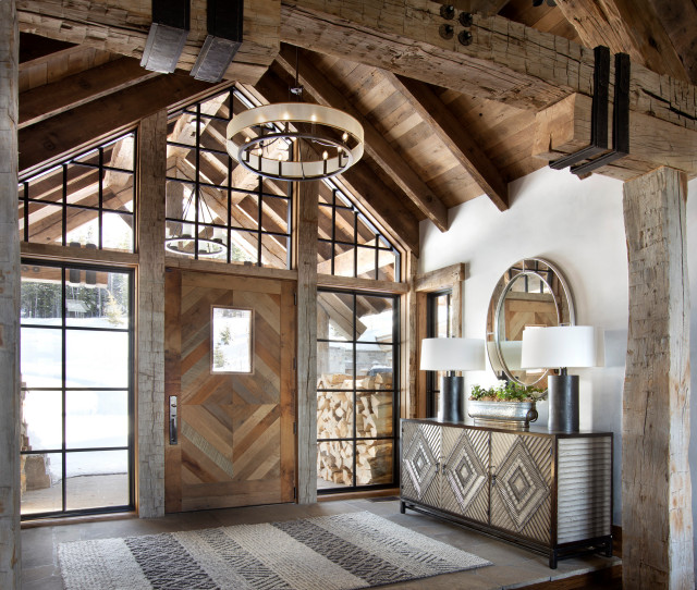
Homeowners’ request. This luxurious “lodge” is in a private community connected to the Montana ski and mountain bike destination of Big Sky Resort. The homeowners wanted the entry to set the tone for the rest of the home, says architect Jamie Daugaard, who used Houzz to collaborate with the client on different aspects of the design.
Main features. A large, reclaimed-oak front door in a natural finish opens to the rugged yet sophisticated entryway.
“As you walk through [it], the first thing you see is the breathtaking views of the mountains through the windows on the far side,” Daugaard says. “The front entry is two steps above the rest of the main level, so you are looking at a slightly higher elevation, which encourages one to notice exposed structural rafters of reclaimed timbers.” The vaulted ceiling is also paneled with reclaimed-wood planks.
The flooring pavers are locally sourced natural flagstone quarried from an area in northwestern Montana. The floor is partly covered with a hand-woven wool “Berkeley” area rug from Feizy. The walls are finished with plaster.
Designer tip. “I truly believe a mirror is a must-have for any entry foyer,” interior designer Michele Wheeler says. “Mirrors are perfect for entryways because they help brighten the space by reflecting light, and they create the illusion that the space is actually bigger than it really is.” The mirror seen here is a family heirloom provided by the homeowners.


Designer: Rebecca Olson of Forum Phi
Location: Aspen, Colorado
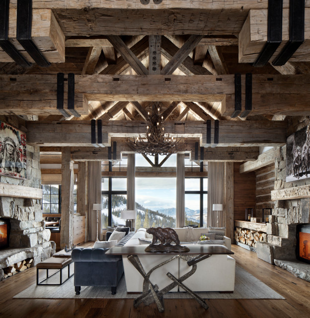
Homeowner’s request. “The homeowner’s vision was to renovate the existing home in a way that purified the architectural design, opened the difficult-to-navigate front entry sequence and optimized the outdoor living spaces — all playing to the homeowner’s desire to ‘live outside,’ ” designer Rebecca Olson says.
Redesigning the entryway was key to achieving those goals. Olson and her team created a grand, airy entrance that opens immediately to the great room and views of the surrounding Roaring Fork Valley.