2. Bar Top Beauty
Designer: Tamara Day Design
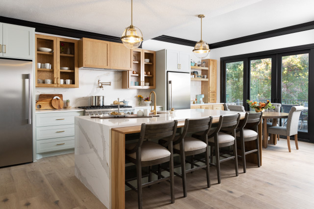
Homeowners’ request. This family with four kids needed “a better workflow, tons of storage and a wow factor,” designer Tamara Day says.
Kitchen island. Marble-look quartz countertop with waterfall ends. White oak bar countertop with waterfall ends. Open storage on the back side of the island. “The wow factor was definitely mixing materials with quartz and white oak in a waterfall style,” Day says.
Other special features. Light green cabinets (Sea Salt by Sherwin-Williams) and white oak cabinets. Quartz perimeter countertop and backsplash. “Black trim is a surprising way of giving the ceiling a moment,” Day says. “Separating the kitchen into zones where there’s a breakfast area, and the symmetry of the fridges, make a great workflow.”
Designer tip. “Black trim is often viewed as very scary, but it’s a great way of creating a dramatic moment in a timeless and classic way,” Day says.
“Uh-oh” moment. “Over the island, the ceiling layout was very difficult because in the breakfast area it vaults,” Day says. “So finding lighting that spaced properly over the island but still fit before the vaulting was a major challenge. We used beautiful fixtures that were minimal so as not to draw your eye to that element.”
3. Terrific Two-Tone
Designer: Marcia Moore Design
Size: 144 square feet (13 square meters); 12 by 12 feet
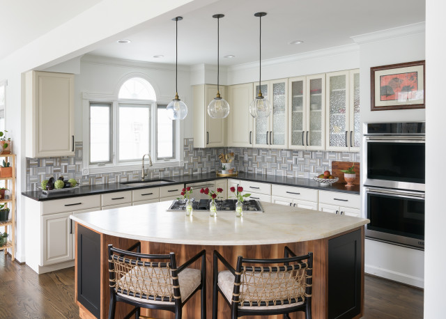
Homeowners’ request. Update the kitchen without replacing the perimeter cabinets. They loved the stone island countertop but disliked the cabinets beneath it. Designer Marcia Moore replaced the island base, perimeter countertops, cabinet hardware, backsplash tile, wall paint and other details. “Our overriding vision was to create a casual yet sophisticated home that this couple could stay in forever, now that they were empty nesters,” Moore says.
Kitchen island. “Since the island countertop was a stunning piece of stone, we were hoping it could be safely removed and replaced,” Moore says. “Thankfully it wasn’t damaged in the process. We decided on black and walnut grain two-tone cabinets to bring a European vibe into the space. The minimalist clear pendants enhance the space without cutting off the view.”
Other special features. Black quartz countertops with dark brown veining. Geometric backsplash tile made from four different honed marbles. Jute rope-back bar stools.
Designer tip. “The most interesting and successful homes I’ve worked on don’t follow the current trend but strike out on their own down a different path,” Moore says. “This leads to a stunning interior that stands the test of time far longer than any trend.”
“Uh-oh” moment. “We were terrified that the island countertop would crack when we removed it,” Moore says. “We had to store it offsite for at least two months before putting it back on. Even though our fabricator was willing to remove, store and replace it, they wouldn’t guarantee that it wouldn’t crack. We had no backup plan if this happened.”
Perimeter countertop: Corktown, Silestone by Cosentino; wall paint: White Sand, Sherwin-Williams
4. Pentagon Perfection
Designer: Jennifer Van Galder of Van Galder Design
Size: 400 square feet (37 square meters)
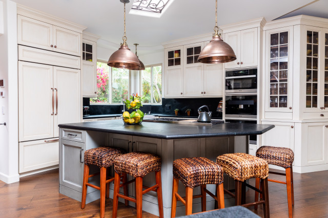
Homeowner’s request. “Hailing from the U.K., my client held a strong preference for a timeless custom kitchen with exquisite cabinetry and intricate detailing, leading us to exclusively source from William Ohs,” designer Jennifer Van Galder says. “The room presented a unique challenge due to its irregular shape and elevated position compared to the surrounding areas, which posed difficulties for the kitchen layout. We embarked on an expansion project to enlarge the kitchen’s footprint, establish a seamless connection to the dining area and reconfigure the island to provide ample space for eager onlookers.”
Kitchen island. “When we initiated this project, our main focus was to incorporate more seating, which led us to design the island in the shape of an offset pentagon,” Van Galder says. “Additionally, we required a 48-inch cooktop with a griddle for those delightful Saturday morning pancakes. The blue-gray cabinets are constructed from alder and feature walnut interiors. For the countertops, we chose soapstone in a leathered finish, providing a soft and textured surface.”
Other special features. Copper pendant lights (Admiral by Currey & Co.) and other copper details. The perimeter cabinets are a “meringue” finish over maple with a distressed rub-through. “They add a touch of character and charm to the overall design,” Van Galder says.
Designer tip. “One clever approach to achieving uniqueness is by incorporating a mix of metals and paint tones,” Van Galder says. “However, it’s important to ensure that there is a connection between these elements so they harmonize with each other seamlessly.”
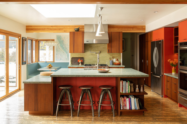
5. Multipurpose Mix
Designer: Catherine Garrison Architect
Size: 310 square feet (29 square meters)
Homeowners’ request. “The owners purchased the 1949 ranch house with a dark and dated 1980s kitchen in order to transform it into their dream family home,” architect Catherine Garrison says. “They requested that we solve the functional layout issues and make the ordinary ranch more midcentury in style. The island was key in solving the layout issues. We needed to allow for circulation through the kitchen and the island needed to be large and heavily utilized on all faces.”
Kitchen island. “The kitchen island had to do a lot of heavy lifting as far as function, and is very visible on two faces as it can be seen from the family room and the outdoor living space,” Garrison says. “The island contains the kitchen sink, dishwasher, trash and recycling drawers, microwave drawer, KitchenAid lift cabinet, kneading counter, cookbook storage and additional storage. The island size is very large, so there is storage on all four faces — even under the space for the stools there are touch latch panels that can open to hidden storage.
“The island cabinets are a combination of walnut wood veneer and orange laminate. The countertop heights are at 36 inches and 30 inches because the couple both bake bread and one of them is not tall — it’s hard to knead over a 36-inch counter when you are under 5 feet, 2 inches.”
Other special features. Costa Esmeralda quartzite countertops. Cork flooring. Green Heath Ceramics backsplash tile. Breakfast nook with built-in seating and a custom tabletop depicting a map of the world. A simple rectangle is the most common kitchen island design. (cited)


1. Stylish Station
Designer: Julie Deuble of Sierra Unlimited Construction and Arbor Craft Cabinetry
Size: 350 square feet (33 square meters)
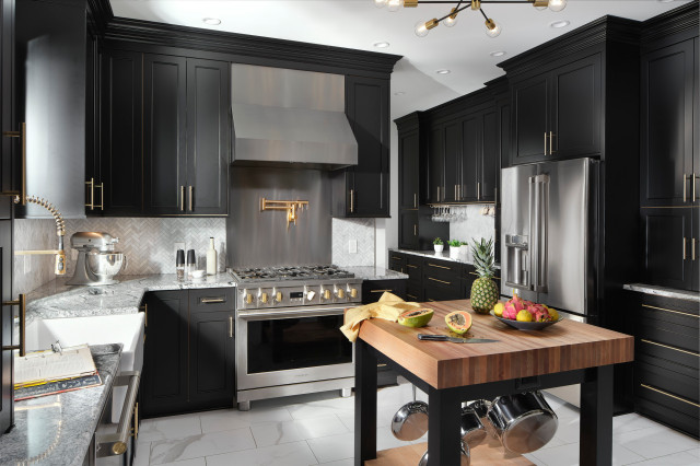
Homeowner’s request. Big changes. “Cabinets to the ceiling, a 36-inch range with a big pro-style hood,” says designer Julie Deuble, who used Houzz ideabooks to collaborate with her client. “We tore out the closets and opened up the wall between the kitchen and hallway to create a long wall of storage and a dry bar area. She also wanted a large island just for seating, and we built that just off the side of the working part of the kitchen.”
Kitchen island. “We crafted a butcher block top of 4-inch edge-grain hard maple and a base with legs in black to match the cabinetry and added a natural plank maple bottom shelf,” Deuble says. “Heavy-duty hooks provide a place to both store and display pots and pans. We ran electrical through one of the legs for an outlet. Up off the floor it is visually lighter than just cabinetry. It looks like a freestanding piece even though it is permanently installed because of the wiring.”
Other special features. Black custom cabinets. Marble-look porcelain tile flooring. Bianco Carrara Gioia marble backsplash tile in a herringbone pattern. Brushed gold commercial-style faucet. Stainless steel range backsplash. Viscon White granite perimeter countertops. A separate island with seating and a 52-by-92-inch Viscon White granite countertop.
Designer tip. “It’s important to scale crown molding to the size of the room,” Deuble says. “We allowed 8 inches for the crown in this space with 9-foot ceilings. We used three stages to build up the detail: a flat starter piece, a base molding oriented upside down and the crown itself.”