2. Arch Support
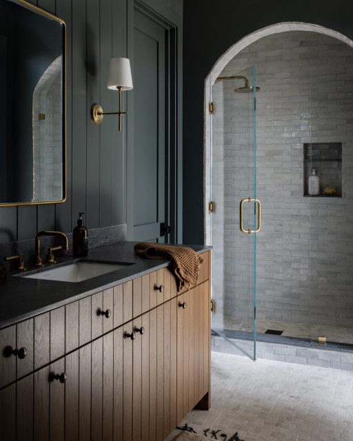
Designer: Melissa Prevost of M Prevost Design
Location: Cardiff, California
Size: 78 square feet (7.3 square meters)
Homeowners’ request. “This is new construction, so the clients were looking for an office bathroom that would also be used as a guest bathroom at times,” designer Melissa Prevost says. “We wanted to match the aesthetic of the office we created, which was a moody blue space, so it would feel cohesive overall.”
Shower details. “This wasn’t a bathroom space that necessitated a curbless feature, as it’s a secondary bath,” Prevost says. “We added an arched feature to the shower entry to make it special, and the unlacquered brass fixtures with the handmade zellige tiles are a timeless and elevated combination.”
Other special features. “The entire office and bathroom was painted a deep blue color that was a custom blend,” Prevost says. “The paint color and arched shower entry are the standout features, but other unique elements we added are the white oak vanity with V-groove detail, vertical tongue-and-groove wall treatments and natural tile materials.” The countertop is Grigio Versilia marble in a honed finish.
Designer tip. “Don’t be afraid to go dark and moody,” Prevost says. “This space only has one window, so one might think it’s not the right space to go with dark paint colors, but we love how this turned out.”
“Uh-oh” moment. “When the arch was built, we had to figure out how to transition the handmade tile that would wrap in the inside of the arch,” Prevost says. “Most of the time these things look like it was easy, but it actually took a lot of calculations and thought to get the final result. A good team is everything.”
Tile: Zellige in Perlato, 2 by 6 inches, Tile Collective
3. Spanish Influence
Designer: Dorothy Day Huntsman of Dayhouse Studio
Location: Salt Lake City
Size: 45 square feet (4.2 square meters); 5 by 9 feet
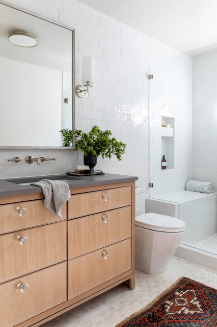
Homeowners’ request. “My client travels quite a bit and showed me images of a bathroom tile that she quite liked from a hotel in Ibiza,” designer Dorothy Day Huntsman says. “They had that handmade wabi-sabi look and they were various shapes, from rectangles to squares, and in various sizes. In addition, we found this beautiful and delicate-looking marble floor tile at a local tile company to complement the wall tile.”
Shower details. The white handmade tile covers the vanity wall, shower walls and bench. The marble mosaic tile spans the main floor and shower floor, separated by a marble-wrapped low curb. “A curb is more budget-friendly and still very beautiful when put with a marble curb and still gives the sense of openness and seamlessness,” Huntsman says. “We wanted the budget to go toward the unique patterned mosaic marble tile and high-end finishes from Waterworks versus the curbless look. It’s always about balancing budget with aesthetics.”
Other special features. White oak vanity with dark gray countertop and clear knobs.
Designer tip. “I like throwing in color in a neutral space, which we did here with this beautiful rug,” Huntsman says.
Wall tile: Natucer Stow in Bianco, Tileshop; wall and ceiling paint: White Dove, darkened by 25%, Benjamin Moore
4. Clear Vision
Designer: Dana Bender of Pine Street Carpenters
Location: Chester Springs, Pennsylvania
Size: 180 square feet (17 square meters)
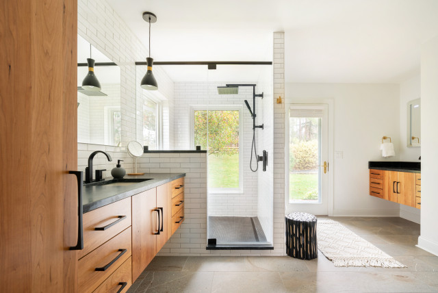
Homeowners’ request. “The owners had recently purchased their home when they enlisted our help,” designer Dana Bender says. “They inherited a spacious yet dated bathroom, which included a sunken tub and separate makeup area. They did not want either in the new design. They liked the natural light and access to the rear yard, so keeping the windows and door was important. The clients were open to the shower location at the windows, as their property is pretty private and they planned for landscaping to buffer it while keeping their view and light.”
Shower details. “We initially planned and budgeted for a curbless shower per the clients’ request, but ultimately the client decided to cut it from the budget at the construction phase,” Bender says. “A curbless design drives the budget since more of the main flooring needs waterproofing. The client opted to keep a linear drain to get a modern touch, and we kept the curb as slim and as sleek as we could. The black curb material blends well with the black shower floor tile, so although it contrasts with the main shower walls, it provides a minimalist effect in the room. The contrasting grout color from the walls plays to the black accents used elsewhere. We included a product niche below the half wall that’s easily accessible but keeps products out of view.”
Other special features. “Separate zones for the vanities allows each owner plenty of space and individual storage,” Bender says. “The owners liked the idea of the floating vanities, so we designed plenty of drawers at each and also included tall cabinets for towels, linens and products. Aesthetically, the client was seeking a modern organic feel. They chose a concrete-inspired tile floor in an earthy tone and liked bringing in the warmth of the wood cabinets. Black, white and touches of brass keep the palette crisp yet inviting.” The countertops are soapstone.
Designer tip. “Our ceiling height was shy of 8 feet, so emphasizing vertical elements helps maximize the feel of the room,” Bender says. “We kept the walls and ceiling the same color so there’s no break to stop your eye. We took the linen cabinets to the ceiling, and the pair of hanging pendant lights helped to draw the eye up.”
Vanities: Camden slab door in cherry, Dura Supreme Cabinetry; hardware: Riverside pull, Top Knobs; shower fixtures: Brizo; wall paint: Pure White, Sherwin-Williams
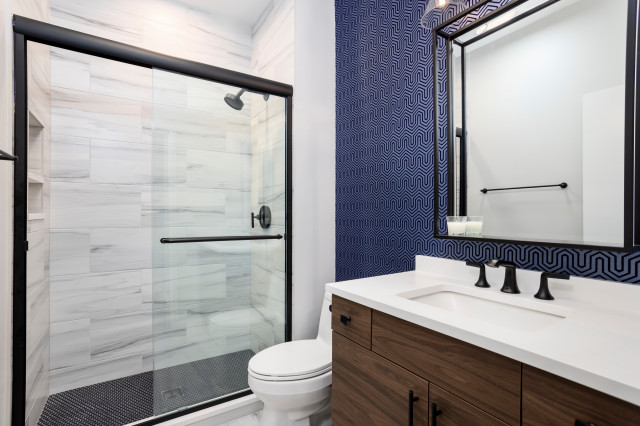
5. Sleek Sanctuary
Designer: Chi Renovation & Design
Location: Bucktown area of Chicago
Size: 44 square feet (4.1 square meters); 5½ by 8 feet
Homeowner’s request. “Our meticulous homeowner envisioned his bathroom as a haven of warmth and modern sophistication,” says design-build pro Michael Rezek of Chi Renovation & Design. “He yearned for a space that would serve as his oasis and could effortlessly welcome his guests and leave a lasting impression.”
Shower details. While the low-curb shower element was existing, Chi Renovation & Design updated the look and function with new features and details. These include silver-toned stone-look porcelain wall tile, matte black fixtures, a new sliding glass door and mosaic black penny tile flooring that adds style and creates a nonslip surface.
Other special features. Blue-and-black labyrinth-patterned wallpaper. Flat-panel laminate wood vanity. Black faucet, vanity hardware and mirror frame.
Designer tip. “We counted on porcelain tile’s technical features for this project as it is an ideal choice over other materials in areas with water and steam,” Rezek says. “Although porcelain tile costs more than ceramic tile in some cases, porcelain tile has a stain-resistant feature and is highly durable. It is best to opt for porcelain tiles with at least a PEI (Porcelain Enamel Institute) III and above rating to guarantee the quality of the material.”
Shower head: Purist, Kohler
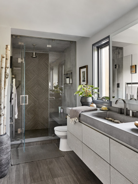
6. Hotel Hero
Designer: Amanda Lehmann of Lehmann Creative Studio
Location: Pound Ridge, New York
Size: 84 square feet (7.8 square meters); 6 by 14 feet
Homeowners’ request. “This was an outdated bathroom that needed more storage and an updated look,” designer Amanda Lehmann says. “They wanted it to feel like a hotel bathroom.”
Shower details. “The low-curb shower was a natural choice for this modern bath,” Lehmann says. “This was an antique home and we were reworking many other sections of it. A curbless shower was not necessary and would have cost more time and money and been complicated. We decided the low curb was just as appealing and used the savings in other areas like the beautiful mosaic tile in the shower and the raw concrete sink. We chose a contrast saddle for the curb that matched the floating bench in the shower.”
Other special features. “Everything about this bathroom was special, from the custom floating vanity with custom cerused paint color to the custom concrete vanity sink to the beautiful linear tile that we repeated again on the wall facing the mirror,” Lehmann says.
Designer tip. “The floating vanity in this small bath provided the feel of openness as it’s not grounded on the floor,” Lehmann says. “By just leaving 10 to 12 inches of open space, we created a look that did not feel cluttered and still gave my client five operable lighted drawers for all her makeup and product.”
Custom vanity: DiIorio’s Custom Woodworking
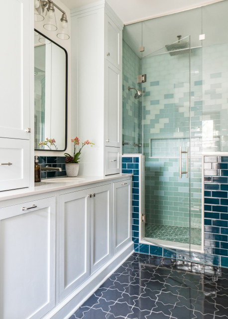
7. History Revisited
Designer: Kathryn Murphy Interiors
Location: Oak Park, Illinois
Size: 100 square feet (9.3 square meters)
Homeowners’ request. “Once featured in the 1981 Better Homes and Gardens New Decorating Book, 40 years later this primary bath had lost all its shine — and its ferns,” designer Kathryn Murphy says. “The clients wanted a retreat from their busy lives and a space that felt like them while holding on to the historic home. They knew they wanted some details from the start: a freestanding tub, glass tile, lots of storage and staying with a single sink. We created a gorgeous new zen oasis ready to take on the next 40 years.”
Shower details. “Because of the awkward dimensions of the room and some interesting 1880s support architecture behind the walls, the shower needed to have some structure, and that meant a curbless shower just didn’t work in the space,” Murphy says. “So the low curb with an infinity drain kept things feeling together and classic while still having modern features. We used glass tile from Fireclay in an ombre pattern for the shower. The clients wanted to feel deluged with water, so we added a rain shower and body sprays to create a luxurious space.”
Other special features. “Wainscoting around the perimeter of the room (Caspian Sea by Fireclay Tile) is a nod to the historic home and helps tie the puzzle configuration of the room together,” Murphy says. “The vanity is custom with Shaker inset doors concealing a hamper and trash bin, both client requests, as well as integrated power outlets and tons of storage.”
Designer tip. “The details are important,” Murphy says. “Think about how you are finishing the tile, what happens at the corners, how much space you have between things. These are what elevate your space.”
“Uh-oh” moment. “When we took down the walls, we discovered some very challenging, very old, very important beams in the corners of the shower that intruded into the space,” Murphy says. “We also discovered joists that had been mouse-holed by previous plumbing. The second one we expected, the first was a surprise. Our genius tiler and framers made the shower beams work and carefully tiled around things so that it’s barely noticeable that there are little corner indents. And the general contractor sistered the joists so that everything is set and stable for the next 100 years.”
Floor tile: Akoya, mini star and cross pattern, Fireclay Tile


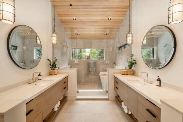
1. Seeing Double
Designer: Krystal Swank of Mountainwood Construction
Location: Sun Valley, Idaho
Size: 180½ square feet (17 square meters); 9½ by 19 feet
Homeowners’ request. “Our homeowners wanted an open concept and a relaxed, warm feeling with clean lines and a window to enjoy their view,” designer Krystal Swank says. “Prior to our remodel, this room was a guest bedroom with an attached office and a small bathroom on an interior wall without a window. The homeowners wanted a luxurious principal en suite with a soaker tub and a double shower. We were able to rearrange the floor plan to create a beautiful airy and spa-like master bathroom with a wet room to house the double shower. A large soaker tub with two windows at the perfect height maintains natural light, great views and privacy.”
Shower details. “As we assessed the wet room for tile, we had a few things we wanted to achieve: a slight decline in the shower area toward the linear drain, a flat area to set the tub on and to keep the floor near the vanities from getting wet,” Swank says. “We decided a set of saloon-style glass doors would help maintain the warmth as well as help keep water from the shower from getting the floor in front of the vanities wet. The advantages of a low curb were creating a barrier to keep the water contained and giving the doors an even place to meet the floor. We also love the way it creates a border between the water room and the rest of the bathroom. We asked the countertop company to cut pieces of quartz for the low curb as well as pieces to trim the pony walls and a ledge in the water room.”
Other special features. “The hemlock ceiling is an eye-catcher in this bathroom, where it complements the warm tones without overpowering the calm space,” Swank says. “We also used flat-panel white oak cabinets with a custom stain. The countertops are Caesarstone Cloudburst quartz.”
Designer tip. “Consider drop-down lighting from a high ceiling,” Swank says. “It’s a great way to accent a vaulted ceiling and still provide lighting close to the mirror.”
Pendant lights: Sovereign, Hudson Valley Lighting; project photography: Azevedo Photo