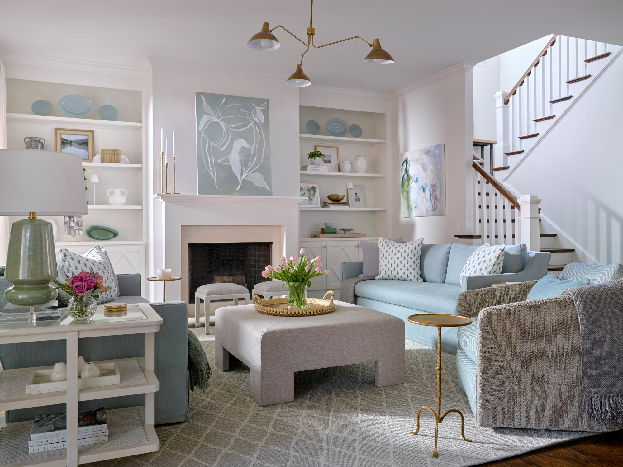
 Heather Wren Interiors
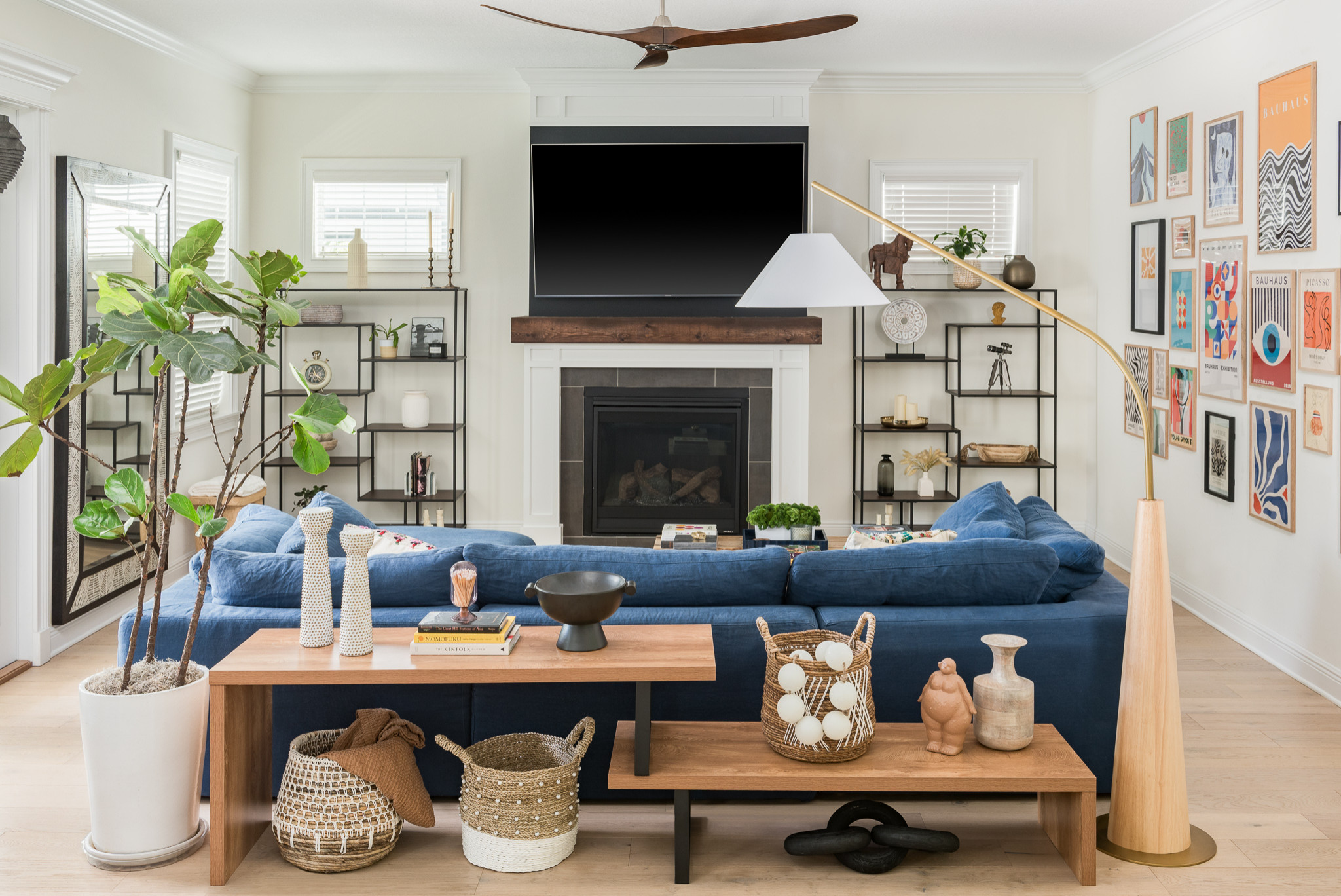 Meliza Veloz Designs
Designer: Meliza Veloz Designs
Location: St. Petersburg, Florida
Size: 311 square feet (29 square meters); 16 feet, 7 inches by 18 feet, 9 inches
Homeowner’s request. “The homeowner wanted to blend bohemian, midcentury and modern styles in his space,” designer Meliza Veloz says. “Since he didn’t need much storage, the focus was on enhancing the room’s aesthetic appeal. The space was originally monotoned and empty, so we introduced color and carefully staged it to add vibrancy and personality. This transformation brought the room to life, achieving the eclectic and modern look the client desired.”
Special features. “We definitely used lots of organic materials in the typical nature of bohemian design, especially wood, between the honey accent table, the white oak base of the lamp or the dark mantel and ceiling fan,” Veloz says. “This client in particular loved cane and wicker, as seen in the featured baskets behind the couch, which are tied in throughout the whole home. We also utilized paint to frame out the TV (Iron Ore by Sherwin Williams) to create a frame effect and make it feel less visually obstructing.”
Designer tip. “Don’t be afraid to take up space,” Veloz says. “The gallery wall pictured on the right measures at approximately 12 feet in width and 8¾ feet in height, which is over 60% of the wall’s full surface area. Oftentimes homeowners will stray away from incorporating color at such a large scale, but when executed well those risks are what take a space from ‘furnished’ to ‘designed.’”
“Uh-oh” moment. “Our client was away on vacation for only five days, so we had less than a week to move everything into this home,” Veloz says. “With a limited timeline, every second counted. On day three, when the art finally came in, we realized that somewhere along the way the dimensions were mixed up and most of the pieces didn’t fit in the frames we ordered. Luckily we were able to reach out to the supplier and get PDF versions of the prints we needed, found the nearest FedEx and explained our situation. They were able to expedite our order and had them all to us the next day.”
 GOGO Design Group
Designer: Rebecca Pogonitz of GOGO Design Group
Location: Evanston, Illinois
Size: 202 square feet (19 square meters)
Homeowners’ request. “When we first met, the homeowner told me that they never spent time in the living room and that it didn’t feel warm and inviting,” designer Rebecca Pogonitz says. “It just didn’t feel conducive for entertaining and relaxation. Their vision was to create a more colorful room that reflected their personality, where they could enjoy quiet time from the bustle of family life.”
Special features. Bronze-colored grasscloth-like wallpaper with a lattice pattern. Black back-painted built-ins (Soot by Benjamin Moore). Black feather-framed mirror. Tiger-pattern wingback chairs. Black-and-white plaid sofa. Gray rug. “We suggested that rearranging the furniture, adding deeply saturated color wallpaper, highlighting the bookshelves and establishing the fireplace wall as a focal point of the room would guarantee they would be drawn to this room each day,” Pogonitz says. “As a result, this is the room where they enjoy their morning coffee, reading and entertaining a few friends at cocktail hour.”
Designer tip. “Combining various types of textures, materials and complementing patterns within the same color palette — in this case, black, white, gray, gold — provides a grounding force within a small room that is enveloped in a deeply saturated color,” Pogonitz says. “Also, painting the backs of the bookshelves a dark color creates an illusion that the built-ins are receding, so the space feels larger than it actually is.”
Wallpaper: Vinyl woven sisal in Vintage Bronze, Phillip Jeffries; mirror: Nikki Chu Midnight, Z Gallerie; chairs: Brockton wing, Lexington
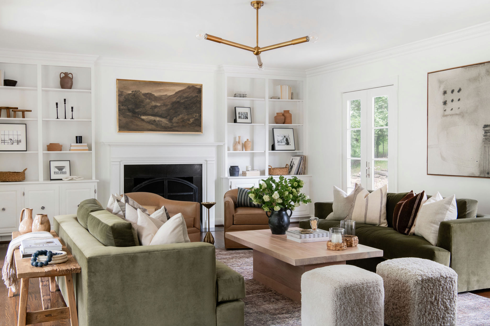 Lauren DeBello Interiors
Designer: Lauren DeBello Interiors
Location: Nashville, Tennessee
Size: 315 square feet (29 square meters)
Homeowners’ request. “The homeowners wanted a cozy, moody, more formal living space that doubled as an entertainment space,” designer Lauren DeBello says. “They wanted to be able to gather with friends, listen to music and watch TV. This is the first room you see when you enter the home, so they wanted it to make a statement. The room was empty prior to me working with them, so I started with a blank canvas.”
Special features. “The walls in the room were previously a gray color and we painted them Greek Villa by Sherwin Williams to bring a subtle warmth to the space,” DeBello says. “The room has great natural light, so we wanted to bring color in with the furnishings and rug. We chose two green velvet sofas from Maiden Home and a Loloi rug from the Amber Lewis collection that helped to make the space feel earthy and moody.”
Light fixture: Regina Andrew; coffee table and chairs: Four Hands
 Morris Lare
Designer: Alicia Held-Morris and Jillian Lare of Morris Lare
Location: West Des Moines, Iowa
Size: 360 square feet (33 square meters)
Homeowners’ request. “The clients were building their forever home and wanted to create a serene, livable, laid-back environment for welcoming their grown children with their families as well as their friends,” designer Jillian Lare says. “They craved a more modern, streamlined environment that still felt warm and comfortable.”
Special features. “The floors throughout this home are a custom-finished natural white oak,” Lare says. “We designed the fireplace wall with brick painted out to match the trim color — Sherwin-Williams Pure White — and a custom-tinted concrete hearth that extends to serve a dual purpose as a bench for extra seating. The mantel is white oak stained to match the floors. The wall color throughout the main level is Benjamin Moore Classic Gray.”
Designer tip. “Scale was a very important consideration in this oversized living room,” Lare says. “We pushed two cocktail tables together to fill the center of the furniture arrangement. A smaller table or single table would have felt out of scale. And the two tables can also be pulled apart if needed.”
“Uh-oh” moment. “At the early stages of the project, we struggled to fully capture the client’s vision for the fireplace wall,” Lare says. “She didn’t want shelves with a lot of clutter or knickknacks that had to be kept dusted, but she still wanted that primary focal point to have visual interest and add depth and dimension to the space. We prepared several rounds of sketches for the wall until we landed on the final design idea. Materiality — the texture and pattern of the brick and hearth — were crucial elements. We emphasized the need for special artwork and careful styling to really pull this aspect of the design together.”
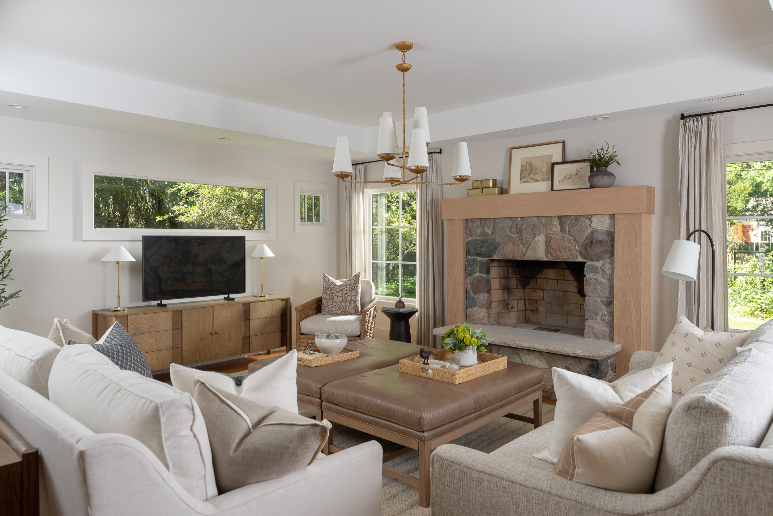 Nightingale Co.
Designer: Kelly Walker of Leighanne LaMarre Interiors
General contractor: Nightingale
Location: Birmingham, Michigan
Size: 357 square feet (33 square meters); 17 by 21 feet
Homeowners’ request. “When we first met the clients, they had purchased the home and loved a lot of the design details and saw all the potential,” designer Kelly Walker says. “The home didn’t feel like theirs and they needed our expertise to provide direction and create a space that was comfortable and functional for them. One of the biggest challenges in a renovation is working with existing architectural features. This home had so much character and our goal was always to highlight the character that the clients loved by adding elements like windows and refinishing beams. By adding these elements, we were able to create a space that emphasized the best details and added furnishings to create a softness and coziness.”
Special features. Custom fireplace mantel and columns. Stone fireplace surround. Two leather-topped ottomans that double as movable coffee tables. Woven chair.
Designer tip. “A common misconception is that adding or relocating windows is too excessive of a cost compared to the outcome,” Walker says. “The addition of these larger windows around the fireplace were such a key design element in this space that if we were to have not considered this due to fear of budget and timeline creep, the entire design would have suffered. The sacrifices and compromises that the clients would have had to make would have left this space feeling incomplete and not as intentional.”
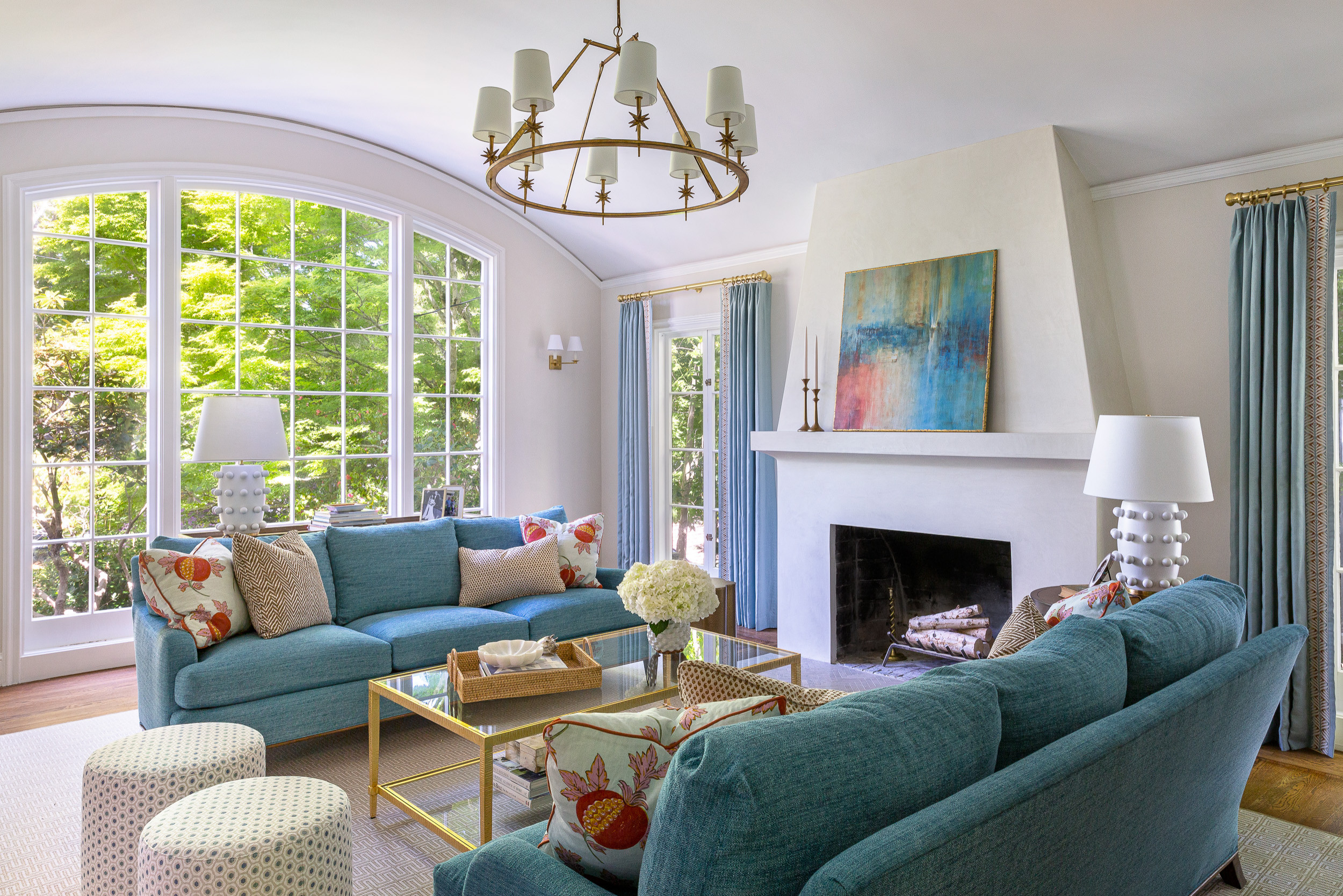 Christine Sheldon Design
Designer: Christine Sheldon Design
Location: San Mateo, California
Size: 275 square feet (26 square meters)
Homeowners’ request. “This was a newly purchased home for homeowners that needed a substantial amount of renovation in every room,” designer Christine Sheldon says. “We wanted to update the room but highlight the fabulous light, ceiling height and barrel-vaulted ceiling.”
Special features. “The client loves color, and while she wanted to maintain the traditional feel of the home, she wanted the living room to feel totally fresh and updated,” Sheldon says. “We used furniture with traditional lines but updated the colors to be fresher and bolder, with fun prints and texture. The table lamps have a fun, unexpected element to them.”
Designer tip. “Highlight the existing elements of the room,” Sheldon says. “We didn’t use window treatments on the arched window because we didn’t want to hide the beautiful lines. Also, use unexpected elements in rooms — maybe a funky lamp or a totally bold fabric.”


Designer: Heather Parker and Wren Caples of Heather Wren Interiors
Location: Atlanta
Size: 288 square feet (27 square meters); 16 by 18 feet
Homeowner’s request. “Our client has a young family and she wanted a living room space for her family to gather that reflected her personality and functioned for her family,” designer Wren Caples says.
Special features. “We drew the space to scale and decided on two sofas facing each other with swivel chairs that work well for conversation,” Caples says. “We were able to achieve her goal of being able to seat several people with the sofas, swivel chairs and ottomans while creating a balance to the room and a focal point on the fireplace and art. Our client’s New Orleans roots are reflected in the space with touches of French antiques, colorful art and a beautiful color palette of soft greens, lavenders and blues.”
“The unexpected palette of lavenders and greens for a living room really makes this room stand out,” designer Heather Parker says. “All the fabrics are performance for easy cleaning to accommodate the family dog, who loves a spot on the sofa.”
Designer tips. “We love using a piece of art as inspiration for a room,” Parker says. “We used the abstract art in this space to pull paint colors, fabrics, a rug, other art, accessories, etc. Art is the perfect jumping-off point to design a room.”
“Another tip is to pull furniture off the walls,” Caples says. “Homeowners often think that a room will appear larger if the furniture is pushed up against the walls, when it’s just the opposite. Pulling a sofa or sectional off the wall, floating a few swivel chairs in the room and a coffee table will create a cozy seating area, give the room some ‘breathing space’ and actually feel larger.”