2. White Oak and Black Quartz
Designer: Megan Oldenburger of Dichotomy Interiors
Location: Rhinebeck, New York
Size: 300 square feet (28 square meters)
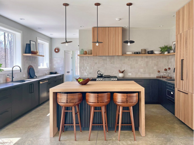
Homeowners’ request. “This young family wanted a warm and welcoming kitchen that would offer plenty of work zones while maintaining the feel of a chic entertaining space that felt harmonious with the rest of the room in the open-concept layout,” designer Megan Oldenburger says.
Countertops. The custom island countertop is white oak with waterfall edges. The perimeter countertops are inky black quartz. “We wanted the perimeter countertops to blend seamlessly with the base cabinets and offer a velvet finish that was nonreflective and resisted fingerprints and stains,” Oldenburger says. “For the island we chose a natural white oak top for the organic look and to feel like another dining table. It was finished with Rubio Monocoat for a durable, safe and lasting finish. Because the floors are concrete, it was important to balance the cold, hard materials with the softness of natural wood.”
Other special features. The base cabinets are blackened oak. The ribbed paneled refrigerator and range hood are white oak. The backsplash is zellige tiles. The stools are walnut.
Designer tip. “This home has tall vaulted ceilings, but the kitchen was more standard-height,” Oldenburger says. “I kept the lower cabinets dark and slowly lightened the look from bottom to top, ending in the plaster finish, which allows the ceiling height to blend in with the rest of the home. Keeping the base cabinets darker on the bottom gave the room weight and substance without looking heavy.”
Perimeter countertops: Oxidian, Caesarstone; backsplash tile: Zellige in natural white, Riad Tile
3. Solid White Quartz
Designer: Gaelle Dudley of GLDesign
Location: Fairfield, Connecticut
Size: 150 square feet (14 square meters)
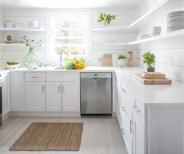
Homeowners’ request. For this 1947 Cape Cod-style home, the owners wanted an all-white kitchen that’s “zen, modern and coastal,” designer Gaelle Dudley says.
Countertops. Crisp white quartz. “They complement the white shiplap walls and 2-inch white open shelving,” Dudley says.
Other special features. “In order to make the low ceilings feel taller and the tight spaces feel larger, we painted the entire home in our go-to white, Chantilly Lace by Benjamin Moore, and stained the floors with Bona NordicSeal,” Dudley says.
Chrome cabinet pulls add a sleek finish that coordinates with the stainless steel appliances.
Designer tip. “We removed overbearing upper cabinets, refaced the cabinet doors and swapped in white countertops and white shiplap, showing that a full gut remodel is not always necessary, which is why hiring a designer who can help you visualize beauty on a budget is critical to accomplishing your dream home,” Dudley says.
4. Dark Gray Quartz
Designer: Christine Granfield of Sea Squared Design
Location: Boston
Size: 96 square feet (9 square meters); 8 by 12 feet
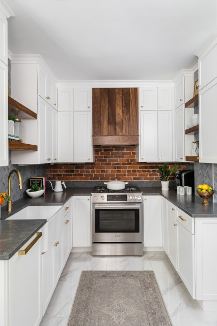
Homeowners’ request. One of the owners wanted all-white cabinets, floors and countertops. The other wanted more of a natural look with a touch of wood and dark colors. “My job was to blend their two visions together so it would be beautiful to both of them,” designer Christine Granfield says. “They also wanted to keep the character and 1880s brick, which is very charming and characteristic of a home in Charlestown in Boston.”
Countertops. Gray quartz in a matte finish. “We went with this because we thought that if everything was white it would look like a hospital, and we thought the gray herringbone marble backsplash would complement both the counters and the brick,” Granfield says.
Other special features. Walnut shelving and range hood. Custom cabinets with brass knobs and pulls.
Designer tip. “Don’t fight your house,” Granfield says. “If your house is an 1880 brownstone in a very historic section of Boston, then go with it. Keep the historic elements of the house and meld them with modern touches. If your house is Victorian, go with that style rather than try to totally transform it into something different that then becomes a confused mix of styles. If you bought an old farmhouse, you don’t want to put in a shiny, modern kitchen.”
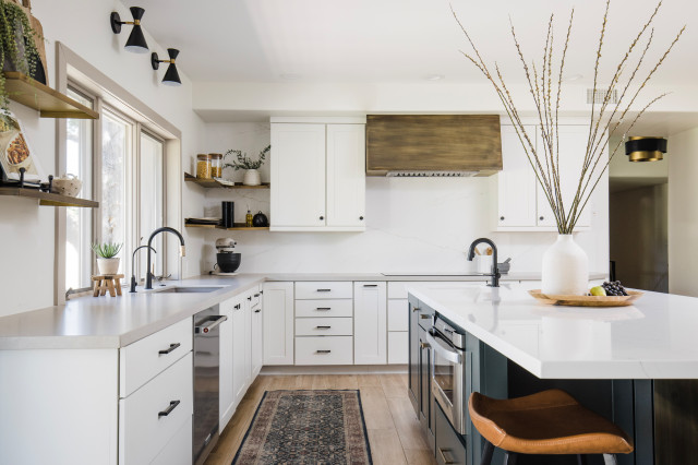
5. Marble-Look Quartz and Off-White Quartz
Designers: Kameran Schaffner and Harley Lugo of Collective Design + Build
Location: Tempe, Arizona
Size: 450 square feet (42 square meters); 15 by 30 feet
Homeowners’ request. “They didn’t like the former outdated cabinetry color and wanted a way to bridge the distance between the far wall in the kitchen and the island area,” says designer Kameran Schaffner, who uses Houzz Pro software.
Countertops. The island countertop is marble-look quartz. The perimeter countertop is an off-white quartz. “The perimeter complements the veining in the island and has a very consistent color that doesn’t compete with the movement seen in the island slab,” Schaffner says.
Other special features. “We had a custom brass hood made with a patina to give it a bit more depth and interest,” Schaffner says. “We also used this same brass material for the single pedestal leg on the island, as well as for the floating shelves to the left of the cooktop.”
Designer tip. “We reused most of the clients’ existing cabinetry and just had it professionally painted,” Schaffner says. “This is a great way to save cost on a kitchen update if your cabinetry is still functioning for you and in good shape. We supplemented their cabinetry and had doors and drawers made to match existing door fronts as needed to accommodate the new layout and appliances.”
Island countertop: Ethereal Glow, Cosentino; perimeter countertop: Ivory White Honed, Arizona Tile
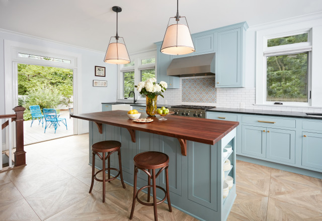
6. Walnut and Black Soapstone
Designers: Marvin and Rene Clawson of Clawson Architects, with Clawson Cabinets and Rita Orell of Designy Things
Location: Maplewood, New Jersey
Size: 315 square feet (29 square meters); 15 by 21 feet
Homeowners’ request. “Once a finishing school for girls, this expansive Victorian had a kitchen in desperate need of updating,” architect Rene Clawson says. “The new owners wanted something cheerful that picked up on the details of the original home, and yet they wanted it to honor their more modern lifestyle. The aqua cabinet color checked the box for creating a cheerful space.”
Countertops. Walnut butcher block island top and soapstone perimeter countertops. “The dark counters and brass hardware complement the aqua cabinets,” Clawson says.
Other special features. Inlaid backsplash tile. Patterned wood flooring. Stained-glass transom window.
Designer tip. “By incorporating a bay window, we were able to gain the space necessary for a table in the kitchen and room to circulate,” Clawson says.
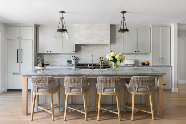
7. Donatello Marble
Designer: Lisa Rossman of LL Design
General contractor: Zac Archuleta of Well Done Building & Design
Location: Huntington Beach, California
Size: 300 square feet (28 square meters)
Homeowners’ request. “The home’s living room, kitchen and dining room had walls separating them, making it feel dark and small,” general contractor Zac Archuleta says. “The client requested a great room combining all spaces into one with lots of light.”
Countertops. Donatello marble. “This countertop really pulled this space together,” Archuleta says.
Other special features. Gray cabinets (Repose Gray by Sherwin-Williams). Custom range hood clad in the same tile used for the backsplash. “It makes it feel more uniform and intentional,” Archuleta says. The island design features wood posts to give the impression of a dining table.
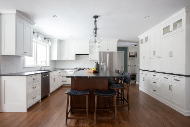
8. Black Granite
Designer: Morgan Froemming of TreHus
Location: St. Paul, Minnesota
Size: 429 square feet (40 square meters)
Homeowners’ request. “They wanted to maintain the existing footprint of the space while getting a more functional and timeless kitchen,” designer Morgan Froemming says. “We reconfigured their kitchen to have a more centrally located sink and relocated their existing windows to allow for more natural light in the space. We used rich wood stains throughout the main level while still keeping the kitchen light and airy.”
Countertops. Black granite in a leathered matte finish. “We used the black countertop to balance the visual weight of the white perimeter cabinets and white marble backsplash,” Froemming says.
Other special features. Marble backsplash tile in a herringbone pattern. Stained oak island and flooring. Black iron-and-glass lighting.
Designer tip. “We used the same stain color on the floor as we did on the island, but the island intentionally appears to be darker since it is a vertical plane,” Froemming says.
Paint colors: Simply White (cabinets) and Cliffside Gray (walls), Benjamin Moore
Countertops often account for a significant amount of surface area in a kitchen. So in addition to providing workspace, countertops also have an important effect on how a kitchen looks. Here, design and remodeling pros share details about various countertop materials, colors and pairings they used to bring durable work surfaces with style to eight kitchens. (cited)


1. Black Soapstone
Designers: Shane Spencer of Spencer Design Associates and Nicole Sirek and Nancy Baker of Partners 4, Design
Location: St. Paul, Minnesota
Size: 330 square feet (31 square meters)
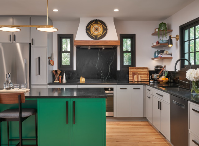
Homeowners’ request. An open-plan kitchen and mudroom for a private chef and her family. “The homeowners definitely did not want a typical white kitchen,” says designer Shane Spencer, whose client found him on Houzz. “What we brought forth is an environment filled with luxe details and vibrant energy for everyday use.”
Countertops. Black soapstone with matching backsplash. “We wanted something dark and modern to connect back to the black-finished wood windows, and this gave an edge to the entire space,” Spencer says.
Other special features. Green island (Verdigris Green by Farrow & Ball). “It brought a vibrance to the space for the homeowners, who knew they wanted color but were hesitant to bring too much color to the entire space,” Spencer says.
The perimeter cabinet color is a light gray (Wevet by Farrow & Ball). The cabinet hardware is handmade bronze.