10. Enhancing Character
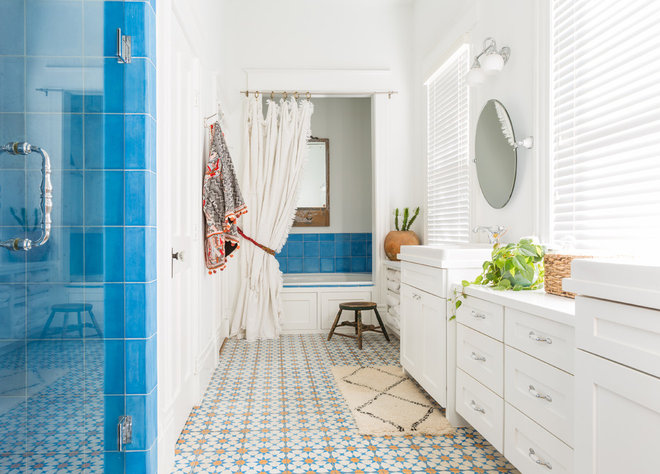
This home in Dallas was built around the turn of the last century, and this colorfully tiled bathroom remains much as it was then. Instead of swapping out the bold patterns, the design team added decorative accessories to enhance them, including an antique mirror from the homeowner’s collection and a vintage chenille blanket the team turned into a shower curtain.
9. Balancing the Elements
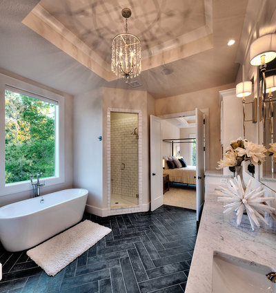
Neutral-colored bathrooms are calm and serene, but without a little texture or color, they can feel lifeless. Add too much contrast, and the space can overwhelm. This master bathroom in Kansas City, Missouri, balances both by keeping most of the room subdued while bringing the drama with a dark herringbone floor and a crystal chandelier.

8. Natural Inspiration
Interior designer Caroline Beaupere looked to a beautiful cherry tree in her backyard in Brooklyn, New York, for inspiration when designing this spectacular master bath. The star is the custom glass mosaic tile mural that wraps around the bathroom. “I wanted to capture the perfect cherry-blossom festival moment,” Beaupere says.
7. Traditional Style Meets Modern Function
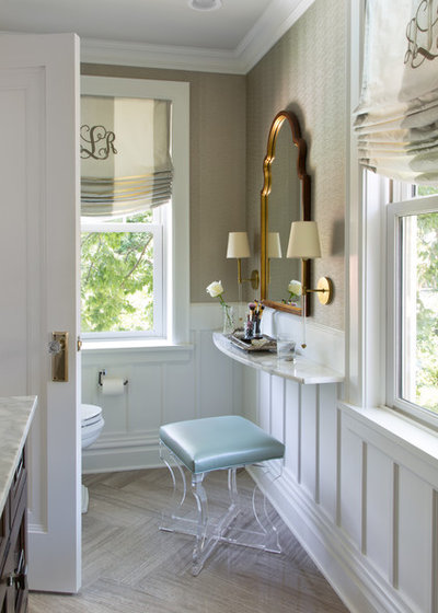
In an existing addition in her 1929 Tudor-style home in Clayton, Missouri, designer and homeowner Laura Lee wanted to make the best use of space in her daughter’s narrow upstairs bathroom while making it feel more of the home’s era. Custom wainscoting ties in with the 1929 portion of the house, while vinyl wall covering tolerates the heat and humidity of the bathroom. The standout feature, however, is the narrow wall-mounted makeup counter. The mirror above the shelf conceals a medicine cabinet. Lee installed a regular medicine cabinet in the wall and then installed the mirror on a piano hinge.
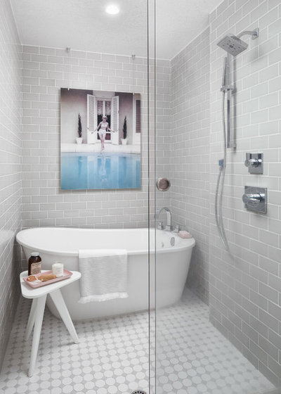
6. Making Room for the Tub
While some homeowners are seeking to lose the bathtub, designer and homeowner Leyla Jaworski added one during her renovation of her home in Sacramento, California. This involved expanding the bathroom into what had been part of the hallway. “The only way to capture the space was to move the washer into the garage and put the tub in the shower,” she says. Incorporating a free-standing tub also enabled the designer to use deck-mounted fixtures, which are “significantly cheaper” than floor-mounted fixtures, she says.

5. Small and Lovely
The next three bathrooms come from the same home in Mahtomedi, Minnesota, and it’s easy to see how they complement one another with their soft natural colors, classic finishes and usability. Designer Shelly Lindstrom and her family built this home from scratch. In this three-quarter bathroom, white penny tile floors and custom-made shiplap walls, both in a warm cream, get a nice accent with the free-standing vanity painted the same color as the shower’s single tile stripe. The door hardware and shower fixtures pick up the marble counter’s veining.
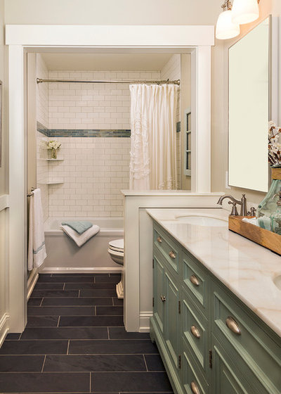
4. Sophisticated Function
The kids’ bathroom got the same design treatment as the rest of the home’s bathrooms, with vintage-style hardware, wood-framed doorways and earth-tone colors, but ample storage, resilient materials and a shower-tub combination mean that it’s also practical for a family. “We wanted a place that was charming and inviting. I think we did that. When people come, they want to stay,” Lindstrom says.

3. Monochromatic Elegance
The same home’s master bathroom, designed in varying shades of gray and tan, is sophisticated without feeling at all stuffy. The homeowners customized this Home Depot vanity by glazing the cabinets themselves and swapping out the existing hardware to create something a little more rustic. The floor has the warm appearance of barn wood but is actually tile.
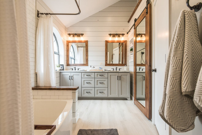
2. White and Wood Contrast
The shiplap walls, porcelain tile floor, subway tile and granite countertop would have made for a beautiful white bathroom, but the custom wood mirrors, sliding barn door and bath shelf add focal points and bring attractive, rustic contrast to this Dallas-area master bathroom.
