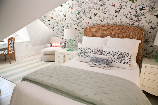
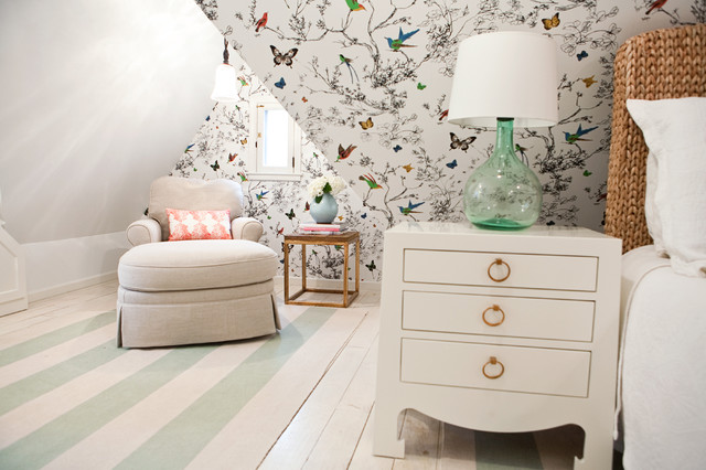
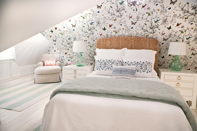
She also made the room look deeper by choosing two matching flat-weave striped rugs — the stripes orient to accentuate the room’s length. They create zones (the workspace–reading nook zone and the bed-nightstand zone) without overwhelming the floor. Their light colors work well with the whitewashed floors and add more of the blue, green and aqua tones she used throughout the rest of the room.
To keep everything from looking too stark, sparkling and new, she added a few items that show age, like warm brass finishes and a vintage-style chandelier over the bed.
Nightstands: Jacqui 3-Drawer Side Table, Bungalow 5; rugs: Dash & Albert
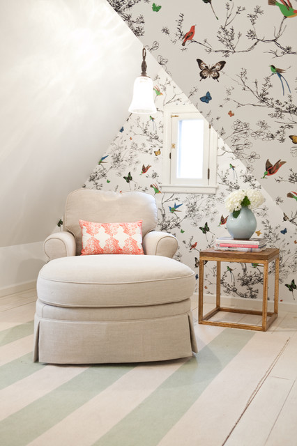
The owners already had the chaise lounge, but it was skirted and covered in a cabbage rose fabric. Wittenbraker had it reupholstered in a basket-weave natural linen for a more tailored, modern look. To make the reading area stand out, she introduced a vibrant coral on the throw pillow, which draws the eye to the cozy nook.
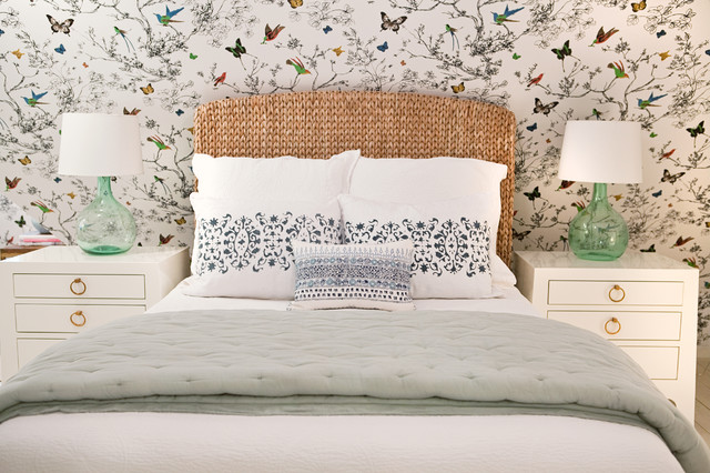
The bedscape continues the use of blues from the wallpaper, with a blue-gray quilt and dark blue hand-blocked pillows. The homeowners wanted to save on the headboard, because while they had decided to use their existing full-size mattress, they knew that someday Wittenbraker would probably talk them into getting a bigger bed. She picked this headboard up at Pottery Barn to add natural fibers to the room.
Small pillow: John Robshaw Textiles
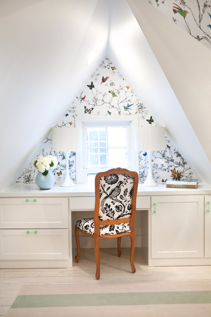
Privacy was not an issue, so she left both windows bare, not wanting to block out any of the natural light.
Tip: When upholstering with a larger-scale print, carefully consider how the pattern will be framed out. Note the composition and where the bird is on the back of the chair here. “I would usually choose something geometric and not another free-flowing pattern for a chair like this, but we scooped this one up at a great price, and the black breaks up all of the soft colors,” she says. “Now that bird is part of the team in here.”


What happens here: Sleeping, lounging, reading, working, nesting
Location: Austin, Texas
Size: About 200 square feet (18½ square meters)
Attic tip: When choosing a wallpaper for a room with odd angles, opt for a free-flowing pattern over an unforgiving geometric one.
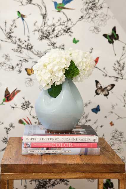
When this couple moved into their antique Tudor-style cottage, the former owners had begun converting the attic into their master suite but had not finished. To save costs, Wittenbraker built on the existing renovations without doing any major architectural changes. Phase one was creating a cozy bedroom; updating the master bath would come later. The biggest splurge was the beautiful wallpaper, which makes the biggest impact in the room.
Wallpaper: Birds and Butterflies, F. Schumacher