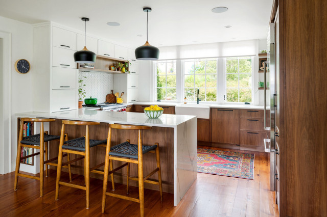
In this bright, modern kitchen for a Boston family, Helios Design Group and Kevin Cradock Builders rejiggered the layout to create a G-shaped setup with a peninsula that features a marble-look quartz waterfall edge. Open storage on one side of the peninsula provides a spot for cookbooks. Black aluminum-and-wood pendant lights complement the wood cabinets and black hardware.
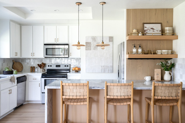
In this revamped California desert condo for a retired couple, Sydney Holliday Interiors removed a short peninsula and an inefficient storage area and created a bigger peninsula with seating for three. The interior side has storage. A push-to-open cabinet sits in front of the stool on the far right. Fluted wood veneer adds texture and visual interest. A Namib Fantasy quartzite countertop with a waterfall edge adds a striking visual element to the kitchen. Three teak stools complement floating wood shelves with antique brass railings against a white oak panel that add storage, style and warmth to the peninsula area.
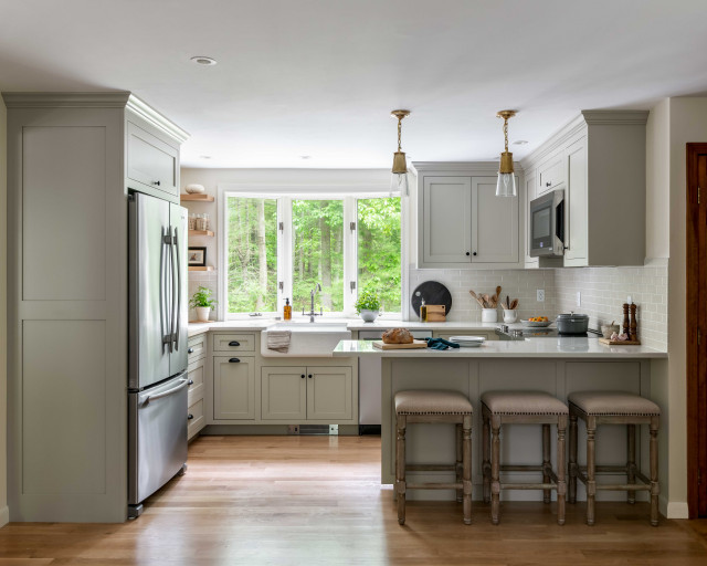
Designer Raquel Swartz of Seviva Design used Houzz Pro to manage the renovation of this now brighter and more open Massachusetts kitchen, which has an efficient G-shaped layout with a peninsula. Two small pendant lights of glass and hand-rubbed antique brass hang over the peninsula. Counter stools found on Houzz introduce a subtle French country detail with creamy upholstery, nailhead trim and turned legs in a driftwood finish.
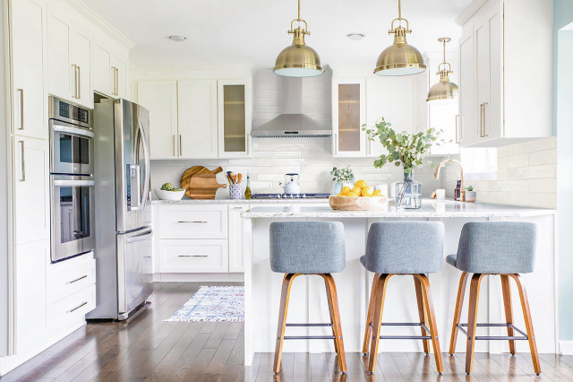
Designer Asha Maxey of Asha Maía Design eliminated a small island in this Arlington, Virginia, kitchen and created a more functional G-shaped layout with a peninsula that seats three. The pendant lights have a nautical style that pairs with the kitchen’s light blue walls, blue-gray stools and crisp white cabinetry. The end of the peninsula includes paneled detailing that coordinates with the cabinets.
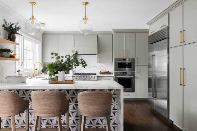
The remodel of this Piedmont, California, kitchen by designer Kelly Berg of Story & Space and contractor Integrity Remodeling included the redesign of a long peninsula to be used for gathering, making jam, serving kids meals and working on laptops. A waterfall countertop provides a sleek and seamless look. Bold geometric tile works with the kitchen’s warm gray-painted cabinets. Clear glass pendant lights add beautiful simple shapes and a warm metal finish overhead while preserving the view of the kitchen from the dining room.
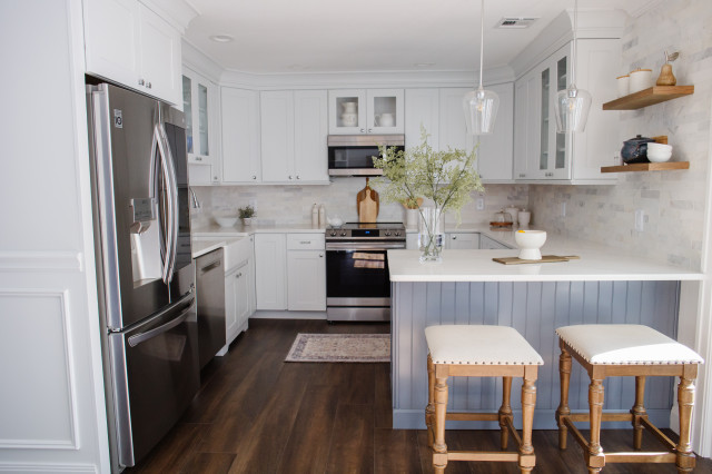
Jaclyn Lankiewicz of Jaclyn Marie Interiors removed a breakfast table and added a user-friendly peninsula to this West Islip, New York, kitchen. On the kitchen side of the peninsula, two drawers and two cabinets improve storage. A blue-gray cabinet factory finish offers contrast to the lighter walls and cabinets. A Calacatta Gold-look quartz counter provides an elegant, durable work surface, while beadboard paneling on the back of the peninsula and a Shaker-style panel on the end add texture and visual interest.
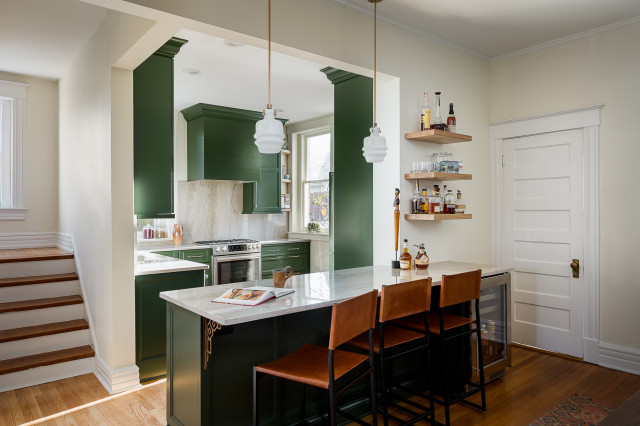
This Kentucky couple used inspiration photos from Houzz to help communicate to their designers that they did not want a “basic” kitchen. Sister designers Mary Culbertson and Susan Haggblom of Centered Interiors and builder Redsmith Construction created a bold space with saturated green cabinets and an elegant peninsula bar with a beverage refrigerator.
Two barrel-shaped opal white glass pendant lights cast a glow from above. A cast-iron shelf bracket with a plated antique brass finish reflects the style of this 1905 Foursquare home. The peninsula bar sits between the kitchen and dining room, giving guests a spot where they can linger and enjoy a glass of Kentucky bourbon while the couple prepare meals.
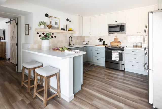
Blue Copper Design relocated a tight Arizona galley kitchen to a former flex space and created a spacious two-tone design in a G-shaped layout with a peninsula. The top of the peninsula is durable white quartz with faint beige veining. The 125-square-foot kitchen includes a pair of glass-and-metal sconces, recessed flat LED lights in the ceiling and undercabinet lighting, which eliminated the need for pendant lights over the peninsula.
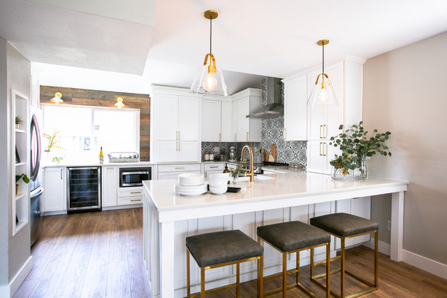
Replacing a wall between the dining room and the kitchen with a peninsula was the most impactful change in this Colorado kitchen by designer Faris Spinosi of TVL Creative. The peninsula, which includes a farmhouse sink, dishwasher and trash pullout, allows the kitchen to enjoy light from adjacent rooms, makes the family feel more connected, creates a buffet serving space for the dining room and provides a breakfast bar out of the cook’s way.


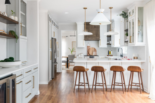
For this Alpharetta, Georgia, kitchen, YB Interiors created a light and bright space with a new extended peninsula with seating. Cabinets added to the back of it improve storage. A pair of 20-inch pendant lights over the peninsula coordinate with the white-and-brass pendant over the breakfast area in the foreground. (A table and chairs were added after this photo was taken.)