Many people have at least one bathroom in their home that feels a bit small or cramped. But no matter what amount of square footage you have, you can create more physical and visual space within the same footprint by using a few design tricks.
Here are five go-to features for creating a more light and airy bathroom.
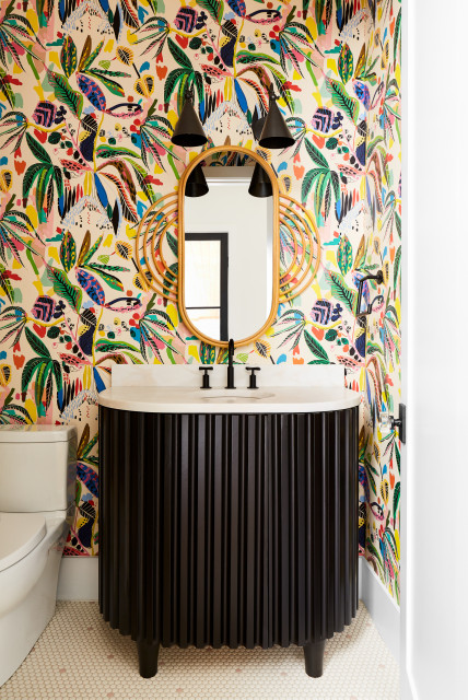
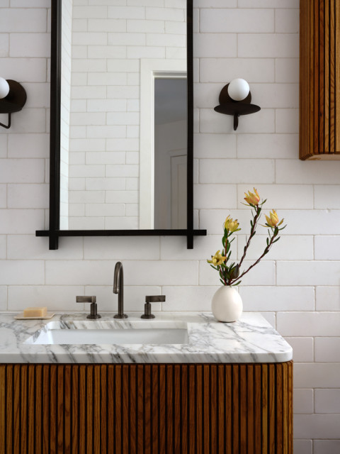
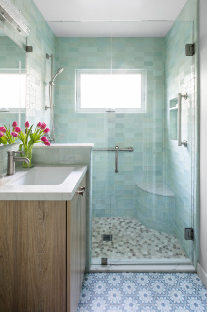
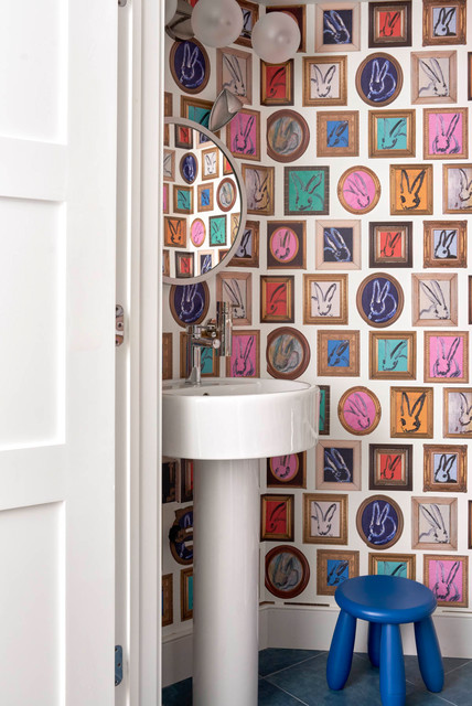
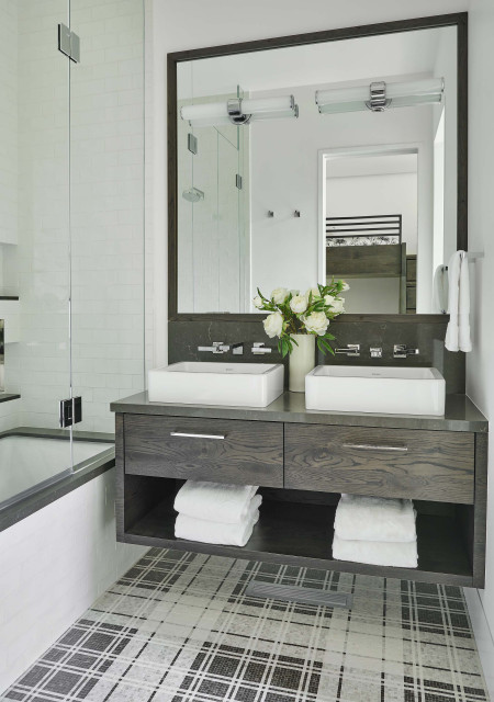
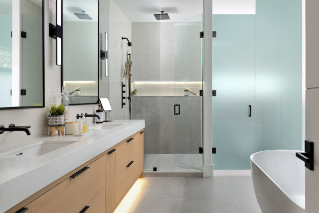
2. Floating Vanity
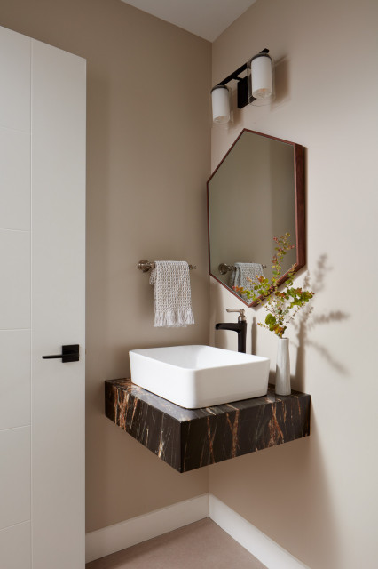
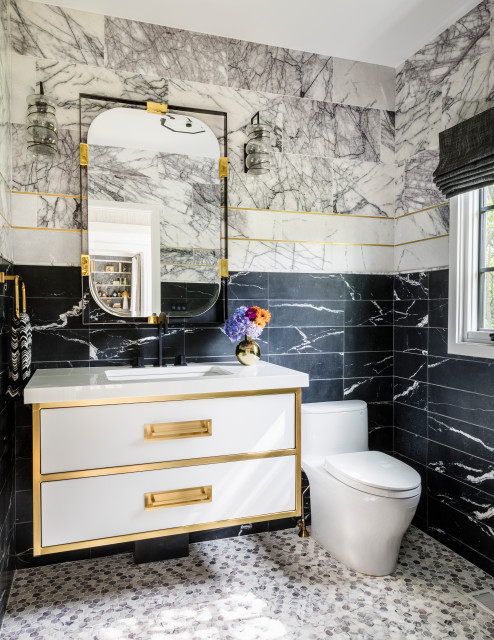
A floating vanity frees up floor space to create more visual and physical openness. It also puts more of your flooring selection on display, which means you can play with lines and shapes to visually extend your space as well.
3. Pocket Door
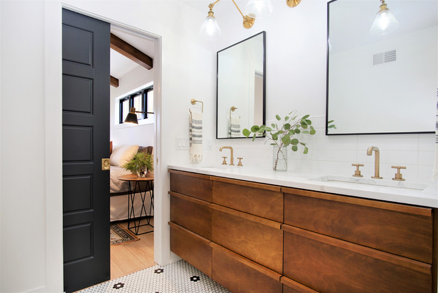
Did you know that the swing of a standard interior hinged door takes up as much as 10 square feet of floor space? That’s not to mention the often unusable space the door occupies when open.
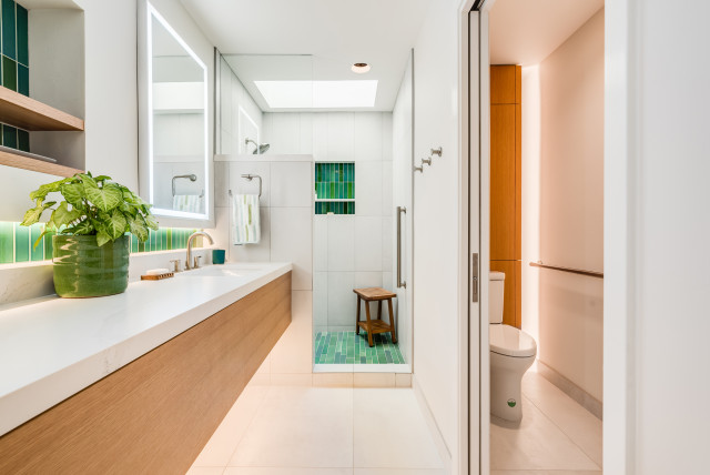
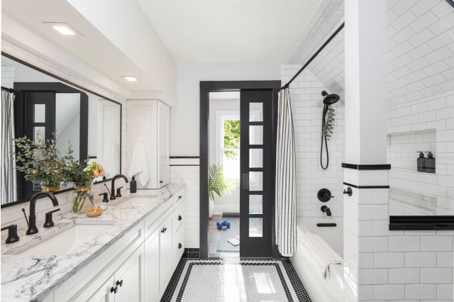
Though this bathroom is already quite spacious, it shows how a glass-panel pocket door can bring in light from an adjoining room, a good idea for making any size space feel bigger and brighter.
You could also consider a mirrored pocket door to achieve a similar effect.
4. LED Strip Lighting
As mentioned, brighter spaces look bigger and more open. And enhancing natural light isn’t the only way to get results.
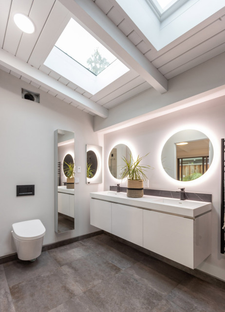
Sufficient artificial lighting is key to highlighting certain attributes that can make a space look and feel larger. LED strip lighting is the way to go for two reasons.
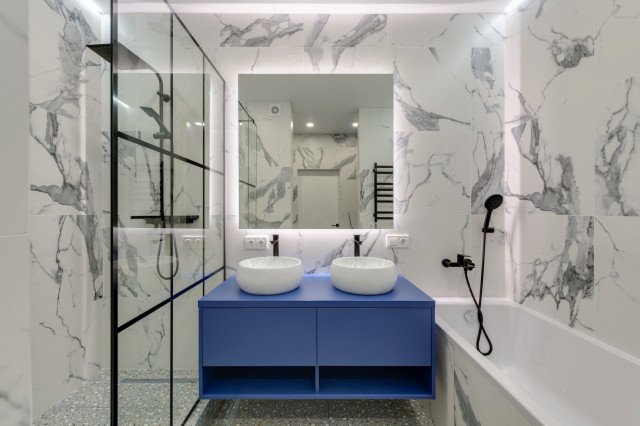
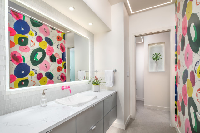
Second, strip lighting can be used to trick the eye into thinking there’s additional space behind certain features. This approach works especially well below a floating vanity and behind a mirror, as seen in this funky bathroom.
Also notice the cool strip lighting detail on the ceiling that draws your eye up and emphasizes the height of the room.
5. Mirror Walls
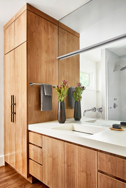
Adding mirrors is one of the simplest ways to give the appearance of more space. Mirrors reflect elements in a room, tricking the eye into thinking there’s more depth and space than there actually is. They also enhance light, creating a brighter, more open appearance.
You can play with multiple small mirrors, but I often recommend going for full walls of mirrors. This will almost completely blur the lines of where your space begins and ends.
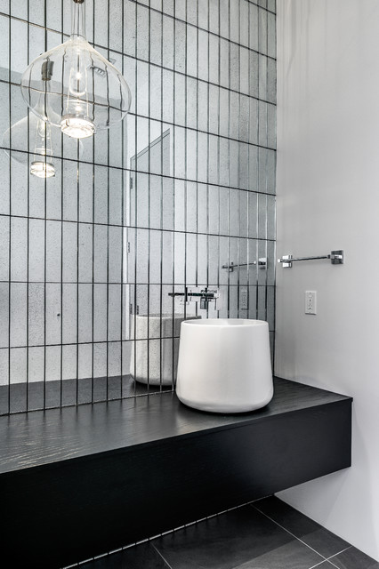
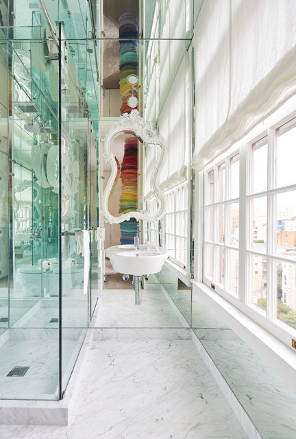


Curves allow for better flow in any floor plan, but they work especially well in tighter spaces. Curved elements are easier to maneuver around, and they add softness to a design, which helps visually lighten the look.