 Kat Black Interiors
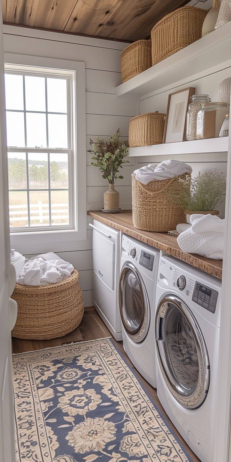 Interiors by Design, LLC
Designer: Azelia Dickson of Interiors by Design
Location: St. George, Utah
Size: 80 square feet (7.4 square meters)
Homeowners’ request. “The homeowners had one key request: ‘Make laundry less of a chore,’” designer Azelia Dickson says. “Their previous setup was cramped, disorganized and uninspiring. I envisioned a sanctuary where functionality and beauty met in perfect harmony. I knew that the flow, colors and design needed to evoke a sense of calm while tackling the practical challenges of laundry day.”
Special features. “To breathe life into the space, I introduced a a soft, serene shade (Benjamin Moore’s Pale Oak) to envelope the walls, offering a neutral backdrop that made the space feel light and airy,” Dickson says. “The ceiling treatment really helps to open up the space and draw the eyes beyond the four walls. The pièce de résistance? A stunning shiplap on the four walls adds texture and visual interest. It provided a nice contrast to the floor and the ceiling treatment. The countertops, a luxurious stained birch, offer plenty of workspace for folding and sorting while subtly also adding an elegant touch. It was imported from North Carolina, lending a subtle country charm to the laundry room. You’ll notice there are no gaps for small laundry items to fall down into. The wall across from the machines was maximized with shelves and built-in cabinets that provided much-needed storage.”
“Uh-oh” moment. “When I opened the walls to install new cabinetry, I discovered some outdated plumbing that didn’t meet code,” Dickson says. “Cue the ‘What did I get myself into?’ moment. But instead of letting this derail the project, I coordinated with local contractors to quickly rework the plumbing, ensuring everything was up to standard and, most importantly, keeping the timeline on track.”
 Cummings Architecture + Interiors
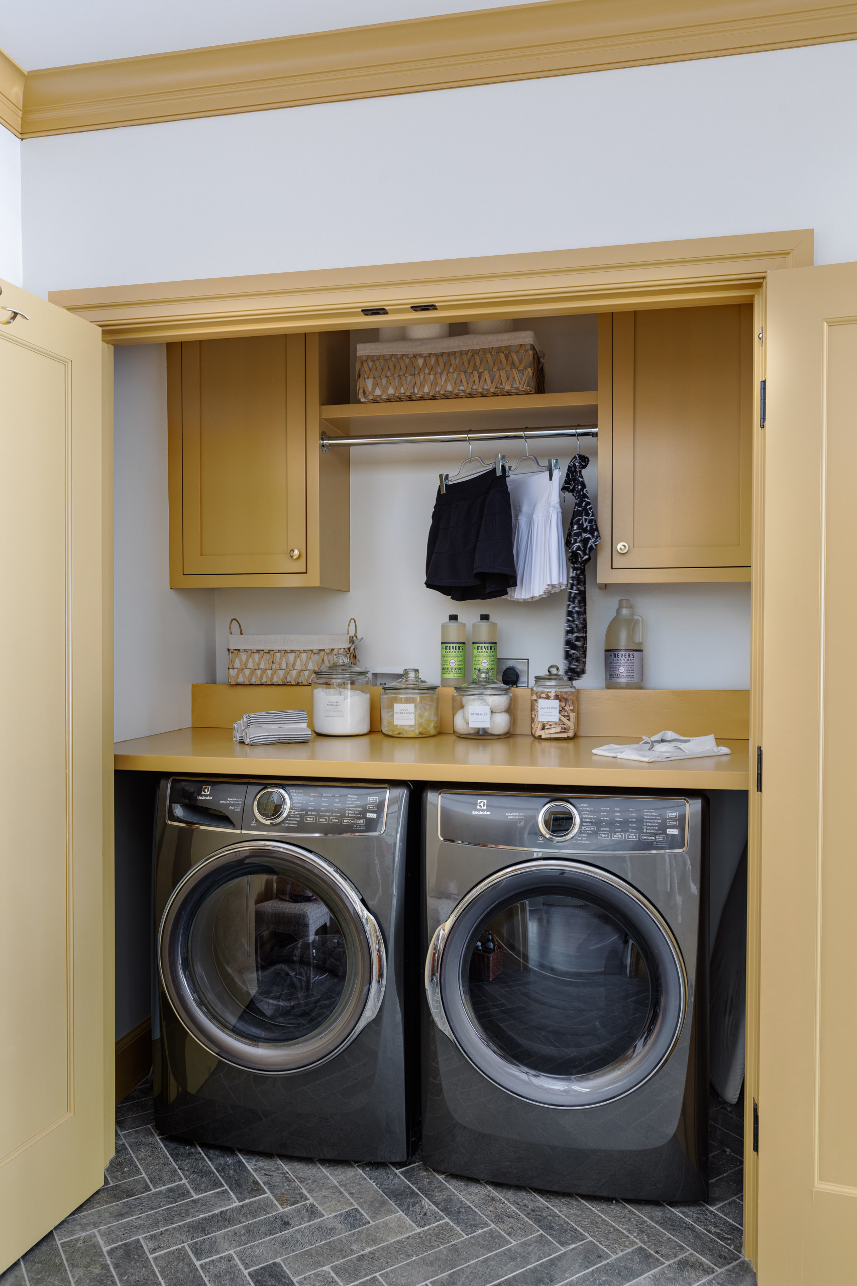
Designer: Mindy Haber of Cummings Architecture + Interiors
Location: Topsfield, Massachusetts
Size: 100 square feet (9.3 square meters)
Homeowner’s request. “The laundry room was originally in the basement,” designer Mindy Haber says. “It was a priority to relocate it to the first floor, as the home is a ranch and single-floor living was important. The homeowner wanted a space that did not feel like a traditional laundry room and wanted a bold color.”
Special features. “We used Farrow & Ball India Yellow,” Haber says. “The main spaces in the house are neutral, so this was an easy place to add a pop of color. Herringbone flooring was used to add a touch of traditional pattern in a dark, forgiving finish, as the laundry and mudroom share one space.”
Designer tip. “Go bold with color and use color on trim with neutral walls,” Haber says.
 Dana Bass Designs
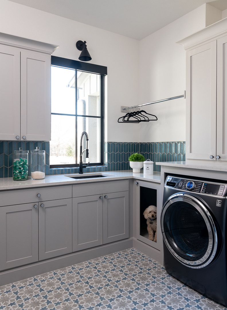
Designer: Dana Bass Designs
Location: Fairview, Texas
Size: 115 square feet (11 square meters)
Homeowners’ request. “The homeowner wanted a place where they could do a daunting chore — laundry — that felt cheerful and happy,” designer Dana Bass says.
Special features. “We selected a patterned tile on the floor to bring in a fun element while hiding dirt,” Bass says. Blue-green glass backsplash tile complements colors in the flooring.
“Corner spaces in cabinets are traditionally hard to utilize, so we turned this into a dog kennel for their beloved pet,” Bass says. “We located the sink in front of the window to let in natural light and so the homeowners could see outside while in there. We also put in a dry hanging rack in a useless corner space and included a fun display of laundry detergents to maximize storage space.”
Cabinet paint: Light French Gray, Sherwin-Williams
 Tim Barber Architects
Designers: Tim Barber Architects and Parrish Cameron Robe of Cameron Design Group (interior design)
Construction: Ford Strei Builders
Location: Austin, Texas
Size: 55 square feet (5.1 square meters)
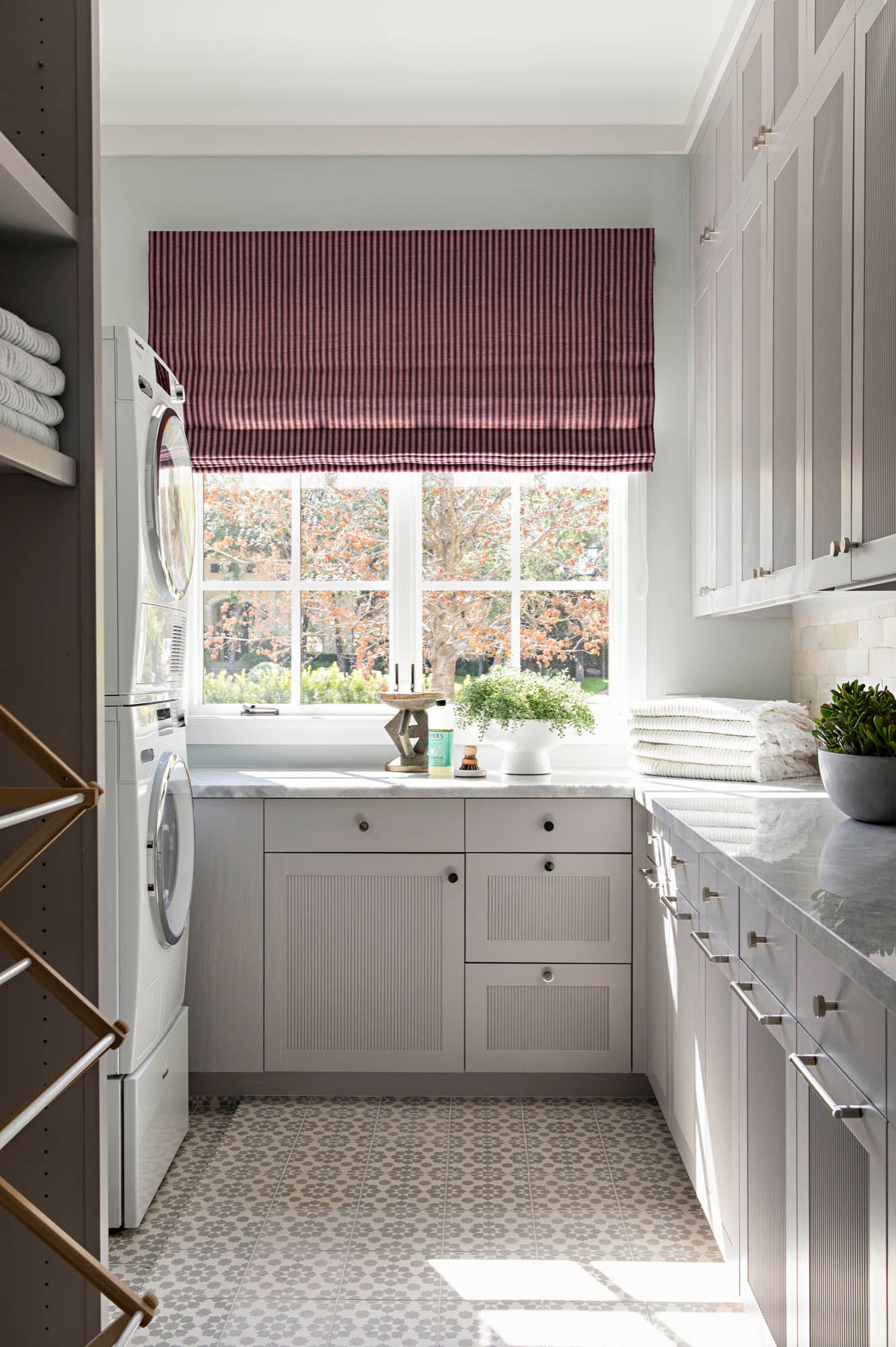
Homeowners’ request. “With a large family and very active children and a dog, they needed counter space and storage — lots of it,” architect Tim Barber says. “Sports clothes need to be air-dried, so we created space for drying racks by using a stacked washer and dryer.”
Special features. “At first glance, this room looks luxurious,” Barber says. “Look more closely and you see pragmatic choices: encaustic tile flooring, zellige tile backsplashes, full-overlay cabinets with inset reeded panels and undercounter lighting. In a laundry, where staining and chipping aren’t real threats, even the Calacatta marble countertop isn’t an indulgence.”
Designer tip. “We make full use of natural light — direct and bounced off the countertops,” Barber says. “The richly striped Roman shade acknowledges that sometimes laundry is done after dark. At night, this bold choice provides warmth and privacy.”
Photography: Karyn Millet
 Concetti
Designer: Rachel Nelson of Concetti
Location: Salem Township, Michigan
Size: 85 square feet (7.9 square meters)
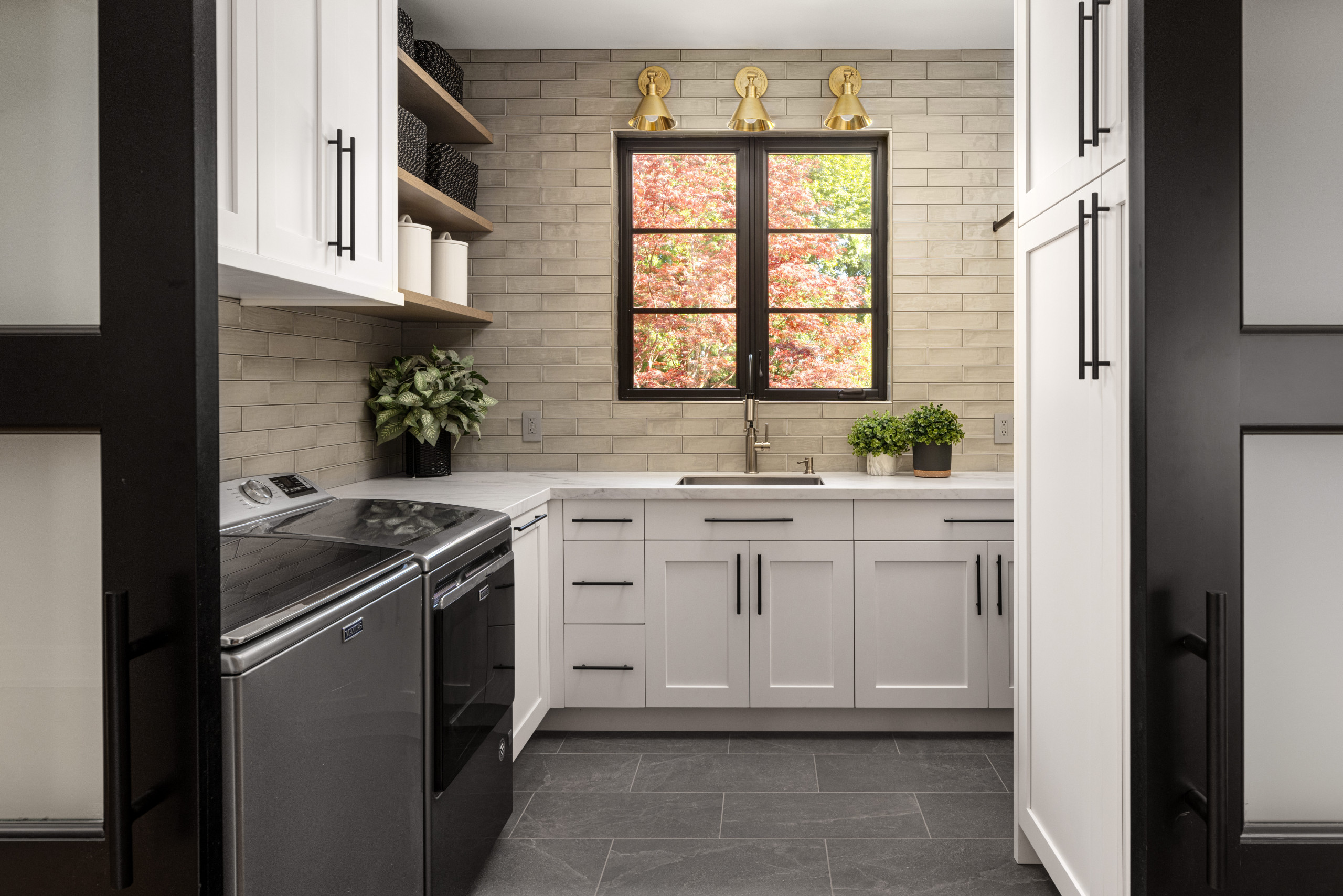
Homeowners’ request. “Our clients are a retired couple who wanted a custom home that was boldly, beautifully them — down to every last detail,” designer Rachel Nelson says. “They had a very distinct vision of how they wanted their space to look and feel. Our collective goal was to co-create a space that perfectly accommodated their lifestyle, hobbies, tastes and paths of travel while embracing their passion for interior design.”
Special features. Custom white cabinets with black pulls. Tan backsplash tile. Brass sconces. Dark tile flooring. Wood floating shelves. Black window frame. Black-framed paneled sliding doors.
 Austin Design Group
Interior designer: Heidi Feliz-Grimm of O’Hara Interiors
Architect: Steve Todd of Austin Design Group
General contractor: Strobel & Associates
Location: Dripping Springs, Texas
Size: 120 square feet (11 square meters)
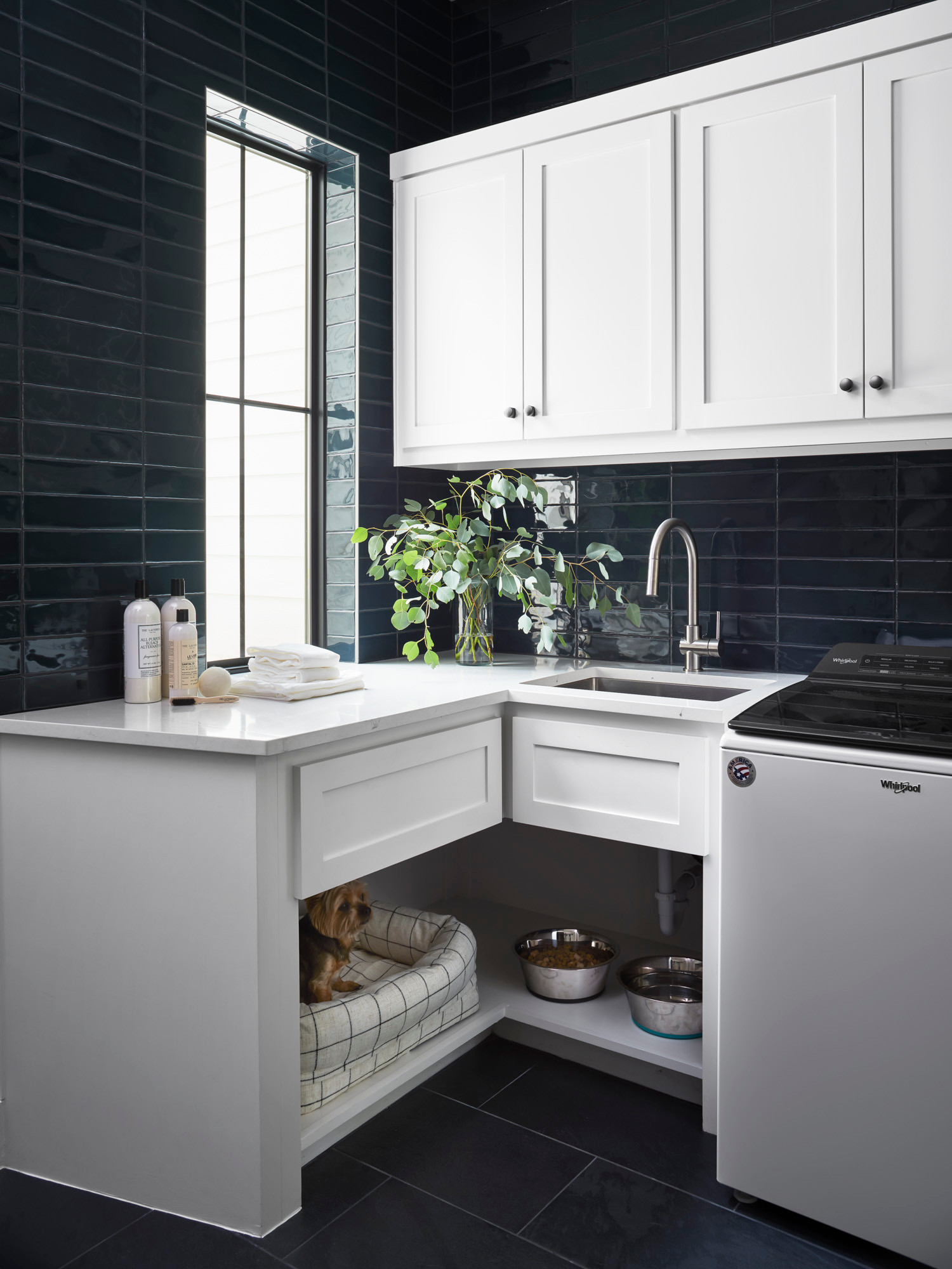
Homeowner’s request. “The owner wanted a spot for her dog’s bed and water and food dishes,” designer Heidi Feliz-Grimm says. “They love their dog, who has since passed away, but it was so important that their family pet was included in the home’s design.”
Special features. Dark green 3-by-12-inch wall tile with irregular edges for a handmade look. The tile is installed in a stacked pattern with black grout for a moody effect. The flooring is porcelain. The cabinets are painted Pure White by Sherwin-Williams. The countertops are quartz.
Designer tips. “Create a special spot for furry friends,” Feliz-Grimm says. “Design should consider every member of your family, no matter how big or small. Also, your cabinets don’t always have to go to the ceiling. We ran the dark green tile all the way to the top of the room because we selected a bold tile and wanted it to be seen as much as possible while still having plenty of storage space. If you’re going to go bold with your design, make sure you commit to it.”
 Kim Dee Designs
Designers: Kim Dee and Melissa Gierhahn
Location: Mesa, Arizona
Size: 105 square feet (9.8 square meters)
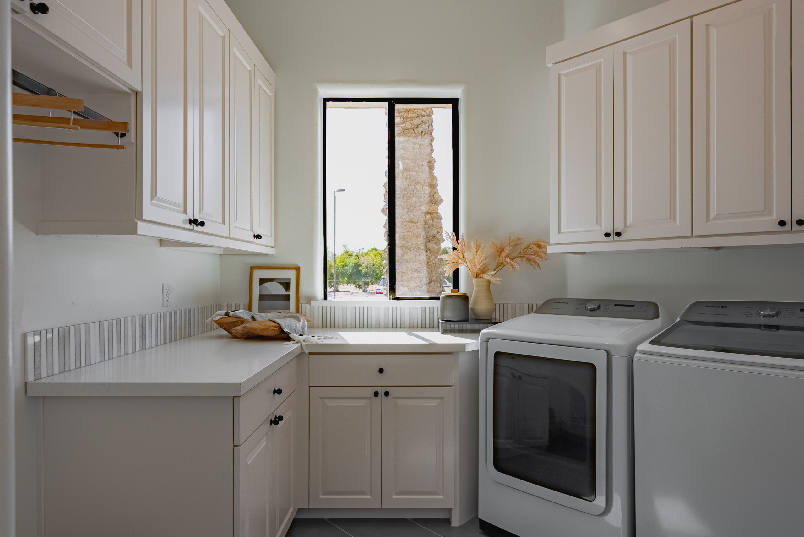
Homeowners’ request. “The primary objective was to refresh the existing laundry room,” designer Kim Dee says. “This was part of a larger full-home renovation aimed at modernizing and elevating all spaces within the home and removing the Tuscan aethestic to a more modern organic vibe throughout.”
Special features. Creamy white cabinets with a hint of greige (Vintage Taupe by Benjamin Moore) with matte black knobs. Marble mosaic backsplash tile. Gray porcelain floor tile. “We wanted to maintain functionality in the laundry room — storage, accessibility — while overall elevating the space to coordinate with the updates being made throughout the rest of the home,” Dee says. “As such, our aim was to accomplish this through updating most of the finishes, including countertops, cabinet hardware, lighting, new floors, wall color and painting existing cabinetry.”
Designer tip. “Paint can go a long way with existing cabinets,” Dee says. “We removed the dated molding on top of the existing cabinets and replaced it with minimal straight-edge molding and painted all a creamy white color.”


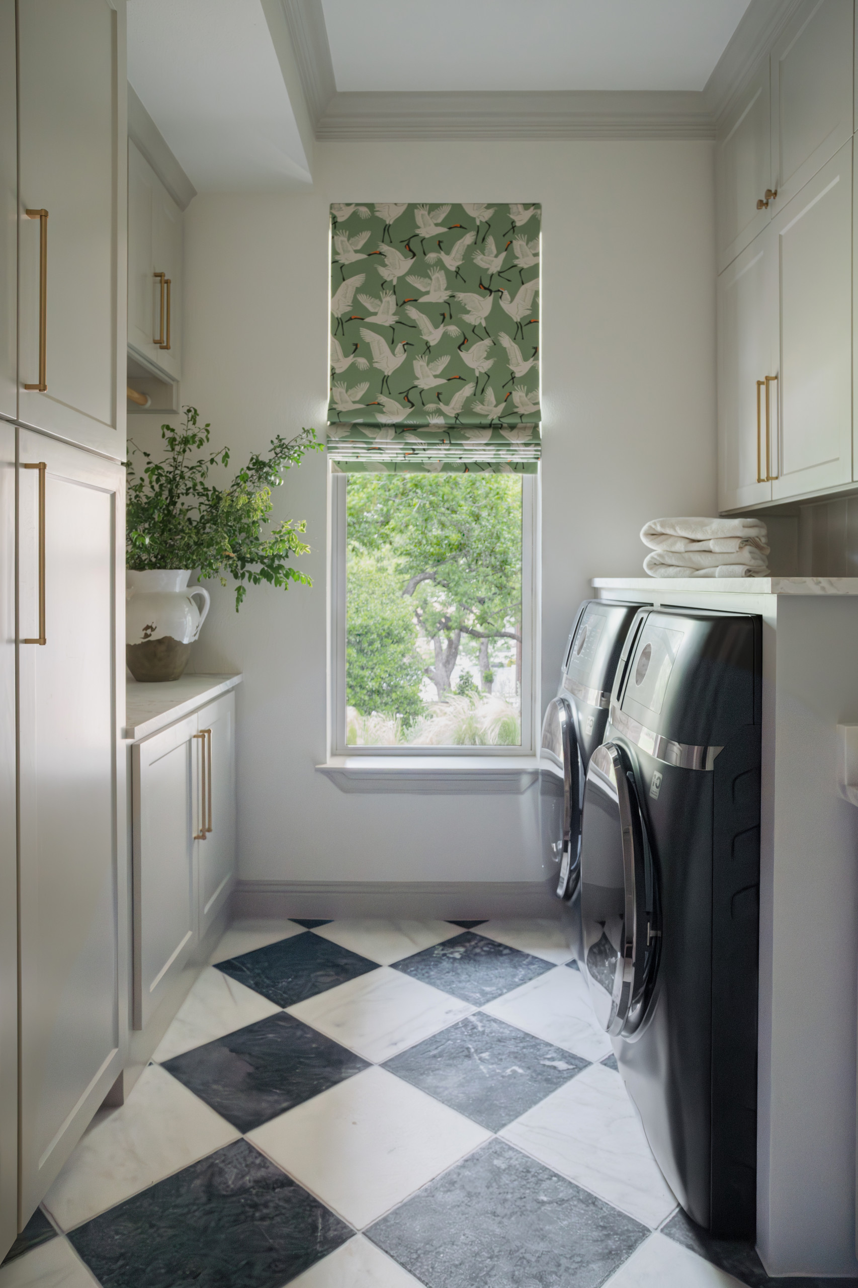
Designer: Kat Black Interiors
Location: Southlake, Texas
Size: 80 square feet (7.4 square meters)
Homeowner’s request. “The original design was both impractical and unattractive,” designer Kat Black says. “Given that the client has a large family and frequently handles laundry, she needed a space that was not only functional but also visually appealing. As she spends a significant amount of time in the laundry room, it was essential to create an environment that enhances both utility and beauty.”
Special features. “The flooring truly steals the spotlight, featuring Italian reclaimed marble sourced from a local Dallas showroom,” Black says. “The Roman shades, with their intricate pattern, harmoniously echo the room’s color palette. The walls are painted in Worldly Gray by Sherwin-Williams, adding a sophisticated touch to the space.”
Designer tip. “We recommend incorporating elements from a mudroom into the laundry room design to create a cohesive and seamless flow between the two spaces,” Black says.