“This client came to me armed with a PowerPoint presentation,” Elkins says. “This is only the second time a client has done that, and I loved this one. It had a lot of references to Dorothy Draper, who designed the Grand Hotel on Mackinac Island and The Greenbrier in West Virginia. I personally love traditional style and color too, and I’m kind of a ‘more is more’ person. The more layers, more colors, more details, the better the design is.”
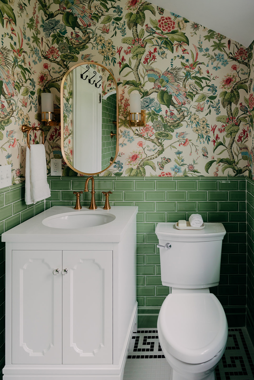 After: Elkins added much-needed storage in the new bathroom. She replaced the pedestal sink with a 24-inch ready-made vanity, the largest size that could fit into the 5-by-8-foot room. She also added a mirrored medicine cabinet. The mirror’s reflection reveals hooks on the back of the bathroom door for towels and robes.
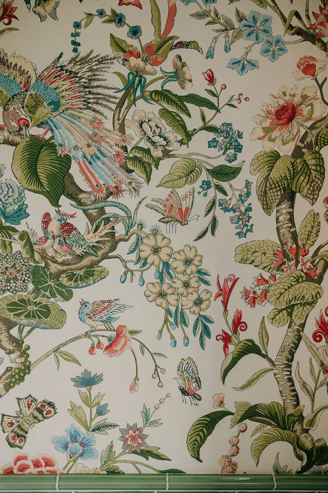
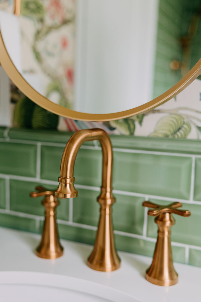
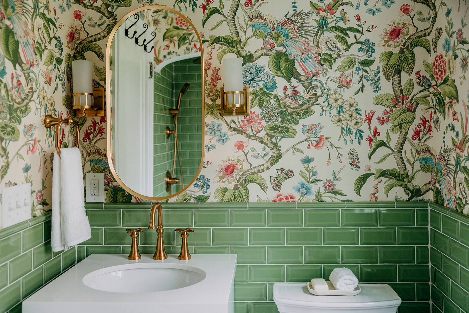 “The tile is beveled, which added more dimension to the room,” Elkins says. She also added matching pencil trim around the top of the tile wainscoting and baseboard tiles at the floor.
“One of the big benefits of a small space is that you can choose quality over quantity,” Elkins says. “You can tile a lot of the walls without breaking the budget.”
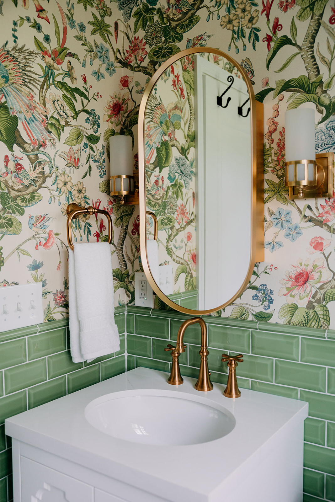 Elkins suggested hand-rubbed antique brass light fixtures with hurricane shades. “We hugged the wall, pushing the one on the left as far as we possibly could,” she says with a laugh. In addition to being the right physical fit, they were also the right stylistic fit for the home.
Sconces: Visual Comfort
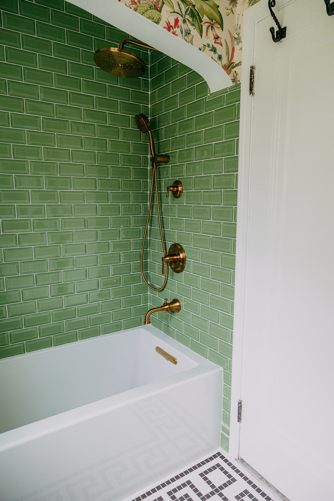
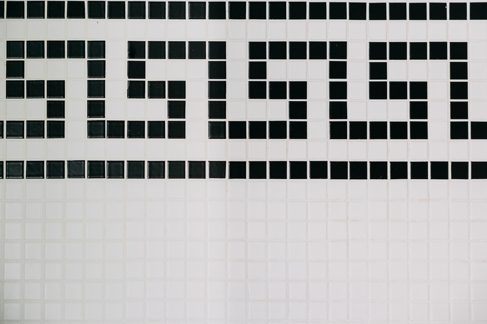
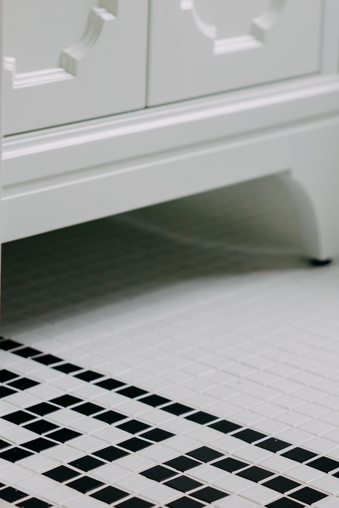
“This is such a beautiful neighborhood,” Elkins says. “The houses are so sweet and have so much character. None of them are large. This house looks like it could have belonged to Snow White. The bathroom looks like it could have been here since the time the house was built. I love designing a room for the period of the house.”


Who lives here: A family of four
Location: Royal Oak, Michigan
Size: 40 square feet (3.7 square meters)
Designer: Emily Elkins of Kendall Design Build
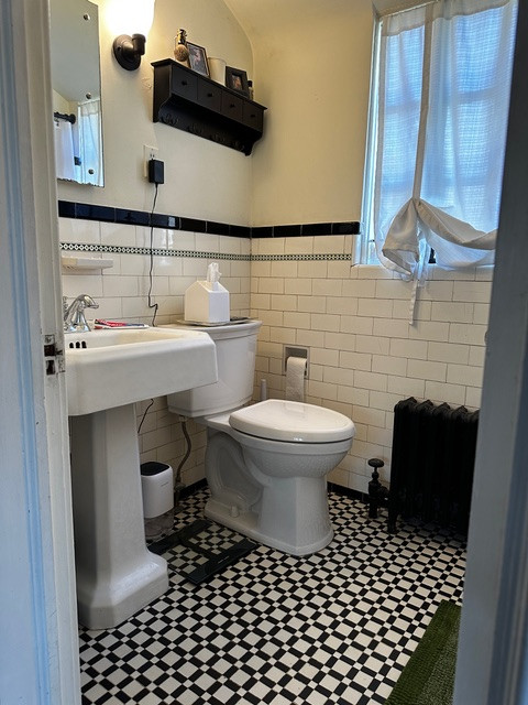
Before: “I liked the original design of the bathroom,” Elkins says. “It was period-appropriate, and the flooring and wall tile were cute. This was more about function than aesthetics. There was very little storage for the family and the shower wasn’t operable. While there was another full bathroom in the home, it was on the first floor, not upstairs where their bedrooms are.”
Getting the look right for the home’s 1920s Tudor-style architecture was important to the homeowners as well as their designer. “We wanted to design it appropriately for the home’s period and make it seem as though it could have been here back then,” Elkins says.