
When you look at these paint chips again at home, you may find that one you didn’t think you liked is actually the right one for your home.

When you go to the paint store, don’t go empty-handed. Bringing a piece of art or fabric as color inspiration can be useful, but something even simpler can help you see colors correctly: a white sheet of paper.
In the store, a pale color may look virtually white, but in your home it will likely be contrasted by some bright white elements such as the ceiling, trim or even something as simple as a switch plate or lampshade, rendering the color much more noticeable.
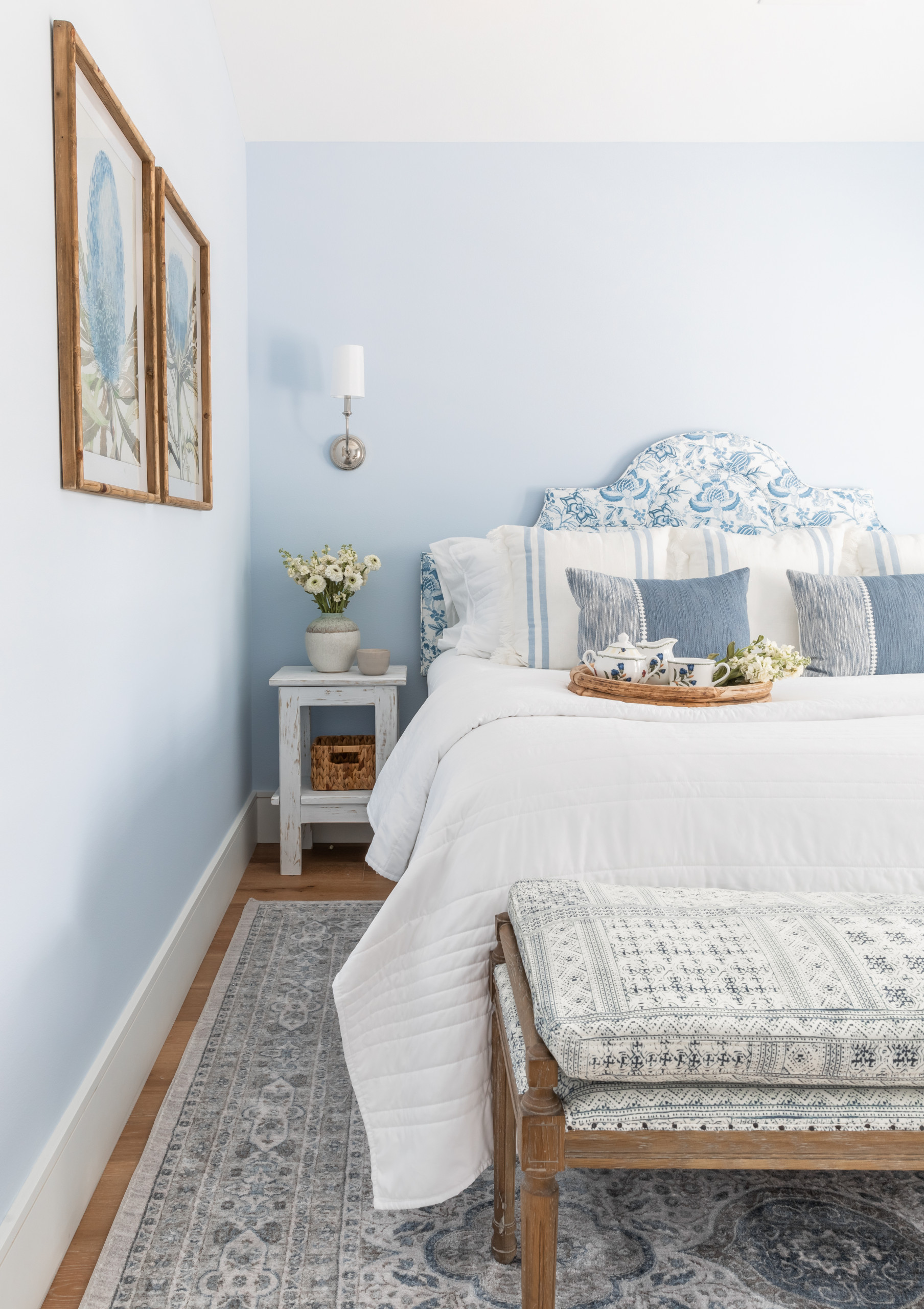
For example, a “light” blue may seem lighter than the other blue shades on the same paint chip, but compared with a stark white it might suddenly look a lot more saturated.
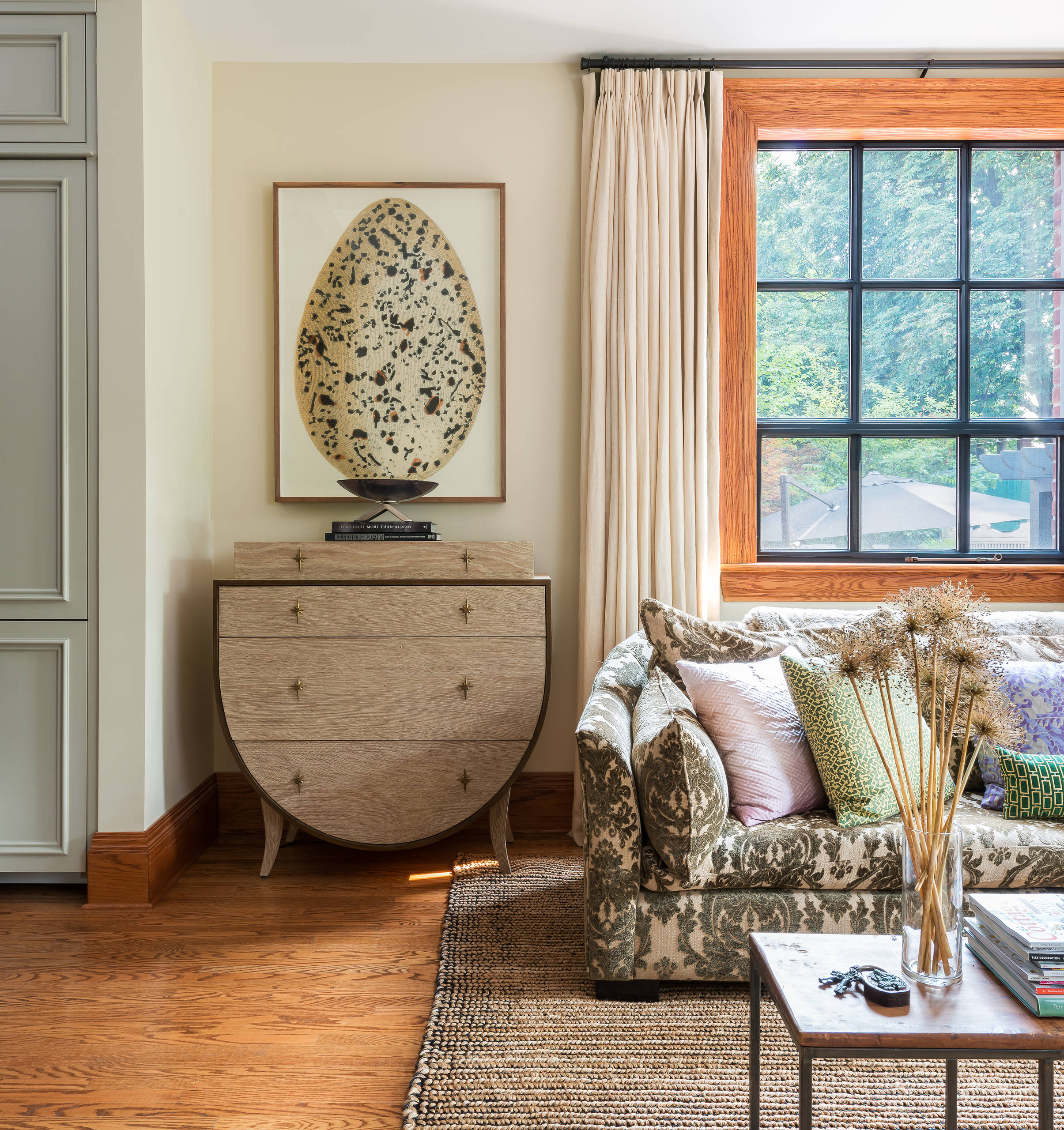
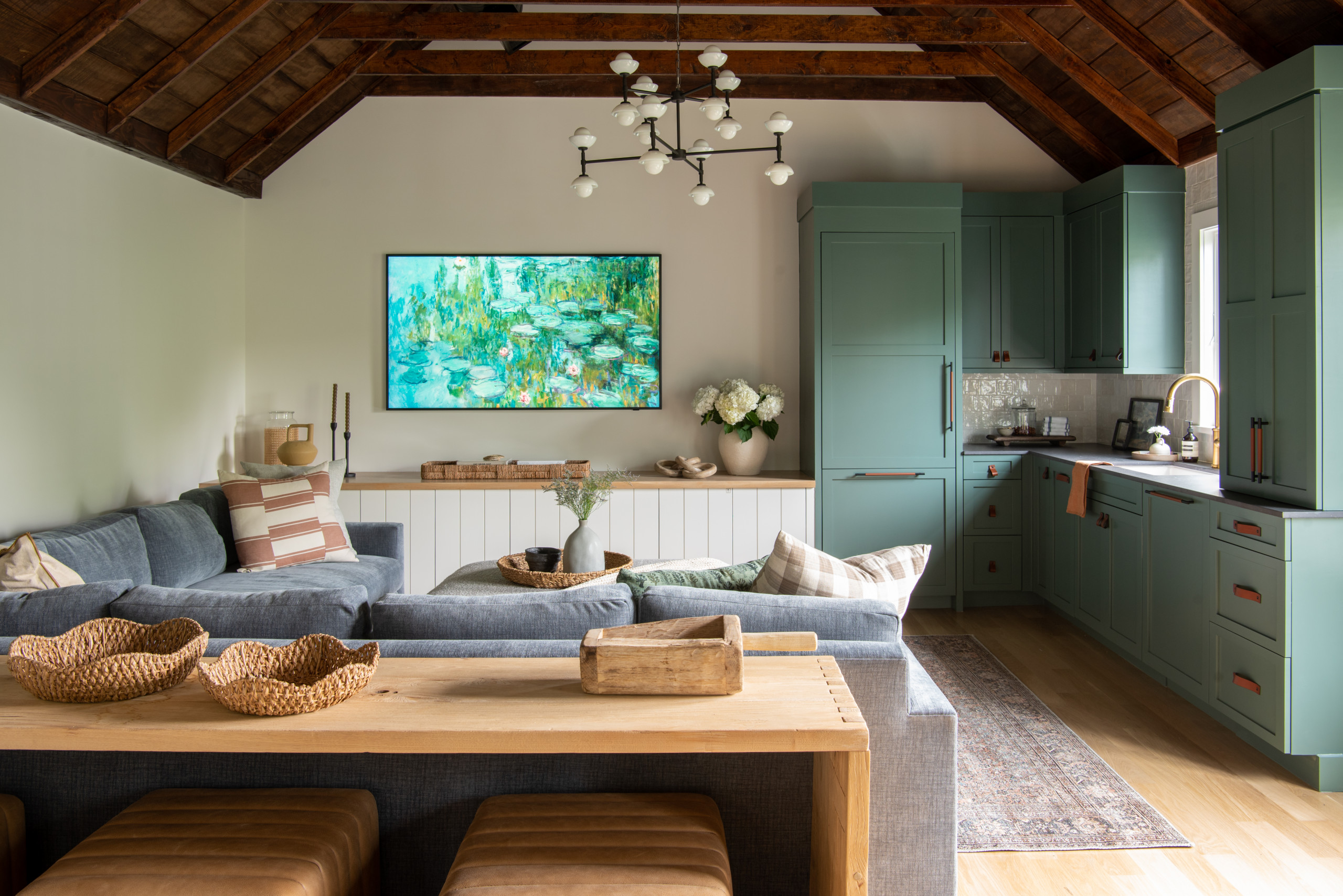
Once you’ve taken many paint swatches home, that is when you can truly decide which colors will work. As you may know, colors can look quite different in your real-life lighting than in the bright fluorescent lighting of a store.
It’s also important to consider that colors will look different relative to other hues in the room, different positions (on a wall versus on the ceiling, for example) and at different times of the day.
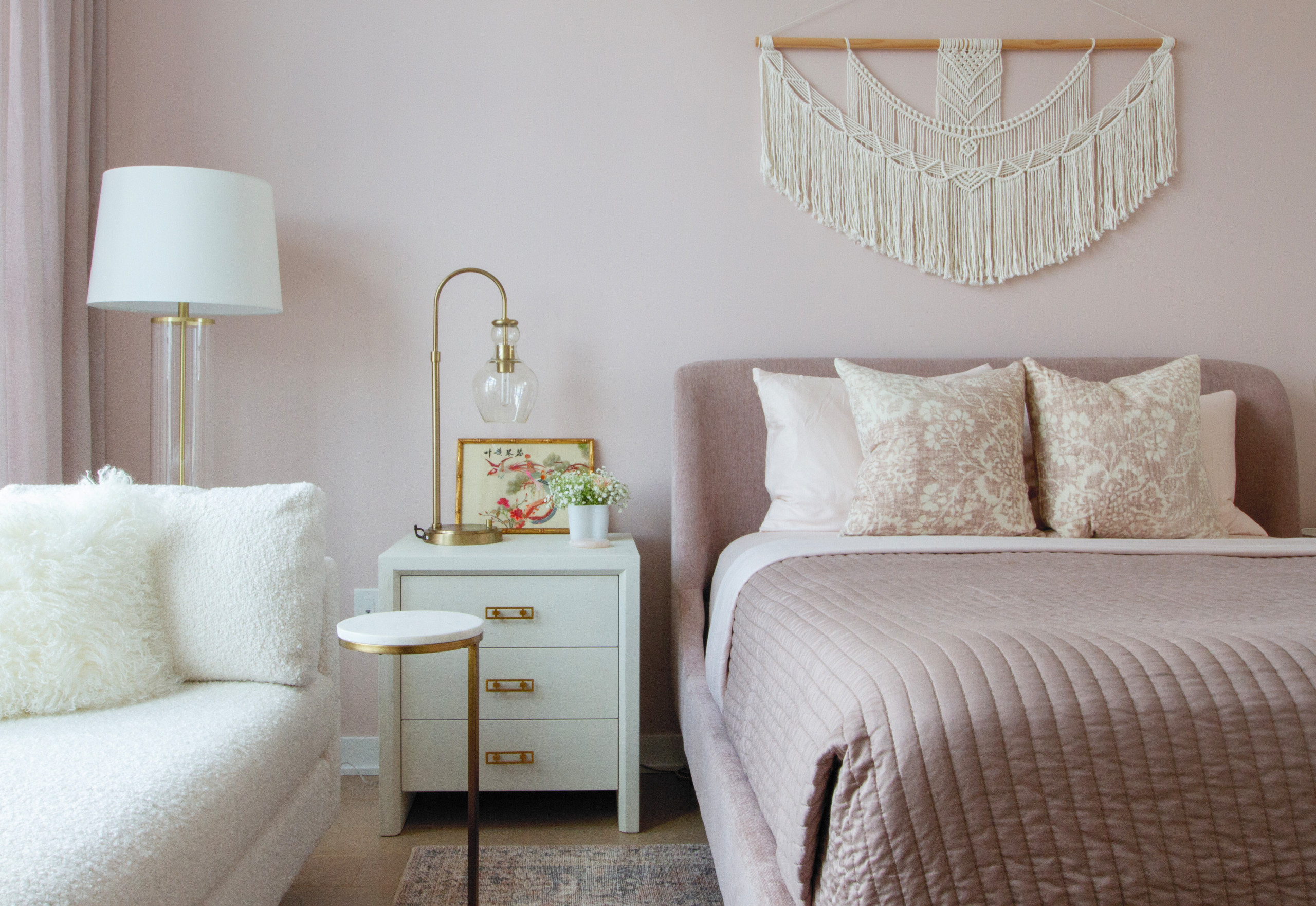 Tape paint chips to the wall where they will be applied, and view them during the time of day you will be in the room the most (for example, in the morning or evening for your bedroom). Take your time to do this with individual color swatches on their own, so each color swatch isn’t visually competing with other options.
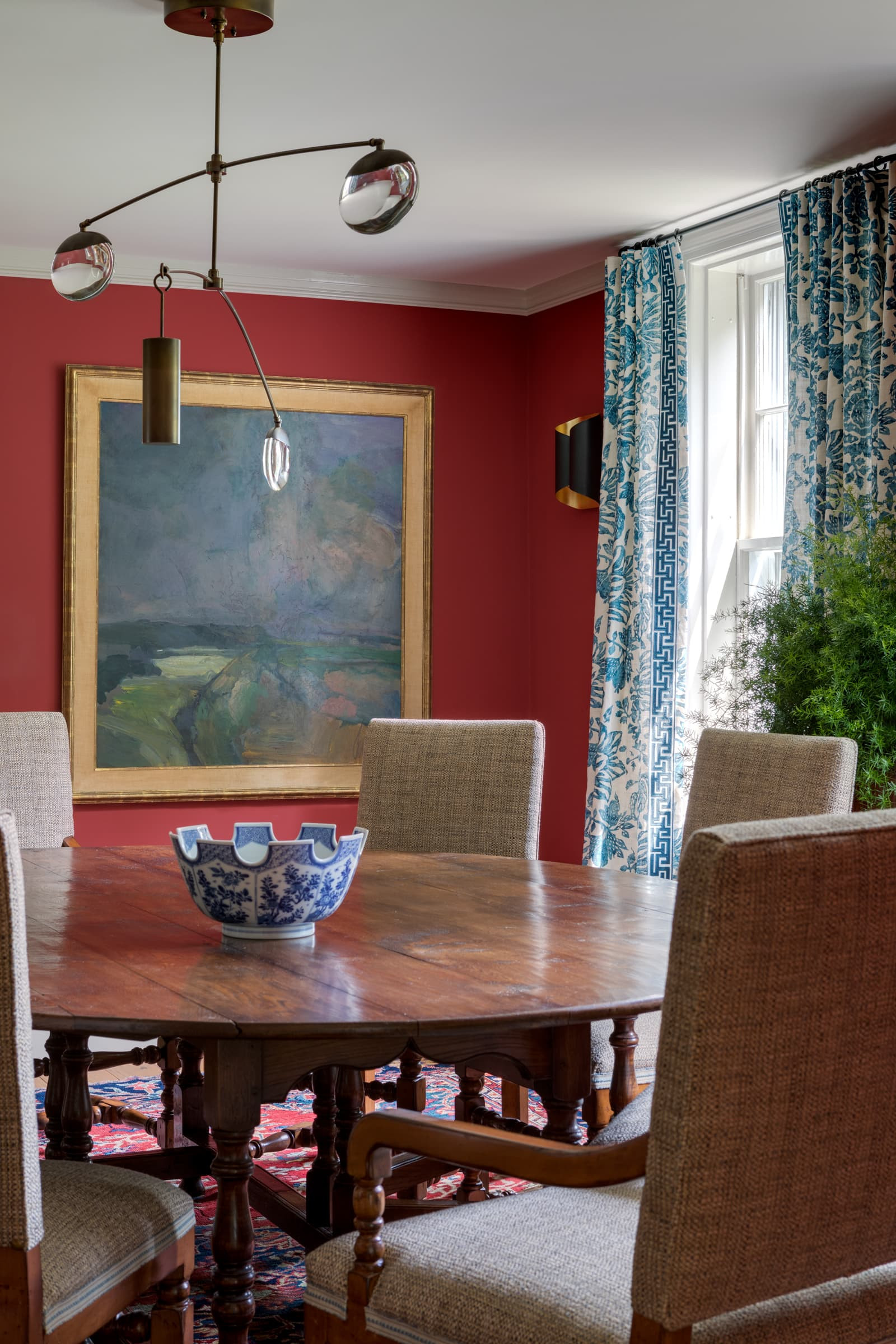
Another huge factor that can change how you perceive a paint color is the size of the swatch. No matter how carefully you look at it, a tiny paint store swatch will never fully show you what a color will look like on a full wall. For this reason, designers will often apply a “paint strike,” a large stroke of paint, directly to the wall to see how it will look in real life.
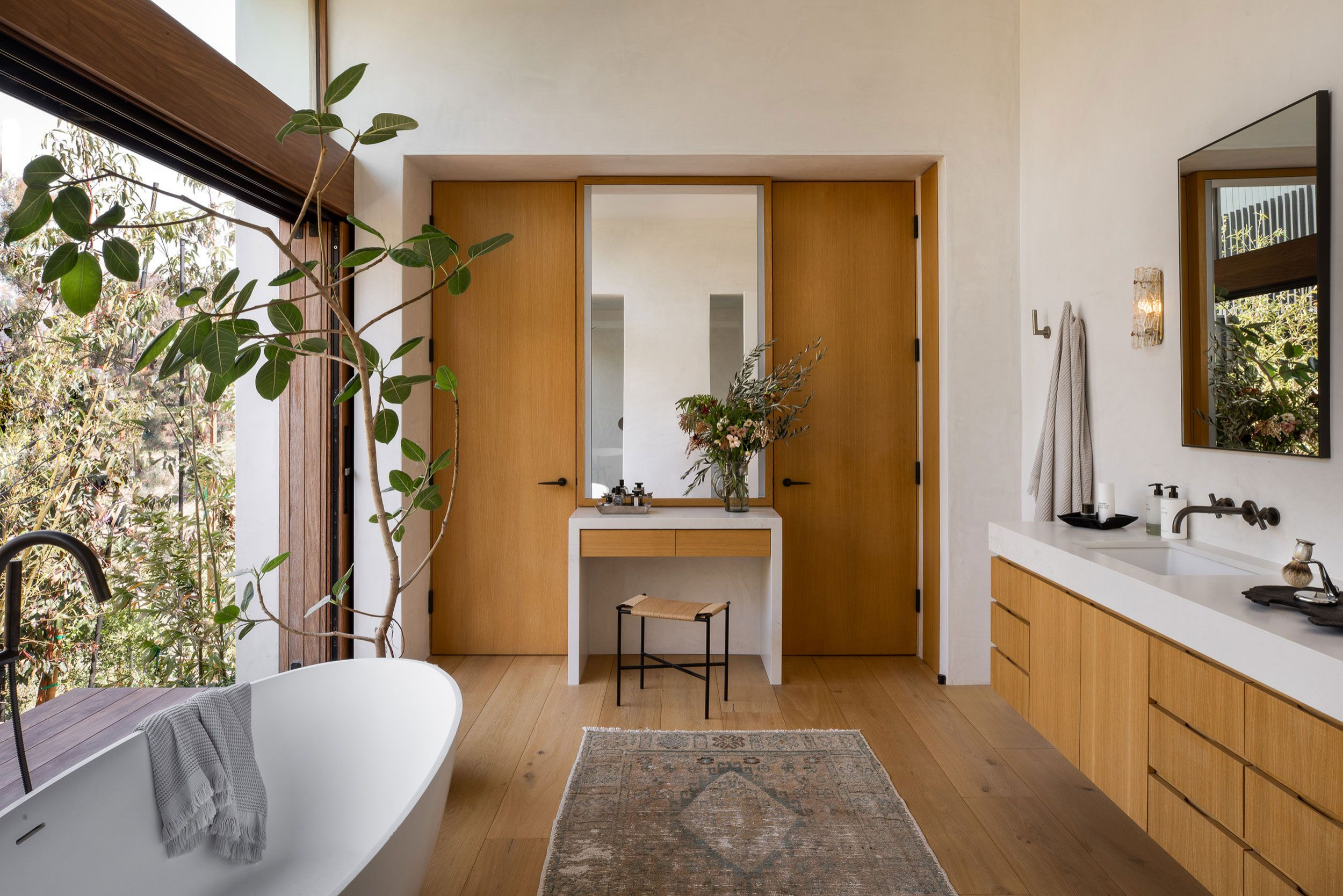 This is an effective technique for helping to compare a shortlist of colors once you’ve narrowed down your selection. It can also help you see how a single shade looks in different finishes if you’re debating between, say, eggshell or matte.
If you don’t want to have to live with messy walls for a while, you can also order large-format paint samples from many companies. It can save you a lot of money in wasted paint.
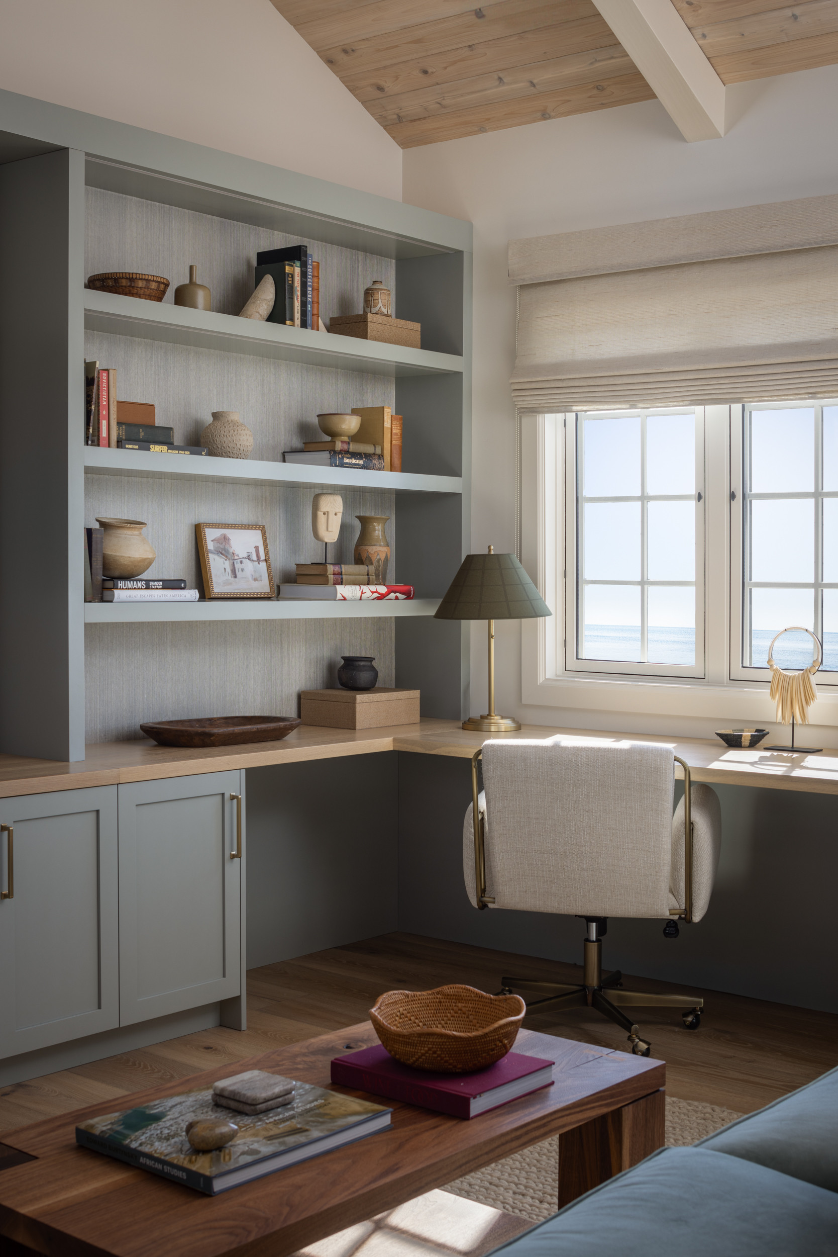
To some, painting a room, and then painting it again later to change the shade, isn’t a big deal. After all, paint is one of the relatively easier elements of a space to fix if you make a mistake.
For others, the effort and expense of repainting is a major pain. If this is you, it’s worth taking the time beforehand to really sit with a color option before taking the plunge. The more time you take to sit with the choice, the less likely you are to get swept up in a passing fad or sudden impulse.
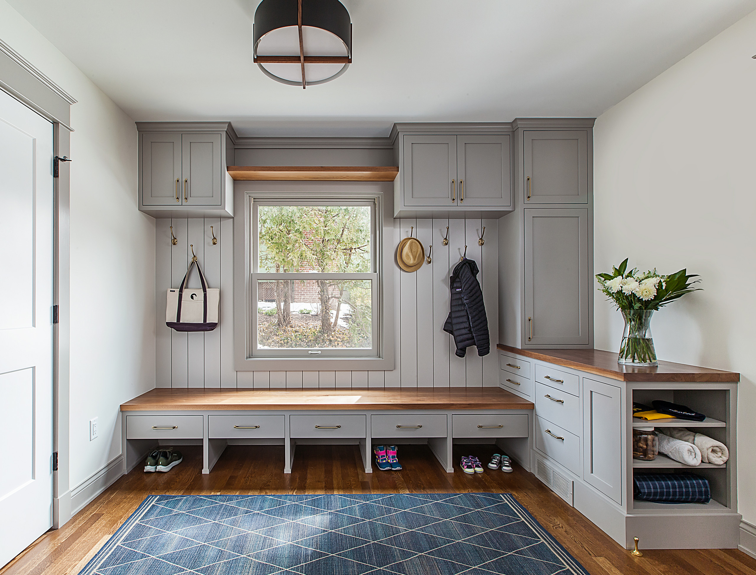
If you think you’ve settled on a favorite shade, keep a copy of the paint chip with you as go about your life. When you find yourself in a friend’s home, a cozy restaurant or another inspiring space, hold the paint chip up to nearby surfaces to see if it seems lighter or darker, brighter or more muted than colors you’re drawn to.
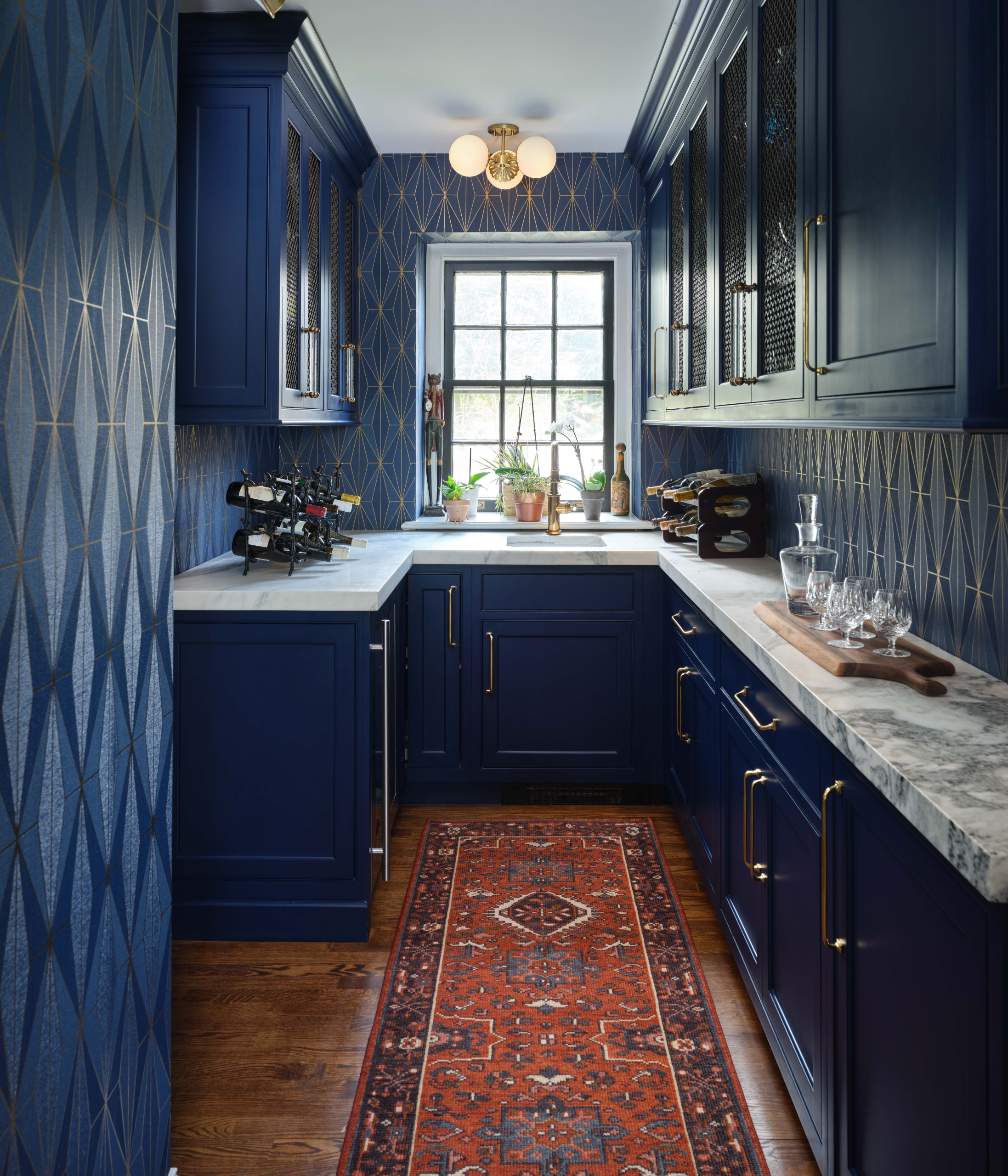 6. Make a Commitment
Once you’ve selected and purchased a paint color, it’s time to commit. Paint will look quite different during the painting process, and it is very important not to judge the color until it has been properly applied in the necessary number of coats — at least two, but often three or more, depending on the product and shade.
It’s truly wisest not to judge the color at all until at least the next day, and to give yourself some time to adjust to the change in your space before jumping to any conclusions.
This is especially true with darker shades, which will visually shrink the space in a way you will need a little time to get used to.
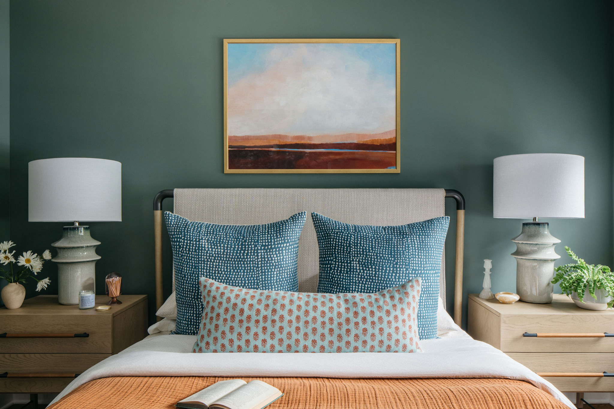 7. Get a Second Opinion
Still worried you won’t be able to live with your choice? Having a design professional come to your home for a color consultation can give you a lot of insight, especially because they will typically come armed with paint-swatch decks in every color, bringing the entire paint store to you.
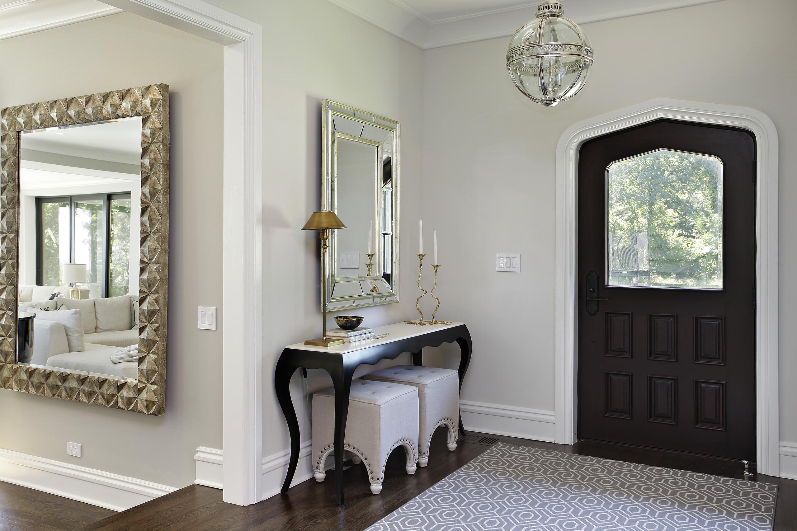
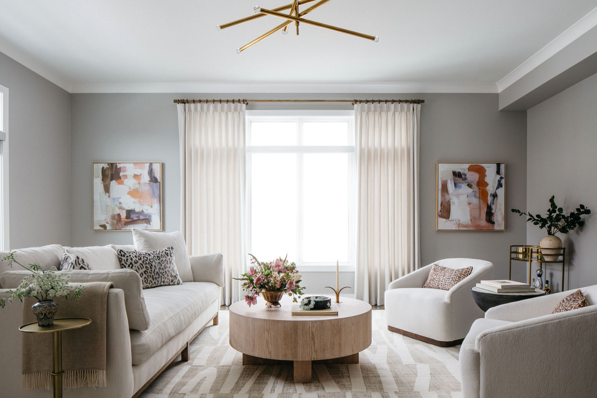
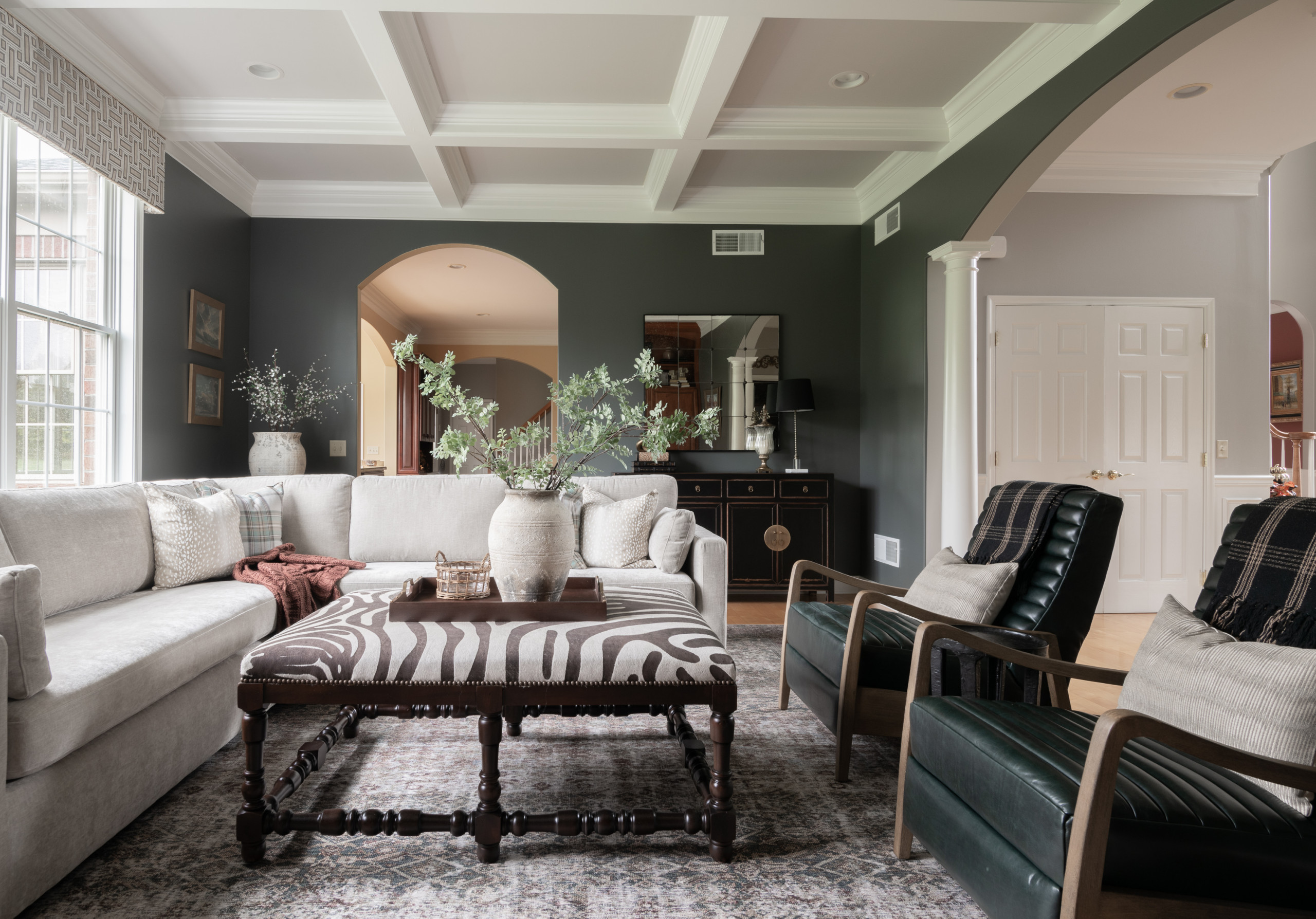
For example, I have used Benjamin Moore’s Classic Gray in a multitude of projects, because it’s sumptuous but subtle, and it always just works. It’s used here in a project by another designer.
Any artist can tell you that the more you stare at something, the harder it becomes to truly see it. Sometimes the best thing you can do while trying to choose a color is to take a break for several days and come back to your options with a fresh perspective.
When you come back, look at your selections and go with your gut. Ultimately, if you really love a color — light, dark, soft or bright — it will feel livable, so there’s no reason to choose any hue but the one that feels right to you.
Hope these 8 tips and tricks have been helpful in committing to a color you’ll love. (cited)


It’s important when you begin the process of selecting a paint color to start with a wide palette of options.
When you go to a paint store, don’t worry about choosing the best possible color while you’re in the shop. Your goal should be to arm yourself with a variety of options so you can make the best possible choice later. This usually means pulling more swatches than you think you need — and even colors you don’t think you will want.