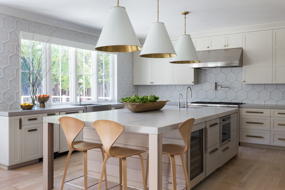
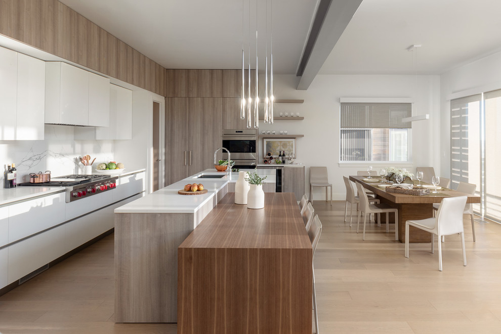
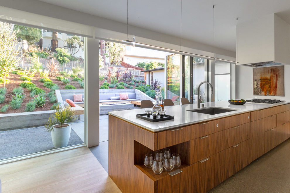
Main overall photo. The most important picture to capture is a straight horizontal shot looking to the kitchen. This establishes the kitchen layout and main features and lets people see the space in total. “There’s a calm, rested balance” to these overall horizontal shots, Livingston says.
Secondary overall shot. Your next photograph also should show the overall space, but from a different angle. “Let’s say you’re looking onto an island. You come around from a different vantage point, so you’re able to understand the circulation space and how one shot, one area, works to the next,” Livingston says.
In addition to showing the kitchen in this secondary shot, you might also include glimpses of a hallway or room leading into the space. This will help create a feeling of taking a tour through the space.
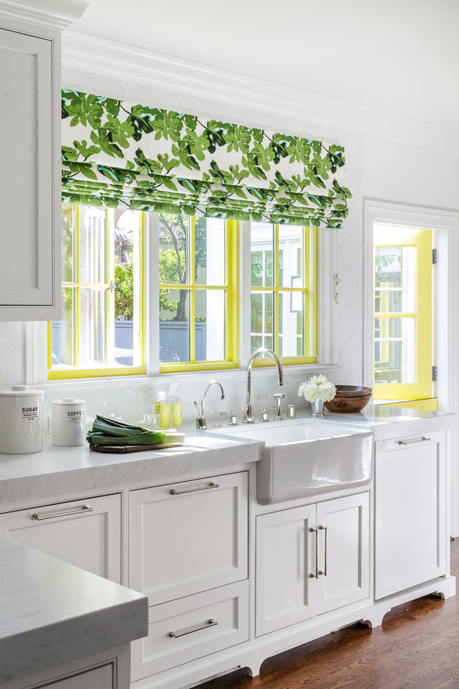
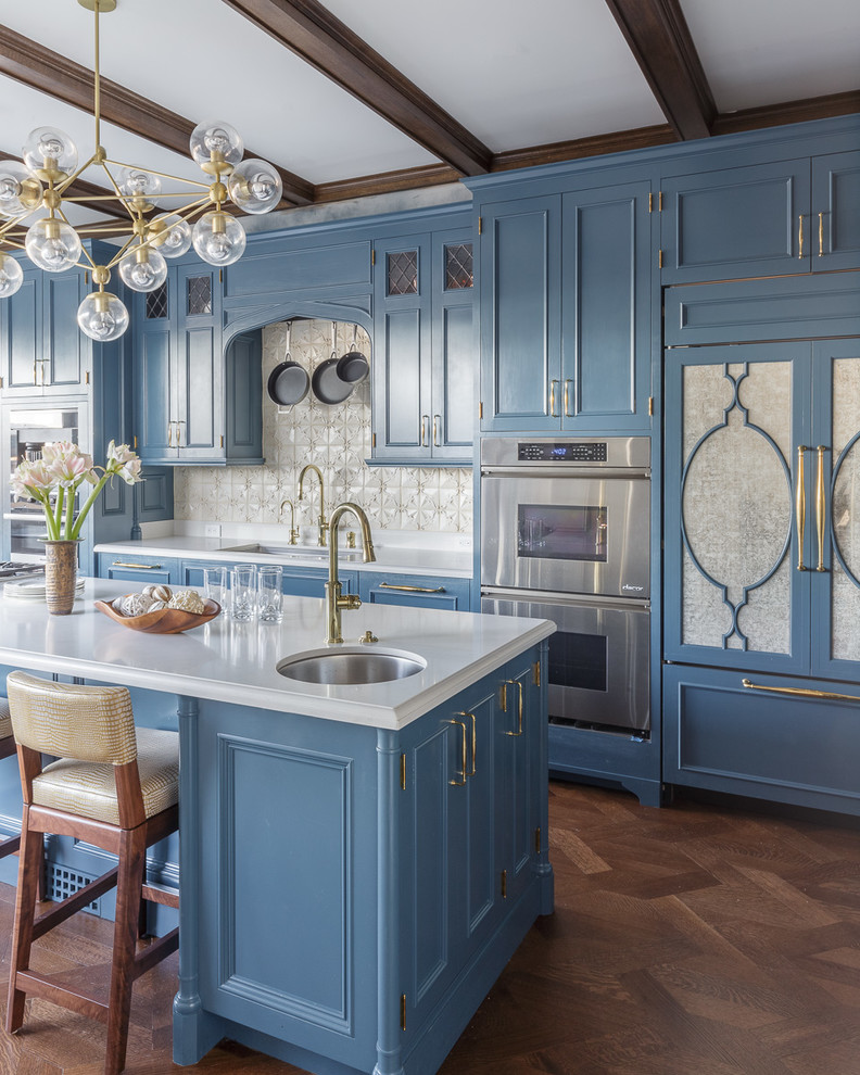
Sink area shot. One of your close-ups should be of the sink area, a focal point of many kitchens. Many sinks have windows above them. This view of the outdoors beyond the kitchen “gives the viewer a light sense of airiness and freshness and can be very inviting,” Livingston says.
Eating area photo. If there’s a dedicated eating area, not just an island or a peninsula counter, you’ll want to photograph this as well.
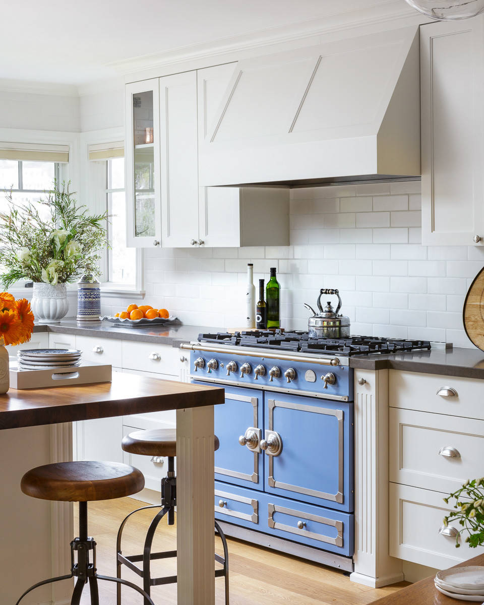 Florence Livingston Interiors, LLC
Compose the Shots
Designers create a mix of materials, interior architecture and palette in their work, Livingston says, and he tries to compose photographs that capture this “collage of elements.” It’s an intentional way of photographing, very different from taking a snapshot.
Before shooting a single photograph, or even styling a room and adding props, Livingston will spend 30 minutes just looking at the space and trying to understand its design. He will look at it from different angles to think about how each photo should be composed. “When I walk through a space, I see what the compositions could be,” he says.
Only then does he start styling the space and adding props. As he’s doing that, he continues to walk through the room to see how all the styling and props would look in each of his photo compositions, as well as how all the elements relate to one another. Because once you’ve started shooting, you don’t want to change your styling or move your props around.
“You need to think all that through and make sure there’s continuity from one shot to another,” he says. “Sometimes you’ll get yourself in a trap where you’ll have styled something in some position that in another shot isn’t working well for you.” After he’s double-checked the angles, he will then start shooting.
Choose the Right Props
Livingston suggests selecting an overall color for your props, and keeping them simple. You should work with the materials in the space and with the architecture, and select a palette that you layer into the shots.
Props can add a welcoming and homey touch to your photos, but you don’t want them to grandstand. Simple white tulips often are better than a full mixed bouquet.
“A number of years ago, there was a real fullness and over-the-top layeredness” to styling elements, he says. “But now it’s getting leaner.” He attributed this change not only to an embrace of modern design but also to the fact that so many people are looking at photos in a small format on their smartphones.
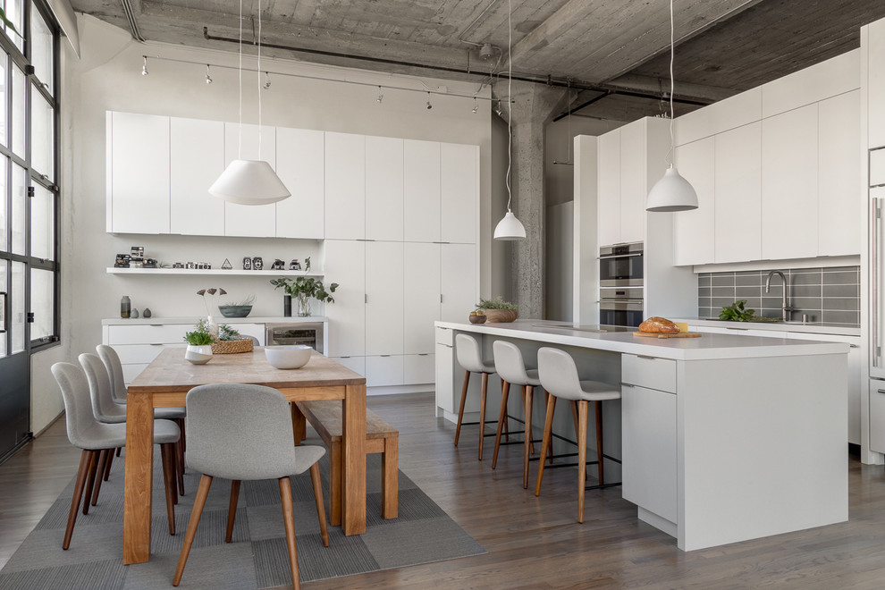
Livingston says he often uses props to create a relationship between the top and bottom of a photo, and he draws the viewer’s eye around the room by repeating colors, shapes and materials in the accessories. “There’s a dialogue that goes on between these spaces,” he says. “When I have kitchen pendants, I prop underneath them. If it’s all glass up there, then I might have some glass vessels or a stack of wineglasses [below].”
In this photo, he connected the white island countertop on the right and the wooden table on the left by placing wood accessories on the countertop and white ceramic accessories on the table.
The photographer suggests choosing trending props. You can find out what those props are by looking at what others are using in their photographs. You want your props to be with the trends or a little ahead of them, but certainly not behind them, he says.
Get in Sync With Your Photographer
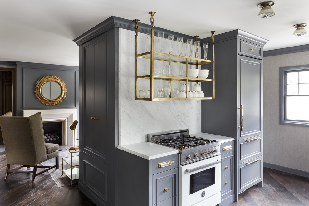
Livingston recommends being prepared when working with a photographer. “Some of my clients make a PDF of all the styling elements that they’re going to be bringing, just as they would do a mood board for a presentation.” He says this also can be helpful when working with a photographer who doesn’t have as much experience shooting interiors as it can help him or her see where you are going.
You can bring and place your props, but then you should be flexible in working with the photographer, because the angles and the placement of the camera will change how the props look in the photos. “With a wide-angle lens, things that are close to you look really big, and things really big that are far away can get really tiny.” So it helps to understand how things like that can affect your photos.
The exciting thing about publishing photographs digitally today, he said, is that you can see exactly what people are responding to. “We never had these metrics before. But now we can get that instant feedback.”


High-quality residential photography involves more than setting up a tripod, adjusting camera settings and shooting. There’s both an art and a science to capturing images that make a room look its best. Livingston outlines how you and your photographer need to plan your shots, compose the photographs, choose the props and work together to highlight elements you want people to notice.