“Their work is very stressful and they were having their first baby. The goal here was zen,” Glaister says. This meant an uncluttered, clean-lined look, an organic feel and warm contemporary style. It also meant laying out the house for the way they lived. The importance of the kitchen to the couple was the biggest influence on the way Glaister reconfigured the first floor. It would truly serve as the heart of their new home.
 Wendy Glaister Interiors
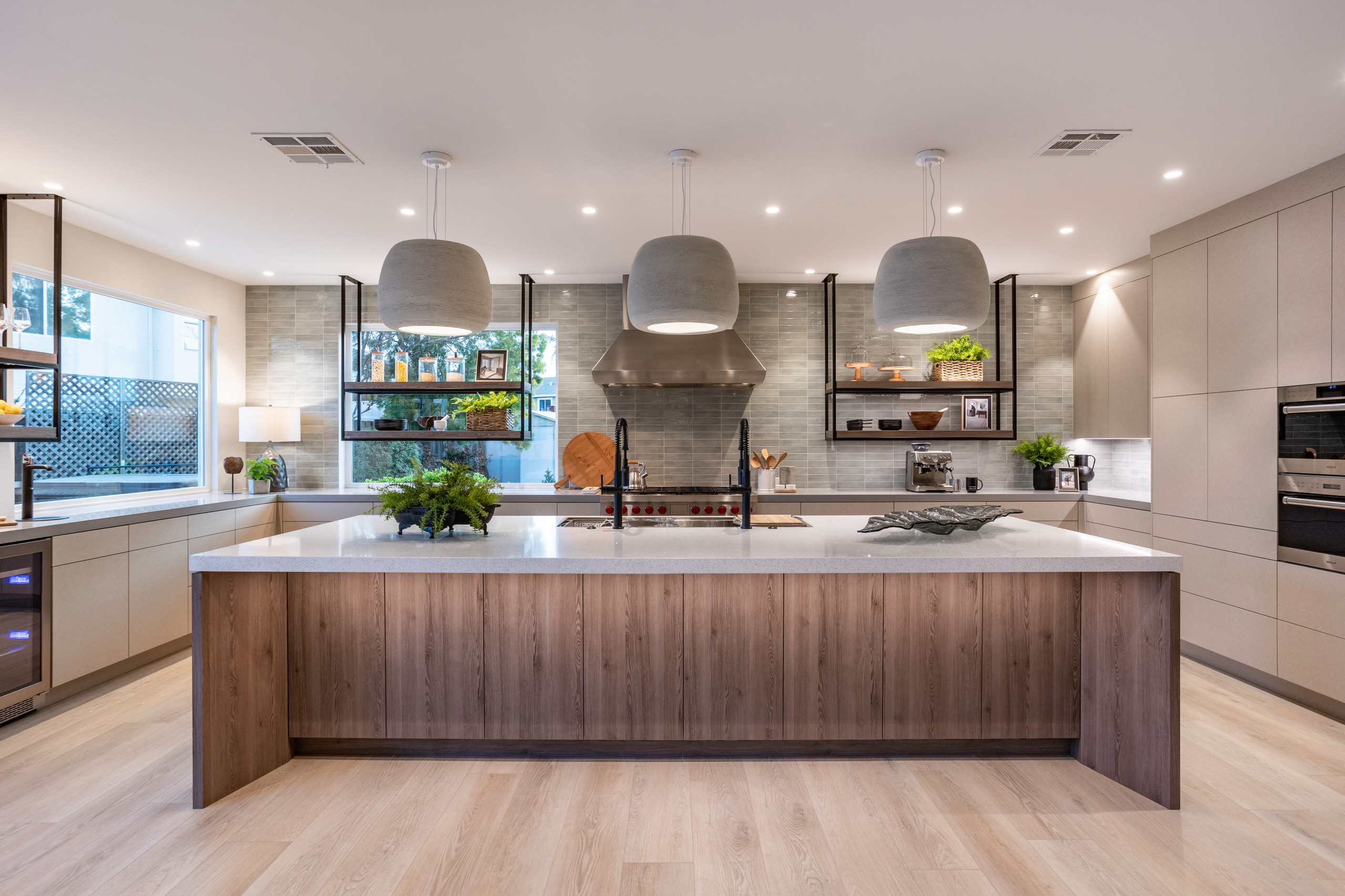
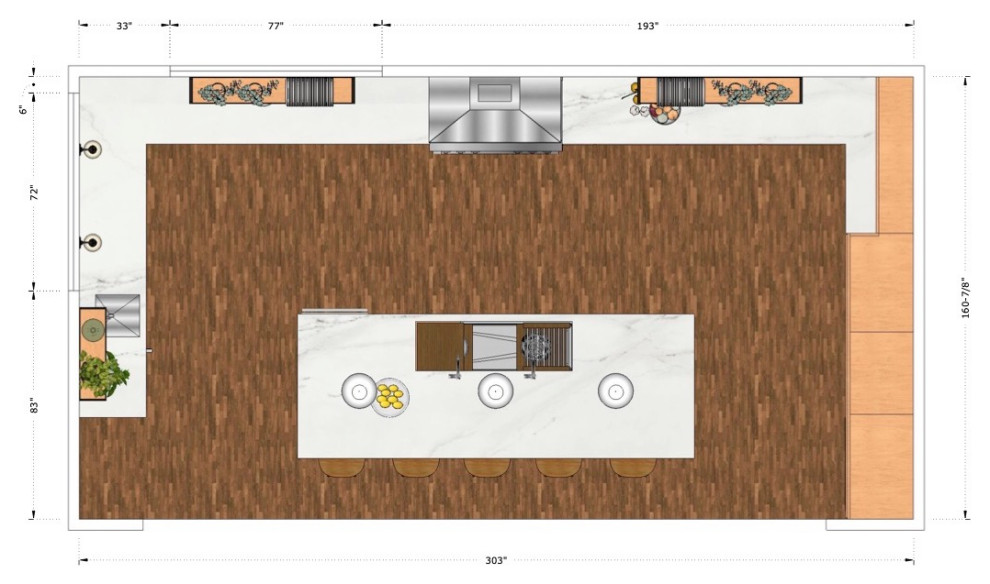
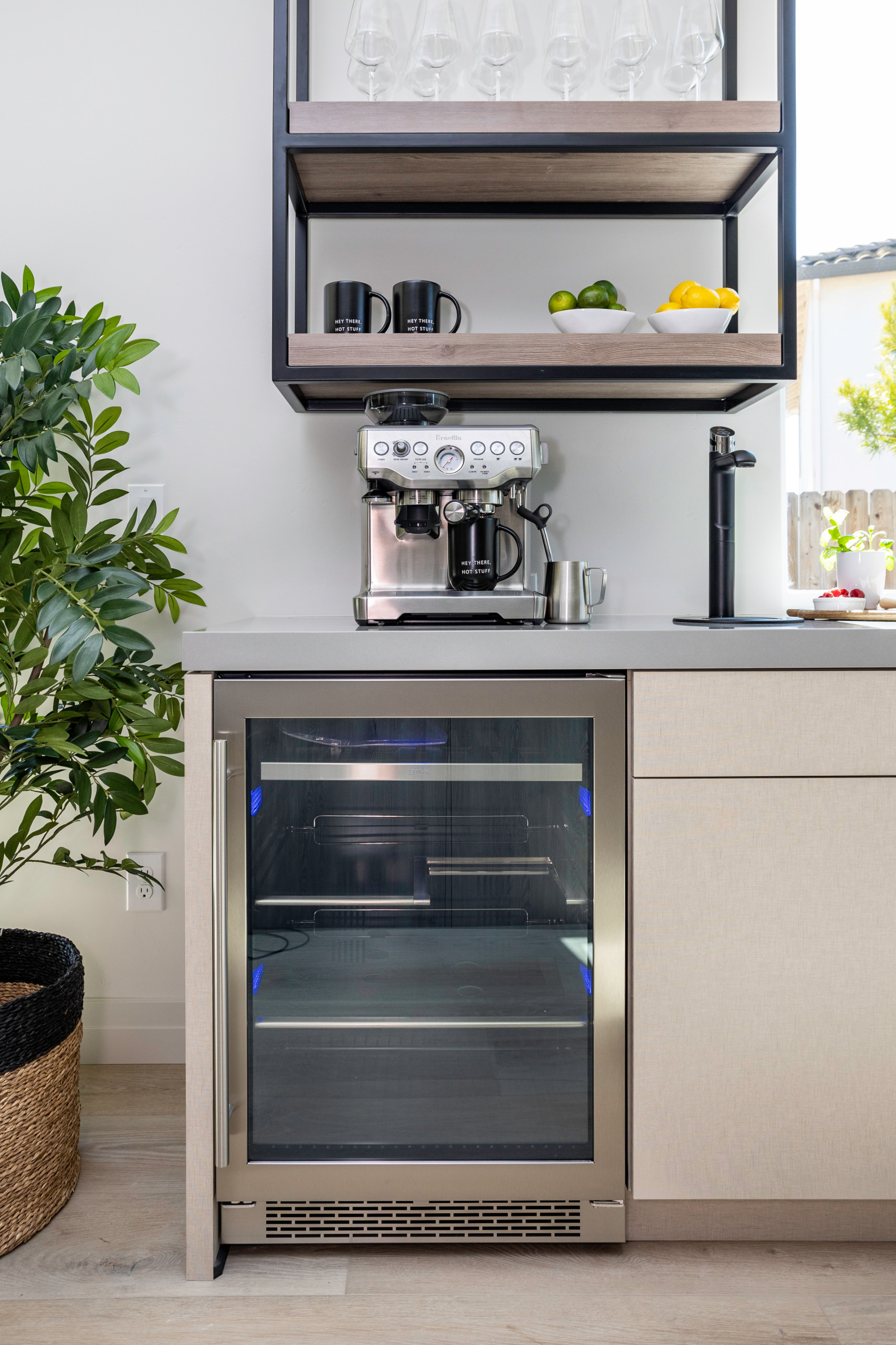
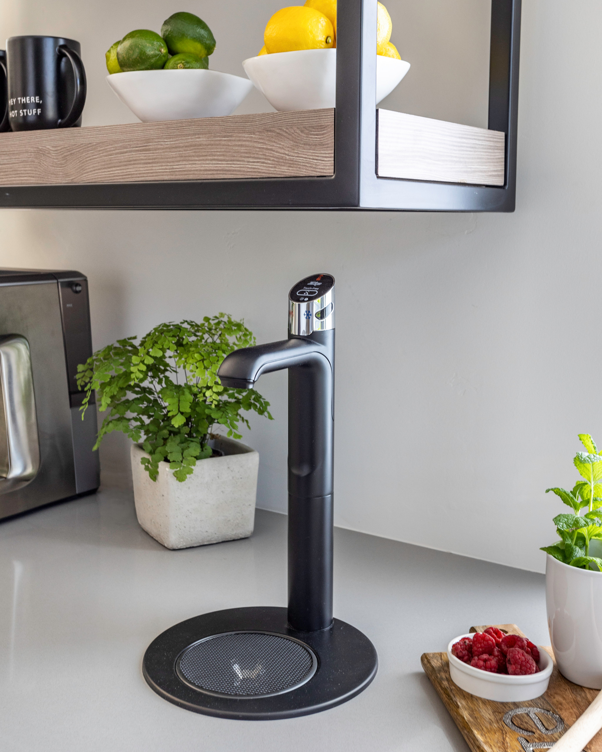
The layout of the kitchen is U-shaped and zoned. The left side has a beverage station and lots of countertop workspace. Glaister centered the main cooking area on the back wall. “We flanked the Wolf range with pullouts that contain the utensils, oils and spices needed for cooking there,” she says. “The range area is the command center for the kitchen, and this is the husband’s favorite spot.”
The wife’s favorite area is the baking station. Located on the right side of the kitchen, it contains a dedicated baking pantry and a lift for the KitchenAid stand mixer. The right side of the kitchen also has a run of floor-to-ceiling cabinets for pantry storage. The fridge is located along this wall.
 Wendy Glaister Interiors
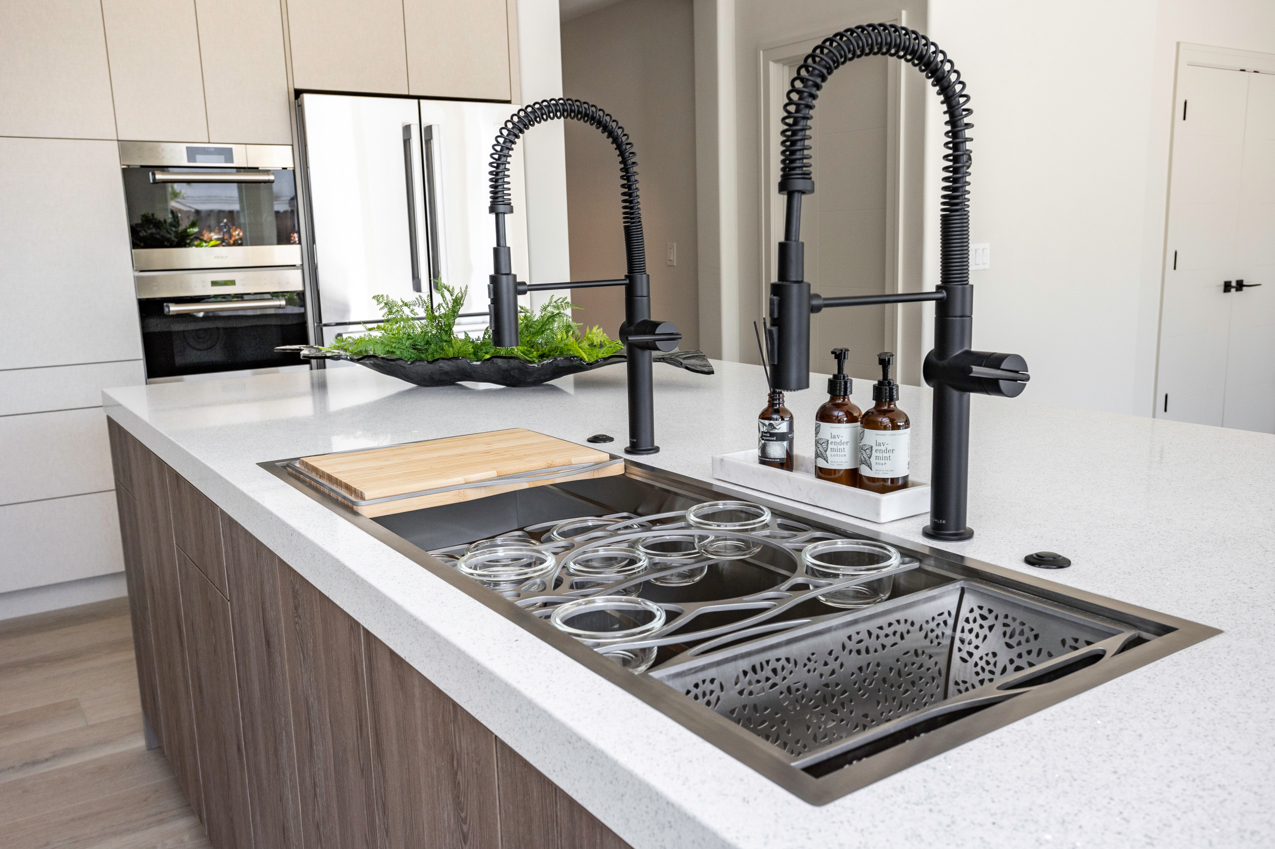
The flush-inset workstation sink is 5 feet long, has two faucets with pull-down sprayers and a variety of inserts for prep, including a colander and cutting board. The island’s base cabinets include a dishwasher on the left and a pullout trash and recycling cabinet and microwave drawer on the right.
The look of the cabinetry is sleek and uncluttered by hardware. Glaister used touch-latch cabinet hardware to maintain the clean-lined look.
Workstation sink: Mila
 Wendy Glaister Interiors
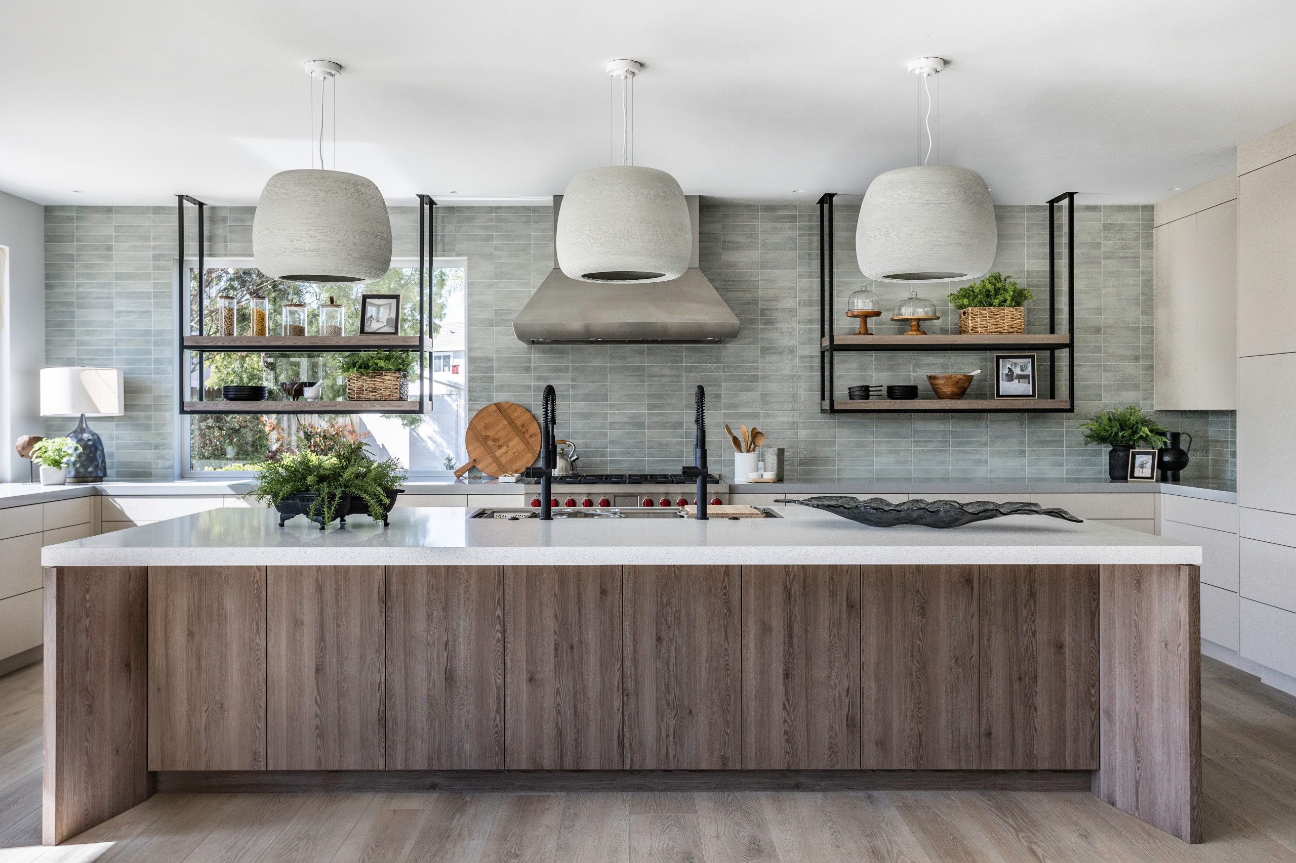
For example, when lots of family members are working together, someone might be standing at the sink prepping while another works at the range, and someone else might want to scoot in between them. Accordingly, Glaister left a generous 52 inches between the island and the perimeter countertops. By comparison, the bare minimum recommendation between these areas is 36 inches, while 42 to 48 inches is recommended by kitchen design experts. This is a good example of listening to clients about the ways they function in the kitchen and designing for their specific needs.
 Wendy Glaister Interiors
Symmetry was also important for creating calm, and it was important to the homeowners. With the window on the left throwing off the symmetry of the range wall, Glaister had to find a way to rebalance things.
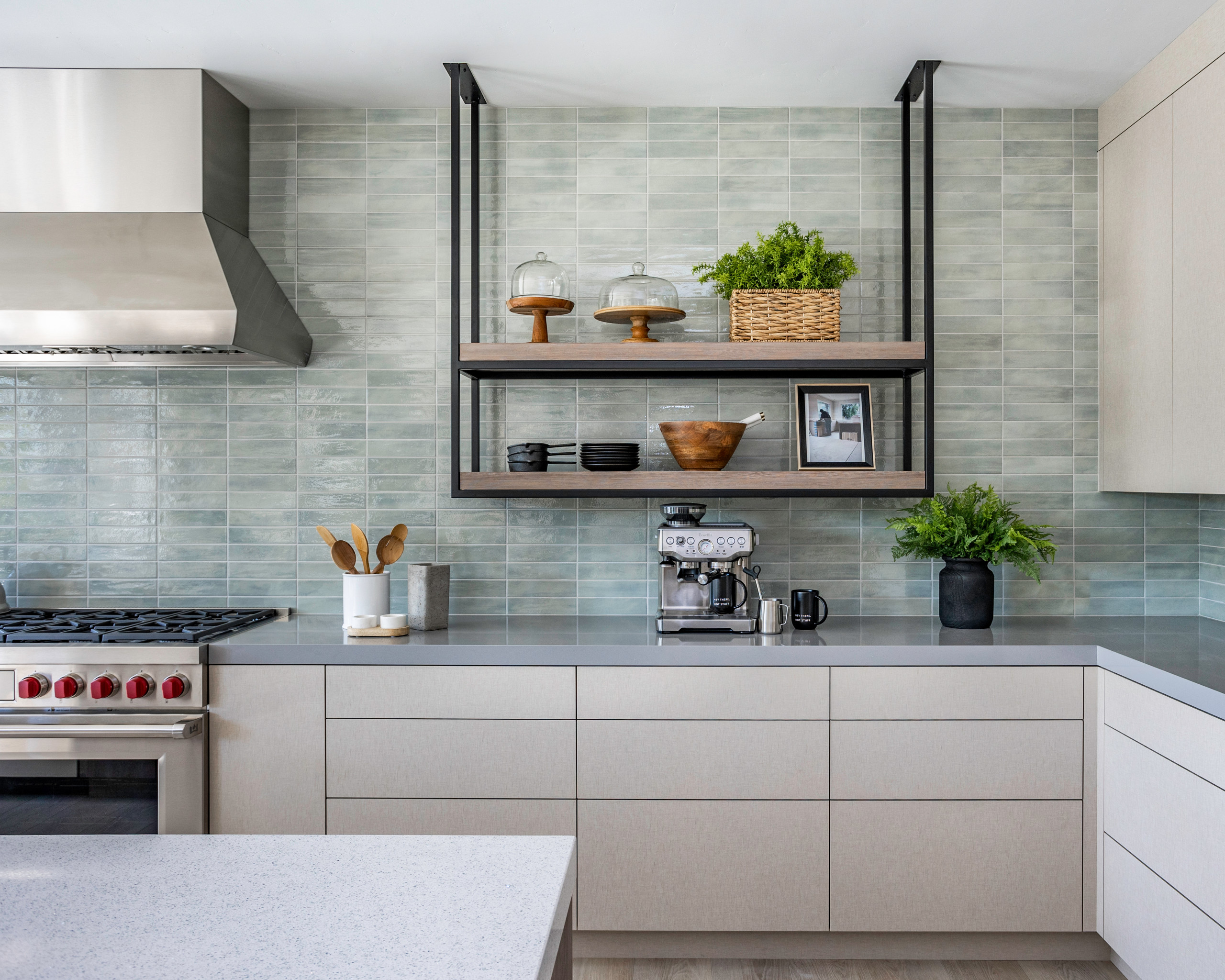
“I knew I needed to bring in symmetry in an architectural way,” she says. She balanced custom metal and wood shelves on either side of the vent hood. These shelves and the spacing of the three pendant lights over the island lend a strong sense of symmetry.
Counters: Silestone by Cosentino, fabricated by Jim Hulstrom of Purestone; tile installation: Jason Parris of Parris Tile & Stone; lighting: Phillips Lighting & Home
 Wendy Glaister Interiors
Lights inside the metal rods provide light above and below the top shelves and from beneath the bottom shelves to the countertops.
Glaister also added subtle texture to the design. The perimeter cabinets are a veneer with a linen texture. “Kitchens, with all their glass, tile and stone, can feel cold awfully quickly if you aren’t careful,” Glaister says. “I needed something that would keep the contemporary style from leaning too sterile.”
 Wendy Glaister Interiors
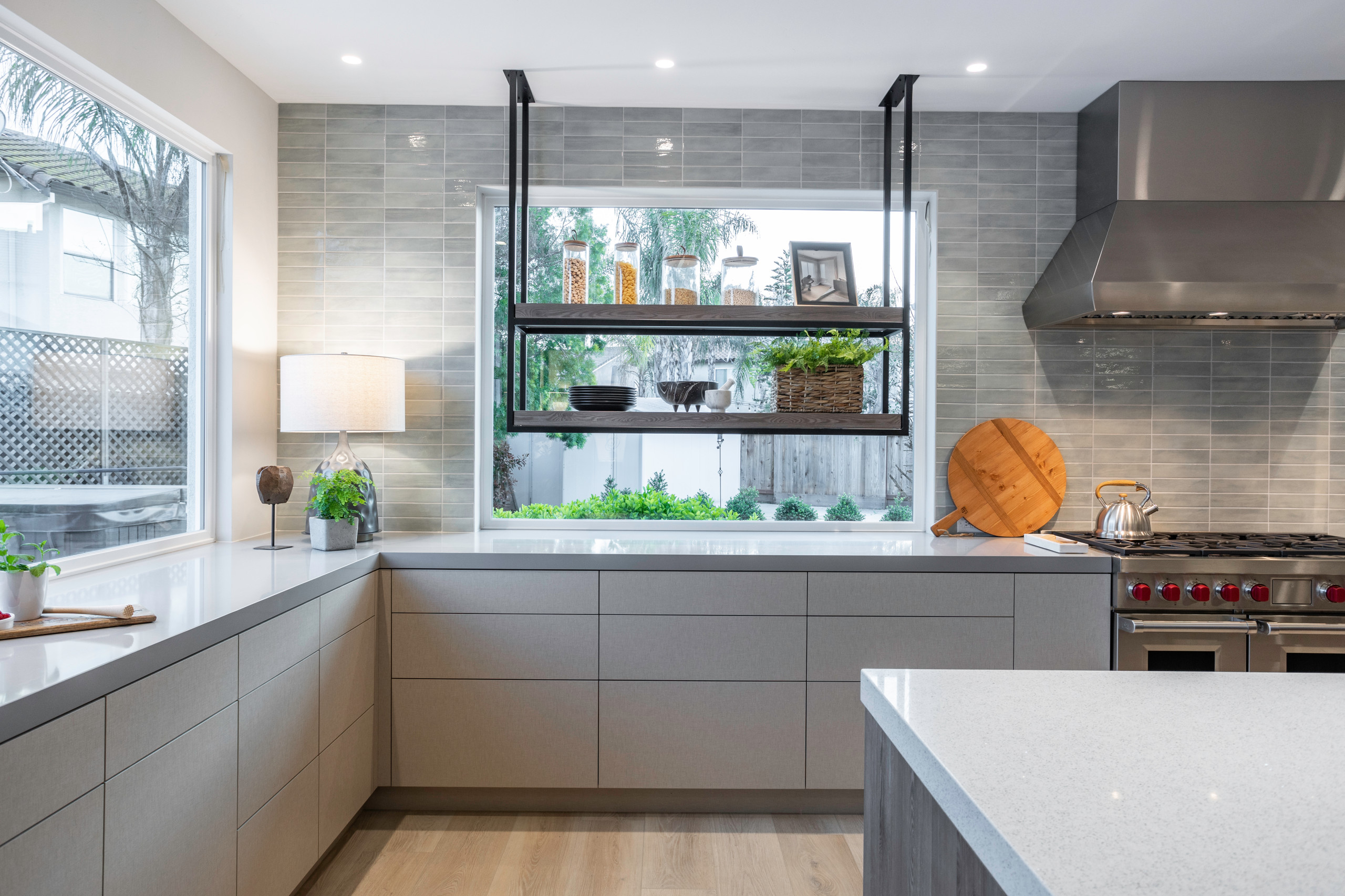
The counters run right into the window frames, providing the clean lines the homeowners love. “This also draws the eye outside and gives more visual access to the yard,” Glaister says.
The left side of the kitchen has another large picture window. Glaister brought in one of her favorite collaborators, landscape designer Mary Dewing, to create a seamless look between indoors and out. “This was a very important part of the renovations,” Glaister says. “We have gigantic windows and 16-foot sliding glass doors in here, so the landscape had to jibe with the kitchen.” This part of the project was in progress when these photos were taken.
Windows and doors: Ultra series, Milgard Windows & Doors, All American Glass
 Wendy Glaister Interiors
 Wendy Glaister Interiors
 Wendy Glaister Interiors
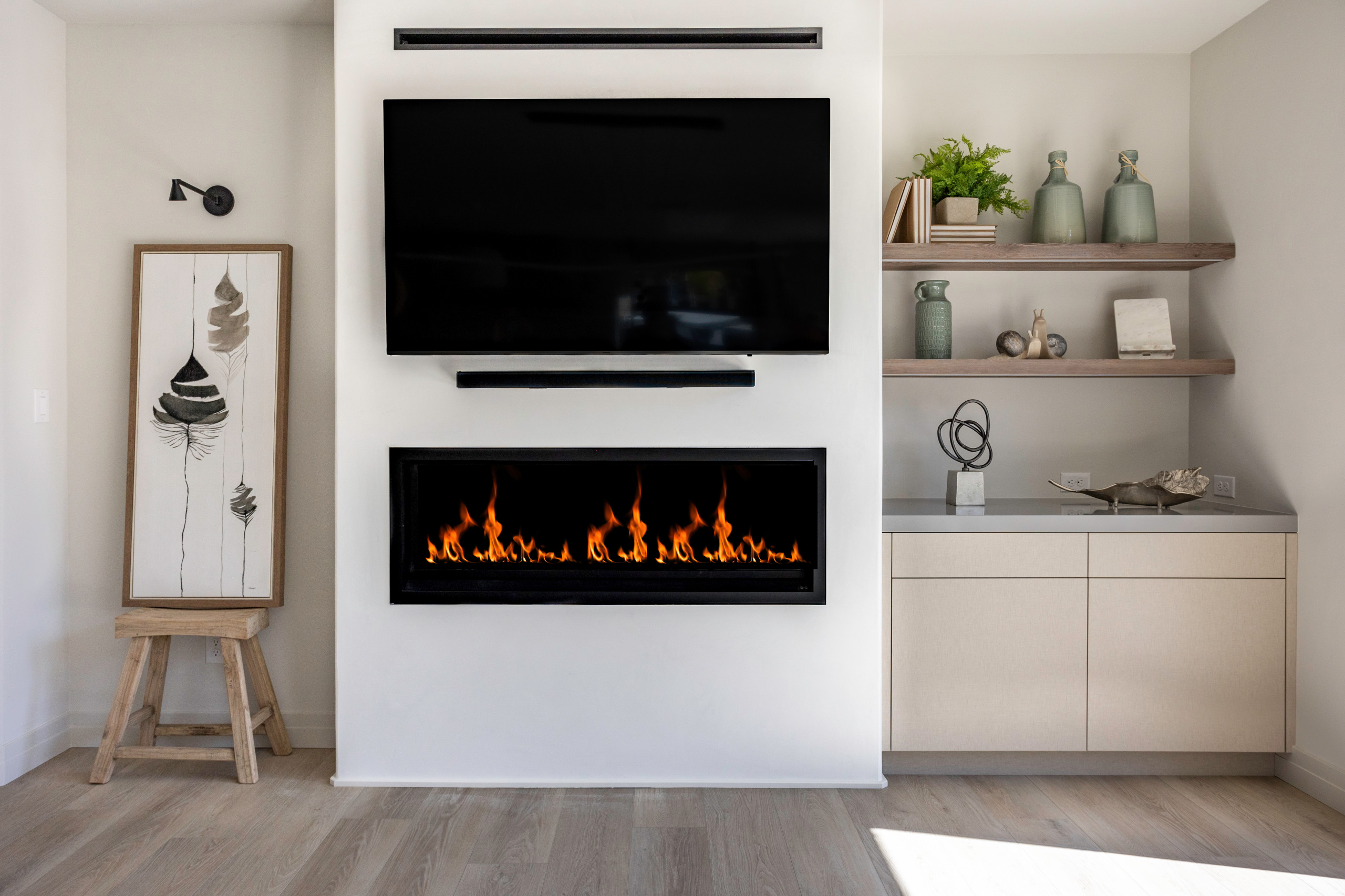
She designed a dining table that could seat 10 between this area and the working end of the kitchen. The table is a custom design and wasn’t finished by photo shoot day. “I also got them 10 really comfy upholstered chairs for the dining table,” Glaister says. “They can sit and visit at that table and be cozy by the fire for hours. Plus, there’s room for six more to sit at the island, so a large group can gather together in here.”
Flooring: Pikes Peak by Paradigm, House of Carpets
 Wendy Glaister Interiors
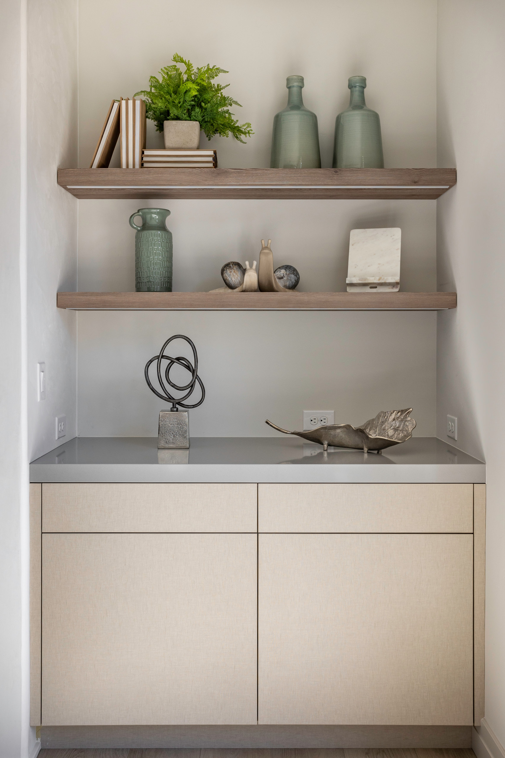
She tied this area to the working end of the kitchen by using the same white oak shelves, Silestone countertop and textured linen cabinet veneers. The shelves have integrated lights beneath them.
The couple’s baby was born just before they moved into their newly renovated home. Now when they return after a long day of work, they’re met with a calming atmosphere where they can unwind and enjoy family life. They also enjoy getting together with extended family, cooking favorite dishes and visiting with them for hours in their beautiful new kitchen and dining space. (cited)


Kitchen at a Glance
Who lives here: Two doctors and their baby
Location: Ripon, California
Size: 750 square feet (70 square meters)
Designer: Wendy Glaister
Contractor: Dean Adkins of Adkins Construction
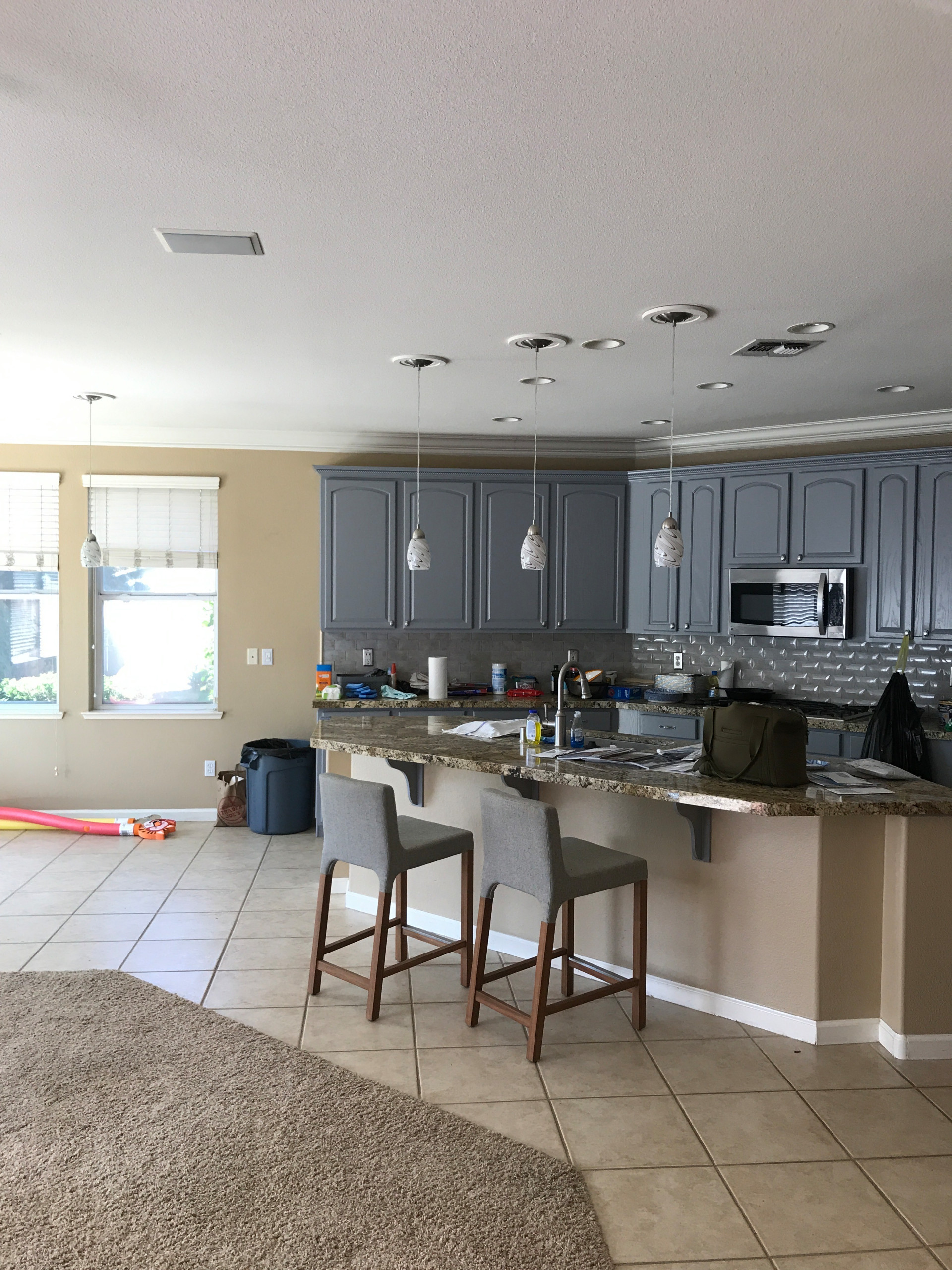
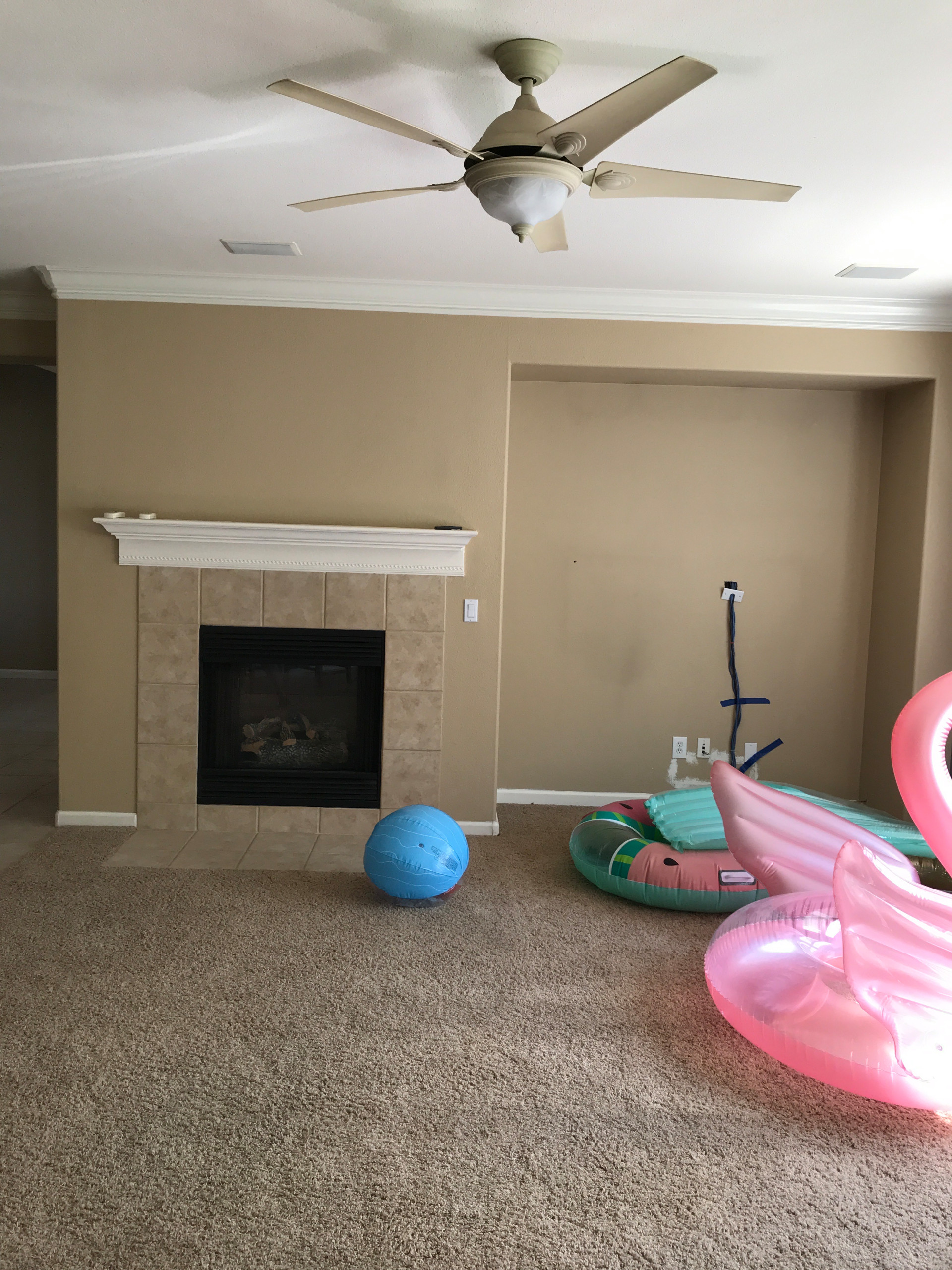
Before: The kitchen was part of an open floor plan that included the formal dining space and family room. It was shoved off to the side and crammed into a corner of the great room. Also, the wall on the right was angled because there was a hot water heater behind it.
After her first hourlong initial consultation with the couple, Glaister found inspiration photos on Houzz to present during her first design summary meeting with them. This helped her affirm her sense of the warm, contemporary style they found calming. She tracked the hours her firm spent on the project using Houzz Pro software.
“This couple loves to entertain and spend time with extended family, and they love to do it in the kitchen,” Glaister says. “They are Chinese and have strong culinary cultural traditions. They like to get the whole family working together in the kitchen, and their existing kitchen was way too small for that.” She expanded the kitchen’s footprint, creating zones for cooking, prep, baking, serving beverages, hanging out and gathering for meals.