 Riemer Kitchens & Fine Cabinetry
 Riemer Kitchens & Fine Cabinetry
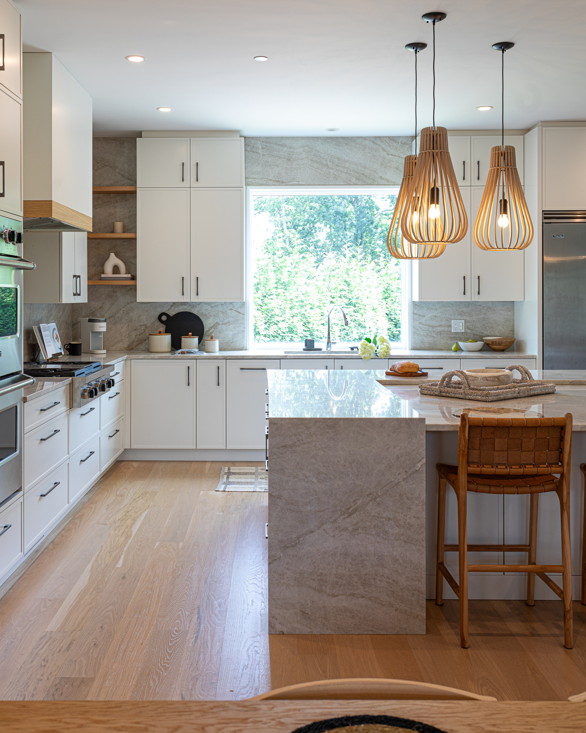
Designer tip. “Increase the height of a window when increasing the width is not an option,” Riemer says. “This brought in a great deal more natural light.”
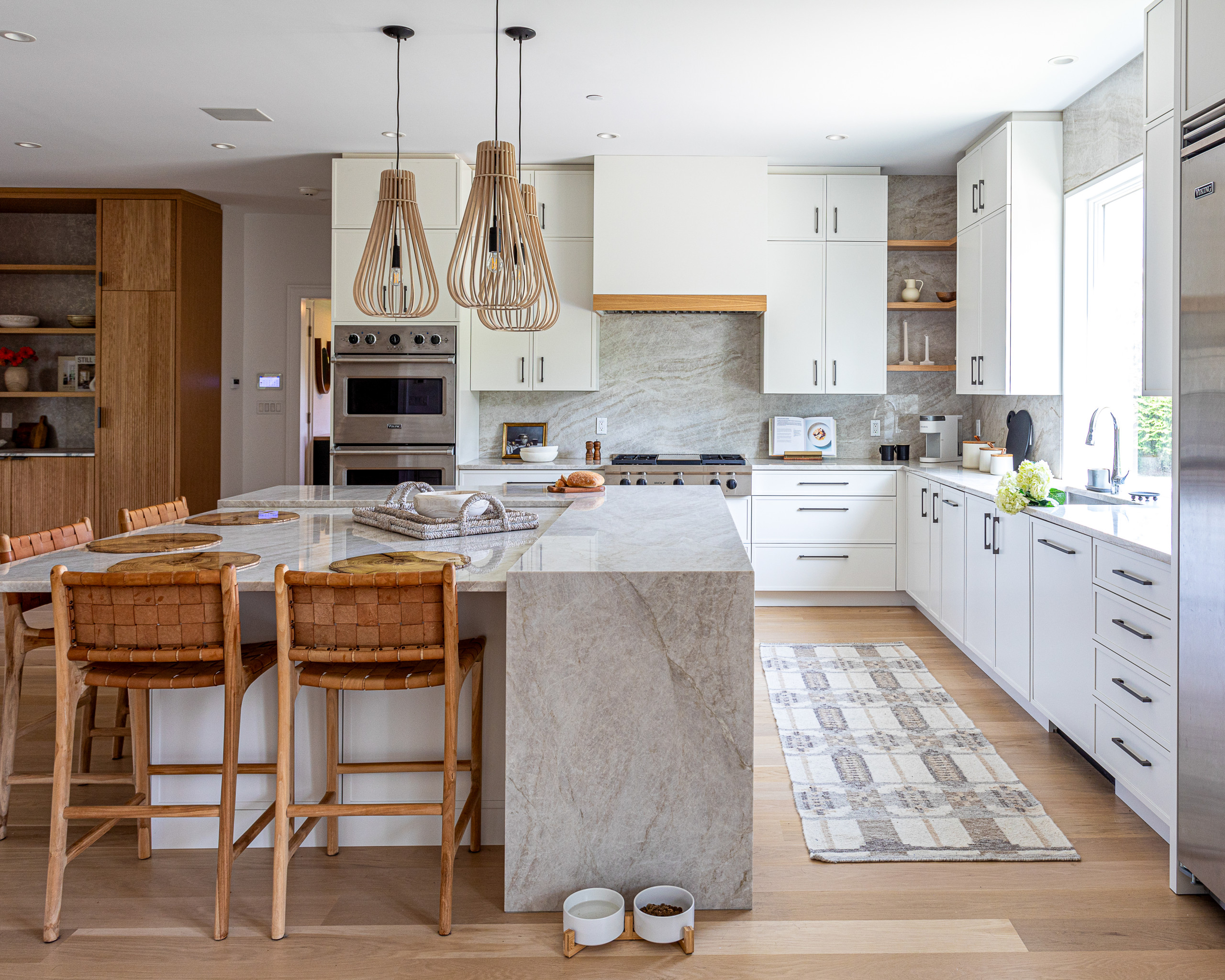
“Uh-oh” moment. “The island was enlarged to accommodate the client’s needs, but the material for the counter did not come in a big enough slab,” Riemer says. “Instead of seaming together two slabs, the seating area was dropped in height 1 inch, creating a distinct and purposeful demarcation.”
 Lemon Grass Interior Architecture
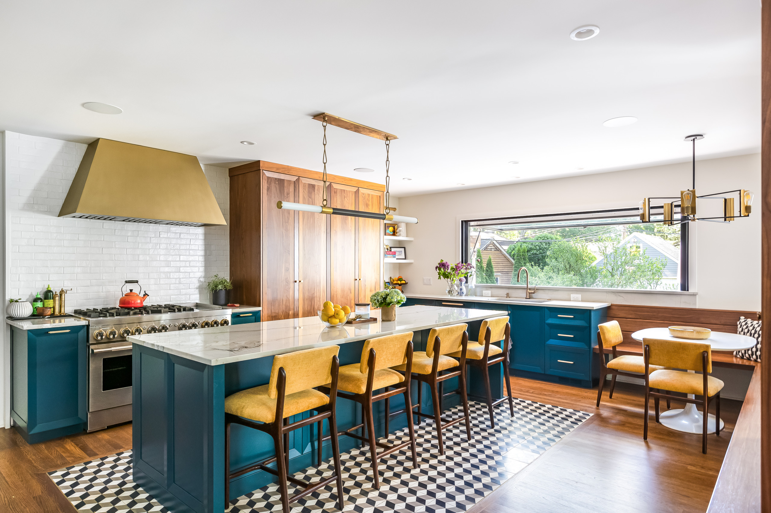
Designer: Martina Servos of Lemon Grass Interior Architecture
Location: Glen Ridge, New Jersey
Size: 408 square feet (38 square meters); 17 by 24 feet
Homeowners’ request. “My clients like to cook, they are family people and love to entertain,” designer Martina Servos says. “This is an addition. We bumped out the space to turn the old galley kitchen into a ‘real’ kitchen with an island, emphasized the connection to the family room by widening the opening and installed the 9-foot-long pass-through window to communicate with guests on the deck.”
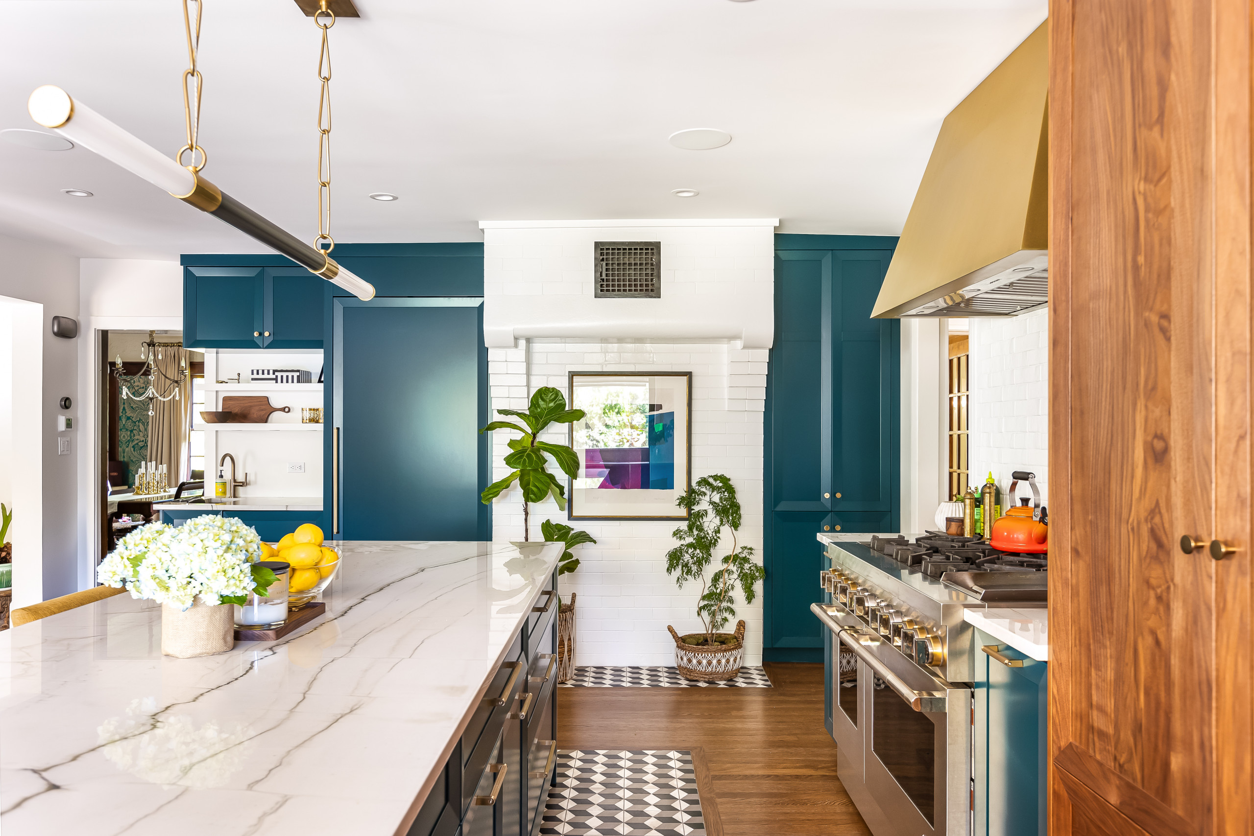
Materials mix. Walnut cabinets. Blue cabinets (Dark Harbor by Benjamin Moore). Quartzite countertops. Oak flooring with cement tile insert around the island and for the hearth in front of an original chimney. A brass liner borders the tile. The hood is also brass. “In my view, visually speaking, a kitchen is a combination of verticals and horizontals,” Servos says. “The challenge is to get the mix right, neither too boring nor too chaotic. We used the walnut more sparsely for furniture-like elements; it made the material special.”
Other special features. The pass-through window over the sink connects the kitchen to a deck with a bar countertop and stools.
 Lemon Grass Interior Architecture
Cabinets: River’s Edge Woodworks
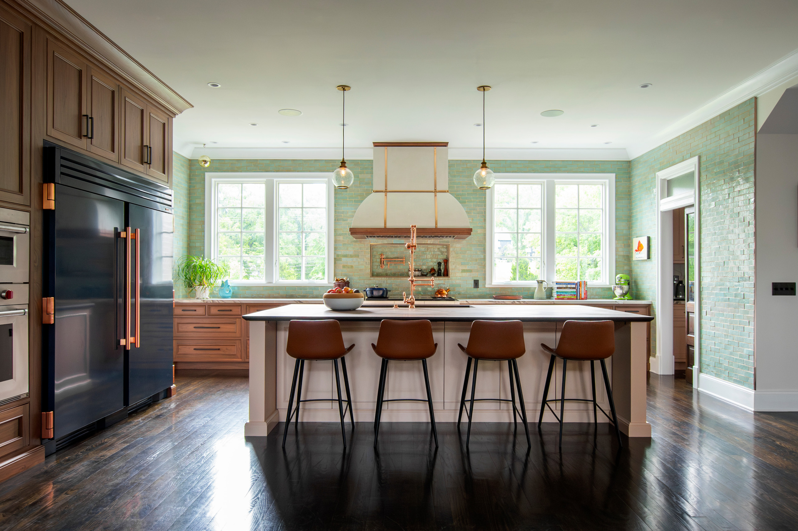 Hermitage Kitchen Gallery LLC
Designer: Terri Sears of Hermitage Kitchen Gallery
Location: Nashville, Tennessee
Size: 340 square feet (32 square meters); 17 by 20 feet
Homeowners’ request. “They were looking for quality cabinets with color,” designer Terri Sears says. “All the appliances in the original kitchen were dying out and they hated the white kitchen they had. They wanted more natural light into this room, so we removed the wall cabinets from the range wall to allow windows to get bigger.”
Materials mix. Natural walnut cabinets with a dusty pink island base (Setting Plaster by Farrow & Ball). Wood island countertop. Marble-look porcelain perimeter countertop. Original oak flooring in an ebony stain. Moss green zellige backsplash tile. Navy blue refrigerator. Limestone hood with hammered and polished copper accents. Four-foot copper workstation sink with a polished copper faucet.
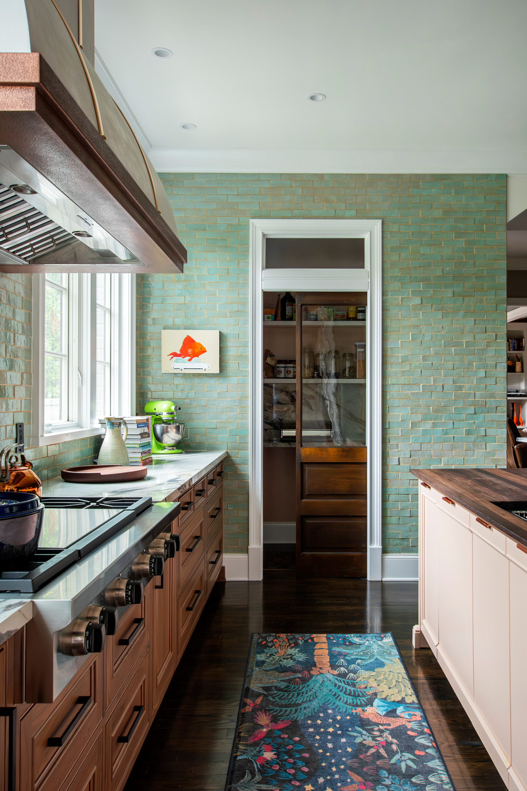 Hermitage Kitchen Gallery LLC
“Uh-oh” moment. “Usually a client is much more reserved with the use of color,” Sears says. “To be able to bring so much color and still have it look sophisticated and well-planned was the biggest challenge of this project.”
Cabinets: Grabill; wood countertop: Grothouse
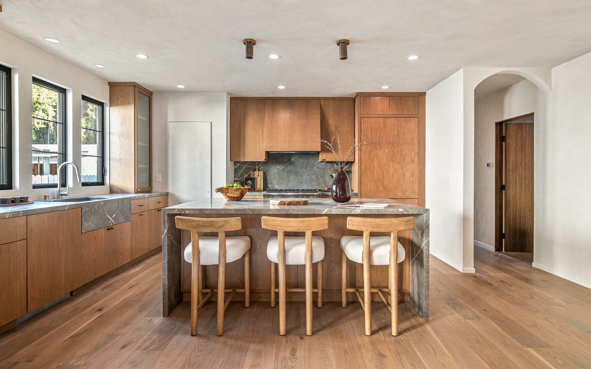 Oro Coast Builders
Design-build pro: Sahar Megidesh of Oro Coast Builders
Location: Studio City neighborhood of Los Angeles
Homeowners’ request. “The vision for this space was to create a kitchen that made you feel like you were entertaining somewhere in the Mediterranean,” design-build pro Sahar Megidesh says.
Materials mix. Custom white oak cabinets. Bronze Vena marble countertops and backsplash. Venetian plaster walls. Engineered white oak flooring. “The entire home is finished with Venetian plaster,” Megidesh says. “Even the pantry door is plaster to look flush with the wall for a clean look that really complements the warm tones in the custom kitchen.”
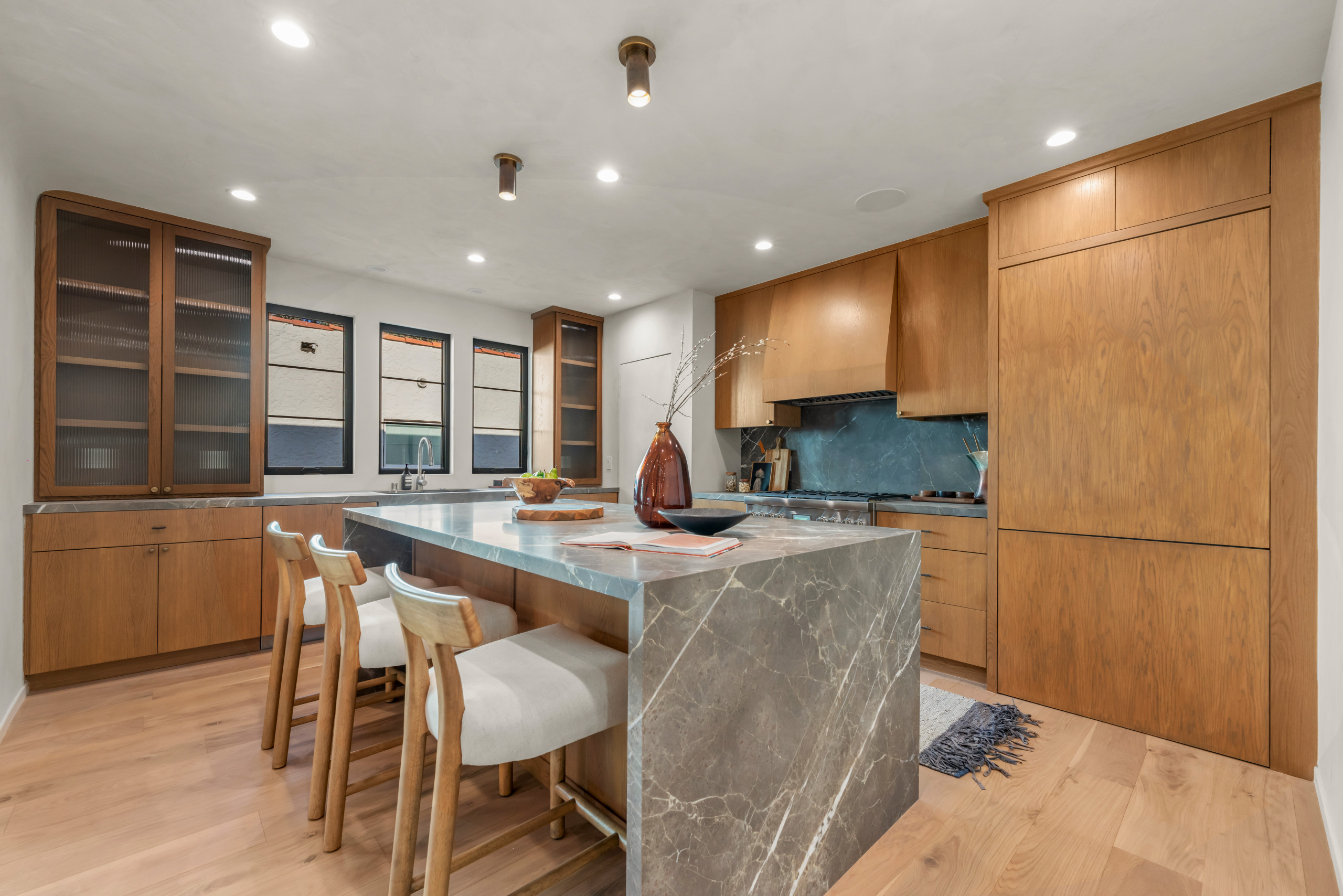 Oro Coast Builders
“Uh-oh” moment. “We originally planned on new construction but then decided to do a complete remodel while keeping some of the framework,” Megidesh says. “It’s always challenging to create your dream home while trying to work with what you have.”
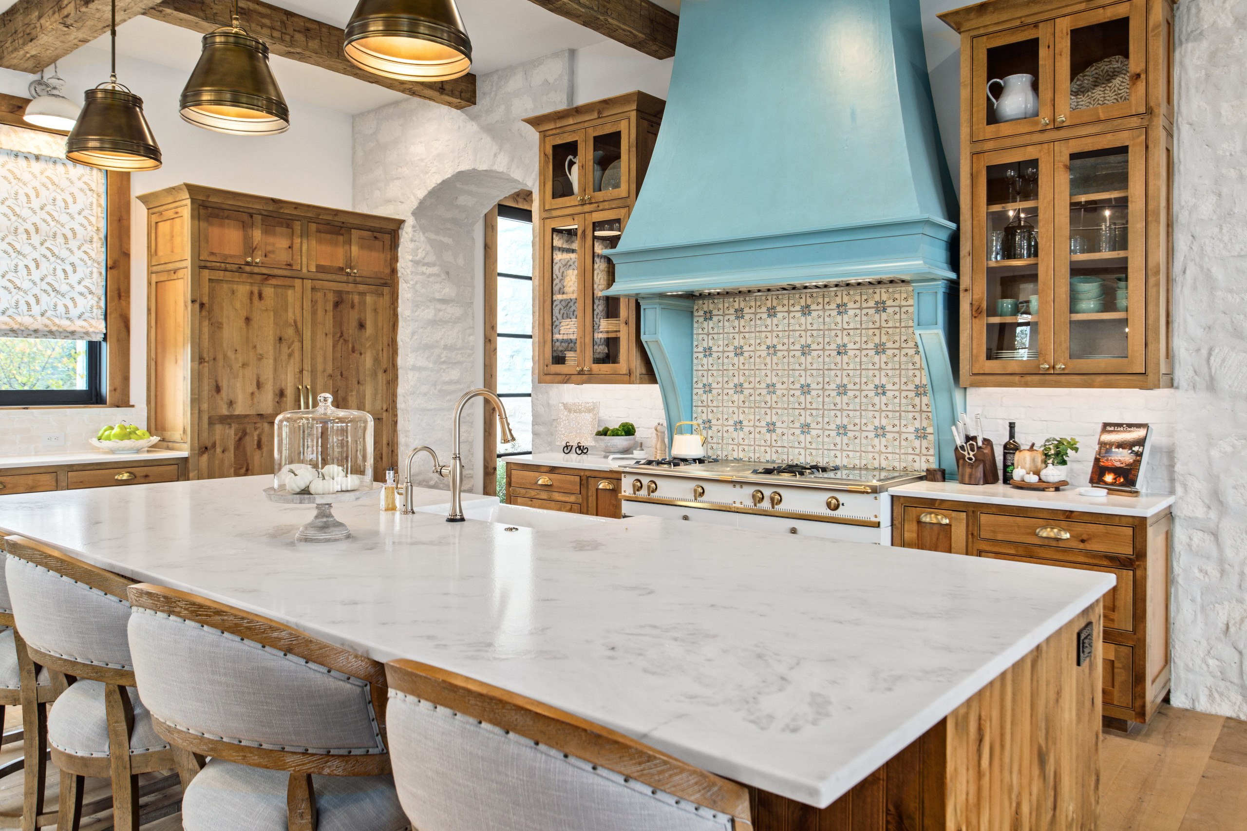 High Cotton Home & Design-Dabney Designs by Tricia
Designers: Bryann Agajanian and Tricia Dabney of High Cotton Home & Design
Location: Driftwood, Texas
Size: 570 square feet (53 square meters)
Homeowners’ request. “The homeowner was wanting a traditional, warm home but really likes a touch of French country,” designer Tricia Dabney says.
Materials mix. Knotty alder cabinets. Robin’s egg blue range hood. Brazilian Thassos marble countertops. Patterned range backsplash tile. White brick backsplash tile. Stone wall treatment. White range finish. “We wanted the space to be functional and welcoming but shine with design,” Dabney says. “This home was very big and it was important to our client that we make it feel comfortable and warm. We achieved this by adding a variety of elements, which added texture and interest, and using gold hardware and plumbing throughout helped add warmth.”
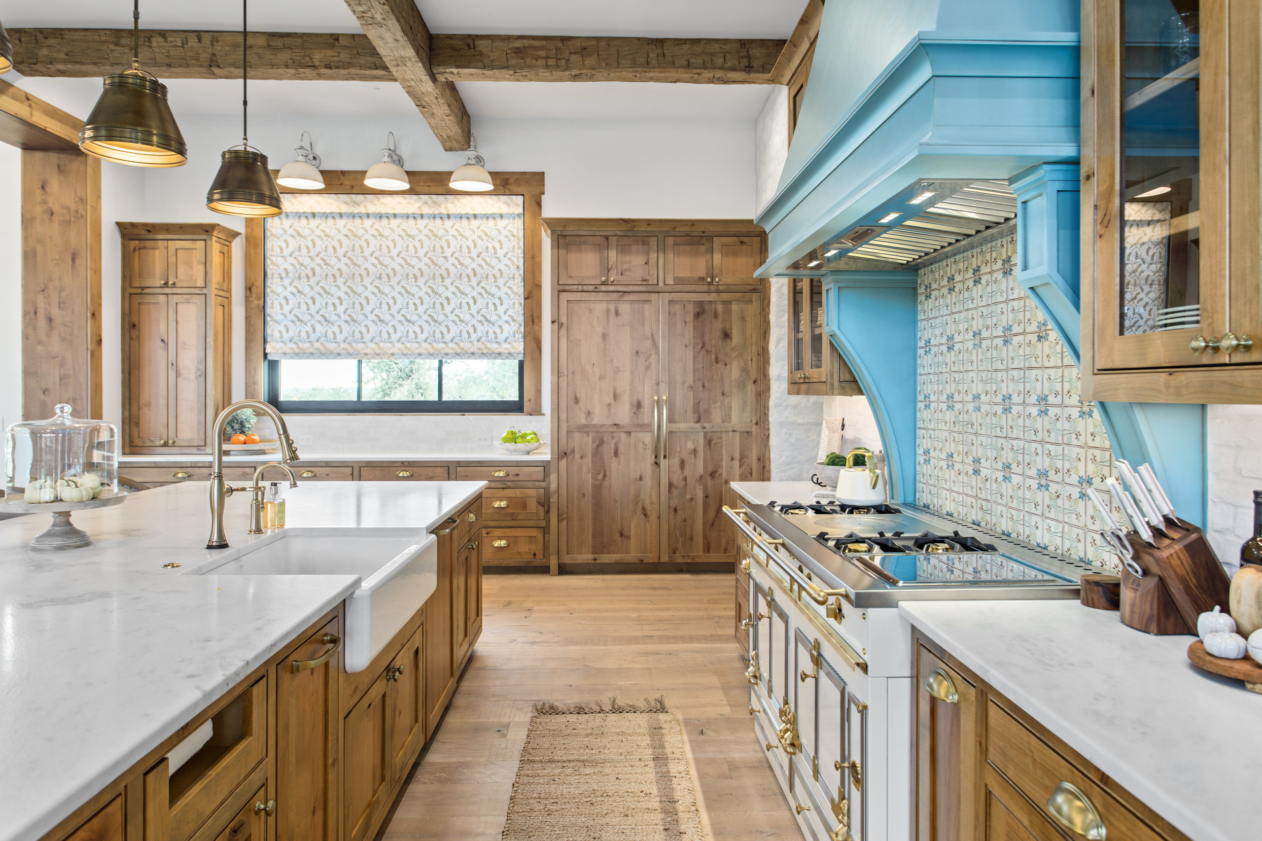 High Cotton Home & Design-Dabney Designs by Tricia
“Uh-oh” moment. “We originally were going to stain the range hood, but it became our biggest hurdle,” Dabney says. “We proposed to paint it instead to really put an emphasis on the kitchen. This was a decision that, in the end, was one of our favorites because the hood really does put a focus on not only the kitchen but the entire space.”
Range tile: Tabarka Studio; wall paint: Alabaster, Sherwin-Williams


Designer: Ruth Riemer of Riemer Kitchens & Fine Cabinetry (in collaboration with Jaqueline Touby of JTD Designs)
Location: West Harrison, New York
Size: 252 square feet (23 square meters); 14 by 18 feet
Homeowners’ request. “This kitchen renovation was born out of necessity after a flood caused water damage, prompting the family to transform their standard kitchen into a uniquely personalized space,” designer Ruth Riemer says. “We increased the height of the cabinets to the ceiling for more storage, created conversational seating at the larger island and organized the storage space.”
Materials mix. Taj Mahal quartzite countertops and backsplash. White cabinets with white oak bar-area cabinets, hood detail and floating shelves. “The wood look continues in the pendant lights and the counter-height stools at the island,” Riemer says. “Stainless appliances add some reflective surfaces.”